
Activity diagrams are among the most powerful tools available for visualizing workflows, business processes, and system logic. They provide a roadmap of how actions flow from start to finish, highlighting decision points, parallel processes, and data movement. However, a diagram that looks logical to a system architect often falls flat when presented to business stakeholders, project managers, or end-users. 📉
This disconnect usually stems from specific pitfalls that obscure the intended message. When an activity diagram becomes a maze of symbols, unclear labels, or overly technical details, it fails its primary purpose: communication. This guide explores the common errors that lead to confusion and offers concrete strategies to ensure your diagrams serve as a bridge rather than a barrier. 🌉
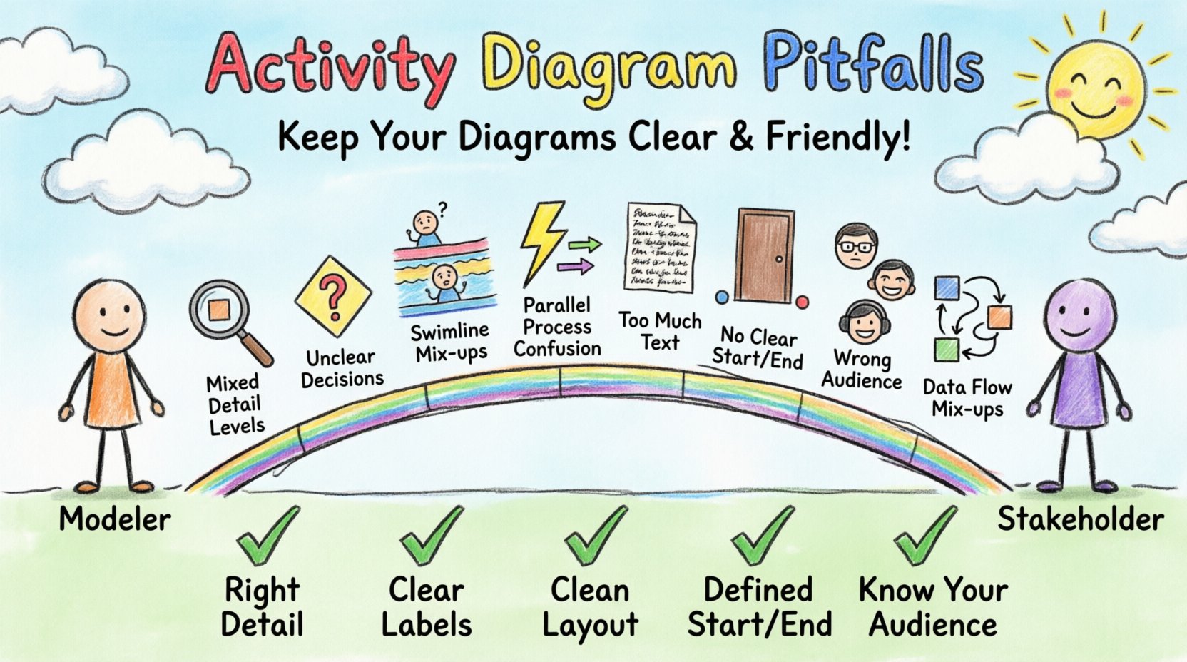
1. The Granularity Gap: Mixing Levels of Detail 📏
One of the most frequent issues in modeling is the inconsistency of granularity. A single diagram often tries to do too much, combining high-level business logic with low-level implementation details. This creates cognitive overload for the reader.
- High-Level View: Focuses on what is happening. (e.g., “Process Order,” “Validate Payment,” “Ship Item”).
- Low-Level View: Focuses on how it is happening. (e.g., “Call API Endpoint 443,” “Check Database Record ID,” “Set Variable X to Null”).
When these two levels collide on one page, stakeholders cannot see the forest for the trees. A business analyst needs to understand the order lifecycle, not the specific database query executed within the “Validate Payment” step.
Why this causes confusion:
- Stakeholders get lost in technical jargon they do not understand.
- Developers feel the diagram is too vague to guide coding.
- The process flow becomes interrupted by irrelevant implementation details.
The Fix: Create separate diagrams for different audiences. Use a top-level diagram for the business process overview. Create subordinate diagrams for specific activities that require deeper technical logic. This hierarchical approach keeps each view focused and digestible.
2. Ambiguous Decision Points and Conditions 🛑
Decision nodes (diamonds) are the traffic lights of your diagram. They direct the flow based on a condition. If the condition is unclear, the path forward becomes a guessing game.
Common errors include:
- Missing Labels: A diamond with no text or text like “Check.” What is being checked? Is it a value? A user permission? A system state?
- Complex Conditions: Using code-like syntax such as
if (user.id == 5 && time > 12:00)directly on the diagram. This alienates non-technical readers. - Unclear Paths: Failing to label the “True” and “False” paths explicitly. Instead, using generic text like “Yes” and “No” which might not apply to every decision type.
Example of Confusion:
Imagine a decision node labeled “Status Valid.” The paths are “Proceed” and “Stop.” Does “Stop” mean terminate the process, or just pause it? Does “Proceed” go to the next activity, or does it loop back? Without explicit labels and clear exit arrows, the flow is ambiguous.
The Fix: Use natural language for conditions. Instead of isValid, use “Is Order Valid?” Label the outgoing edges with the result of the condition, such as “Yes” or “No,” or “Approved” and “Rejected.” Ensure every possible outcome has a distinct path leading to a specific next step.
3. Swimlane Mismanagement and Responsibility 🏊
Swimlanes are intended to clarify who is responsible for which activity. They divide the diagram into horizontal or vertical sections representing actors, roles, or systems. However, poor management of swimlanes can create more confusion than clarity.
Common Swimlane Pitfalls
| Pitfall | Impact on Stakeholders | Correction |
|---|---|---|
| Too Many Swimlanes | Diagram becomes a narrow strip; flow is hard to follow. | Group related roles or use sub-diagrams. |
| Activities Cross Boundaries | It is unclear which actor performs the action. | Ensure every activity node sits entirely within one lane. |
| Unclear Labels | “System” vs. “Backend” vs. “Server” causes confusion. | Use consistent, role-based naming conventions. |
| Missing Handoffs | Process stops at the boundary between lanes. | Use clear connector arrows crossing lane boundaries. |
When swimlanes are not used correctly, stakeholders cannot easily identify their own responsibilities. If a process flow jumps from the “Customer” lane to the “Database” lane without passing through the “System” lane, the logical handoff is broken.
4. Overlooking Concurrency and Synchronization ⚡
Real-world processes often happen in parallel. Fork nodes (splitting the flow) and Join nodes (merging the flow) represent this concurrency. Misusing these elements is a major source of misunderstanding.
The Fork/Join Confusion:
- Many models use a simple fork without a corresponding join, leaving the parallel paths dangling. This suggests the process ends prematurely or continues indefinitely.
- Using a join without specifying synchronization. Does the merge wait for all incoming paths to complete, or just one? This distinction changes the timing and logic of the entire workflow.
- Complex loops within parallel branches. If one branch loops and the other does not, the join node may never be reached, causing the process to hang logically.
Why Stakeholders Care:
Business stakeholders need to know if tasks happen simultaneously to understand resource requirements. If “Pack Item” and “Calculate Shipping” happen at the same time, you need fewer resources than if they happen sequentially. Ambiguity here leads to incorrect resource planning.
5. Visual Clutter and Text Density 📝
An activity diagram is a visual aid, not a text document. When nodes are filled with paragraphs of text, the diagram loses its visual power. The human brain processes images faster than text; cluttering the image negates this advantage.
Signs of Visual Clutter
- Long Activity Names: Nodes wider than 3-4 lines of text force the diagram to grow horizontally or vertically, making it unscrollable.
- Dense Arrow Connections: Too many lines crossing each other create a “spaghetti effect.” It becomes impossible to trace the path without losing your place.
- Inconsistent Sizing: Some nodes are huge, others tiny. This visual hierarchy confuses the reader about the importance of each step.
- Redundant Information: Repeating the same description in the diagram legend and inside the node boxes.
The Fix: Keep node text concise. Use external notes or linked documentation for detailed descriptions. Simplify the layout to minimize crossing lines. If a diagram becomes too large to fit on one screen, split it into logical sections and use reference links.
6. Missing Entry and Exit Points 🚪
Every process needs a clear beginning and a clear end. Yet, many diagrams omit the initial node (black filled circle) or the final node (black filled circle with a border). Without these anchors, the flow direction is implicit rather than explicit.
The Consequences:
- Start Point Ambiguity: If there is no initial node, readers must guess where to start reading. Do they start at the top left? The first label? The first activity?
- End Point Ambiguity: Where does the process stop? Does it stop when the last activity finishes? What about error states? Are there multiple final states?
- Orphaned Nodes: Activities that are not reachable from the start or do not lead to the end suggest dead code or incomplete logic.
Best Practice: Always define a single initial node. Define final nodes explicitly, distinguishing between a “Successful Completion” and an “Error Termination.” This helps stakeholders understand the different outcomes of the process.
7. The Human Factor: Audience Alignment 👥
Even a technically perfect diagram can fail if the audience is not considered. A diagram meant for developers will differ significantly from one meant for executives.
Understanding Stakeholder Perspectives
| Stakeholder Group | Focus | Pitfall to Avoid |
|---|---|---|
| Business Executives | ROI, Time, High-level flow | Showing code-level logic or error handling details. |
| Business Analysts | Requirements, Rules, Process | Skipping decision logic or validation steps. |
| Developers | Logic, Data, Interfaces | Vague conditions or missing data objects. |
| End Users | Steps, UI, Interaction | System backend processes that the user never sees. |
When a single diagram tries to satisfy all these groups, it usually satisfies none. It is better to tailor the diagram to the specific conversation taking place. If you are discussing budget, show the high-level flow. If you are discussing code architecture, show the detailed logic.
8. Data Object Flow Confusion 📦
Activity diagrams often include data objects moving between activities. These are represented by rectangles with folded corners. While useful, they can become a source of confusion if not managed well.
Common Data Pitfalls:
- Missing Input/Output: An activity has no incoming or outgoing data objects, making it unclear where data comes from or where it goes.
- Data Transformation: Failing to show how data changes. If a “Calculate Total” activity takes “Item List” and outputs “Final Bill,” the transformation should be clear.
- Storage vs. Flow: Confusing data flow with data storage. Using data object symbols for databases creates ambiguity about whether the data is just passing through or being saved.
The Fix: Clearly link data objects to the activities that produce or consume them. Ensure the data flow aligns with the control flow. If data is created in one step and used in another, draw the line between them.
Review Checklist for Clarity ✅
Before presenting an activity diagram to stakeholders, run it through this validation checklist. This ensures the diagram is robust and free of common pitfalls.
- Granularity: Is the level of detail appropriate for the audience?
- Start/End: Are there clear initial and final nodes?
- Swimlanes: Are responsibilities clearly defined and contained?
- Decisions: Are all conditions labeled with natural language?
- Paths: Do all paths lead to a conclusion? Are there no dead ends?
- Concurrency: Are parallel processes synchronized correctly?
- Visuals: Is the layout clean with minimal line crossings?
- Consistency: Are symbols and notation used consistently throughout?
Moving Forward with Better Models 🚀
Creating effective activity diagrams requires more than just knowing the notation rules. It demands an understanding of human communication, process logic, and stakeholder needs. By avoiding the pitfalls outlined above—such as granularity mismatches, ambiguous decisions, and visual clutter—you ensure that your diagrams serve their true purpose.
Remember, a diagram is a contract between the modeler and the reader. If the contract is unclear, the resulting work will suffer from misalignment and rework. Take the time to refine your diagrams. Use swimlanes to clarify ownership, keep text concise, and validate your logic against real-world scenarios. This investment in clarity pays dividends in smoother development cycles and happier stakeholders. 💡
When you prioritize understanding over technical completeness, your diagrams become valuable assets rather than obstacles. Start reviewing your current models against these criteria. Identify where the confusion lies, and apply these fixes. The result will be a clearer path forward for everyone involved in the project.