Understanding how different parts of a system interact is fundamental to building robust software. One of the most effective ways to visualize these interactions is through a communication diagram. This guide breaks down the concept without the heavy jargon often found in technical documentation. Whether you are a new developer, a project manager, or a stakeholder, grasping this visual language helps clarify complex workflows.
We will explore what these diagrams represent, how they differ from other modeling techniques, and the practical steps to create them. The focus remains on clarity and structure, ensuring you can apply these concepts immediately to your projects.
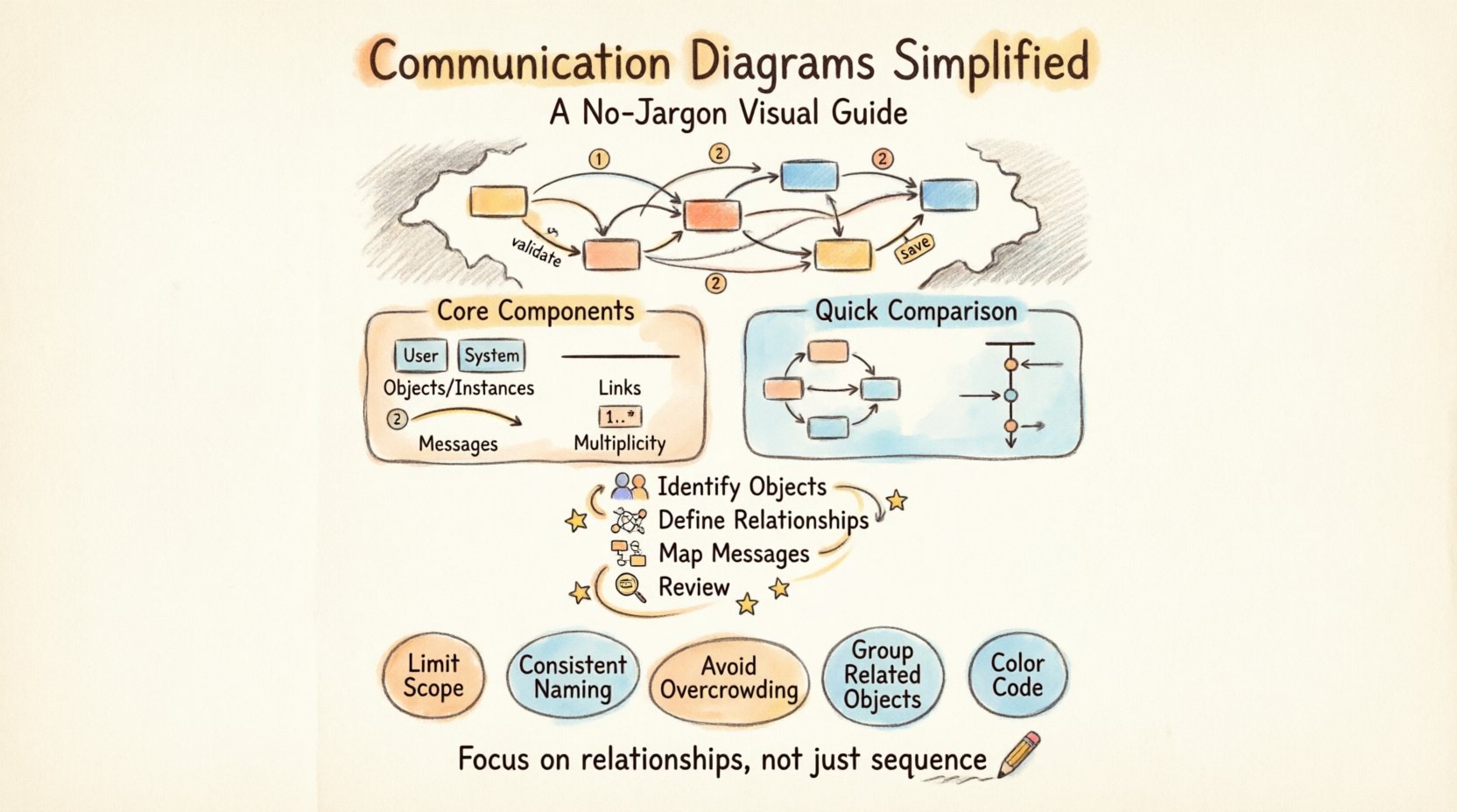
What Is a Communication Diagram? 🤔
A communication diagram is a type of interaction diagram used in software design. It shows how objects in a system communicate with each other to perform a task. Unlike other diagrams that focus heavily on time and sequence, this format prioritizes the relationships between objects and the messages they exchange.
Think of it as a map of conversation. Instead of a timeline, you see nodes representing entities and lines representing the flow of information. This makes it easier to understand the architecture of the system at a glance.
- Visual Focus: It highlights the structural organization of objects.
- Message Flow: It tracks the direction and order of information passing.
- Context: It provides a snapshot of a specific scenario or use case.
When you look at this diagram, you are not just looking at boxes and arrows. You are looking at the logic that drives the system. Each object has a responsibility, and each line represents a request or a response between those responsibilities.
Core Components Explained 🔧
To build a clear diagram, you need to understand the building blocks. Every element serves a specific purpose in defining the interaction. Here is a breakdown of the essential parts.
1. Objects and Instances 🖼️
Objects are the active participants in the scenario. They are represented as rectangles. Each rectangle contains the name of the object, often prefixed by a colon or simply written in text.
- Class: The type of object (e.g., User, Order).
- Instance: A specific occurrence of that class (e.g., User:john).
It is important to distinguish between the general type and the specific instance. The diagram usually shows instances to describe a specific interaction flow.
2. Links and Connections 🛤️
Links represent the paths available for communication. They are solid lines connecting objects. These lines indicate that one object knows about the other and can send a message.
- Association: A permanent link between objects.
- Navigation: The ability to traverse from one object to another.
If two objects are connected by a line, they have a relationship. If they are not connected, they cannot interact directly in this scenario.
3. Messages 💬
Messages are the actions that occur. They are represented by arrows along the links. Arrows indicate the direction of the flow.
- Label: Text describing the action (e.g., validate, save).
- Numbering: Sequential numbers help track the order of events.
- Direction: Solid arrows for requests, dashed arrows for returns.
Messages can be synchronous (waiting for a response) or asynchronous (sending and forgetting). The diagram usually focuses on the request, but return paths help clarify the complete flow.
4. Multiplicity 🔢
Sometimes, an object represents more than one instance. Multiplicity notation indicates how many objects are involved in a relationship.
- One: A single object.
- Many: Multiple objects of the same type.
This is crucial for understanding scale. If a Customer sends messages to Many:Orders, the diagram must reflect that potential volume.
Communication vs. Sequence Diagrams ⚖️
People often confuse communication diagrams with sequence diagrams. Both show interactions, but they emphasize different aspects. Choosing the right one depends on what you want to communicate.
| Feature | Communication Diagram | Sequence Diagram |
|---|---|---|
| Focus | Object relationships and structure | Time and chronological order |
| Layout | Organized by object proximity | Organized vertically by time |
| Best For | High-level architecture views | Detailed step-by-step logic |
| Complexity | Can handle complex branching well | Can become cluttered with deep nesting |
If you need to show the exact timing of events, a sequence diagram is better. If you need to show which objects talk to each other and how they are connected, a communication diagram is superior. The lack of a vertical timeline allows you to arrange objects spatially based on their logical grouping.
How to Create a Diagram Step-by-Step 🛠️
Creating these diagrams requires a methodical approach. You do not need special tools to start; you need a clear understanding of the flow. Follow these steps to ensure accuracy.
Step 1: Identify the Actors and Objects 👥
Start by listing the participants. Who is initiating the action? Who is receiving it? Who is processing the data?
- Write down the main Initiator.
- List the Supporting Objects required.
- Identify any External Systems involved.
Keep the list focused. Do not include every object in the system, only those relevant to the specific scenario.
Step 2: Define the Relationships 🧩
Draw the lines between the objects. Ensure that the connections represent real data paths. If Object A needs data from Object B, draw a line between them.
- Check for Direct Connections.
- Identify Intermediary Objects.
- Ensure the graph is Connected.
Do not leave objects floating without connections. If an object exists in the diagram, it must be reachable from the initiator.
Step 3: Map the Messages 📩
Add the arrows. Label each arrow with the specific action. Number them to show the sequence.
- Start with the Request Message.
- Add Processing Steps.
- End with the Response Message.
Be precise with labels. Instead of send data, use submitOrder or fetchInventory.
Step 4: Review and Refine 🔍
Walk through the diagram as if you were the system. Does the flow make sense? Are there loops? Are there missing checks?
- Verify Logical Order.
- Check for Dead Ends.
- Ensure Clarity for the reader.
Refinement is key. A diagram that is confusing is worse than no diagram at all.
Best Practices for Clarity 🌟
Designing these diagrams is an art form. The goal is to reduce cognitive load for the reader. Follow these guidelines to maintain high standards.
- Limit Scope: One diagram per scenario. Do not try to show the entire system in one image.
- Use Consistent Naming: Use the same names for objects throughout the documentation.
- Avoid Overcrowding: If a diagram has too many lines, split it into multiple views.
- Group Related Objects: Place objects that talk frequently near each other.
- Color Coding: Use colors to distinguish between different types of messages (e.g., read vs. write).
Consistency builds trust. When readers know what to expect, they can focus on the logic rather than the layout.
Common Pitfalls to Avoid ⚠️
Even experienced designers make mistakes. Being aware of common errors helps you steer clear of them.
1. Too Much Detail
Do not include every method call. Focus on the high-level interactions. If a method calls another internal method, do not draw that unless it is critical.
2. Ignoring Error Paths
Real systems fail. Show what happens when an object cannot respond. Include dashed lines for error messages or timeouts.
3. Circular Dependencies
Avoid loops that do not end. If Object A calls B, and B calls A, ensure there is a termination condition. Infinite loops confuse the reader.
4. Misleading Arrows
Ensure arrows point in the correct direction. A return message should be dashed and point back to the caller.
5. Inconsistent Numbering
Messages should be numbered sequentially. If you skip numbers or repeat them, the flow becomes ambiguous.
Integration with Other Design Elements 🧱
This diagram does not exist in isolation. It works best when combined with other documentation.
With Class Diagrams
Use the class diagram to define the structure. Use the communication diagram to define the behavior. The class diagram shows what exists; the communication diagram shows how it works.
With Use Case Diagrams
Use case diagrams identify the goals. Communication diagrams break down the steps to achieve those goals. They provide the technical detail behind the functional requirements.
With Data Models
Data models define the storage. Communication diagrams define the access. Ensure the objects in the diagram match the entities in the database schema.
Real-World Application Scenarios 💡
Where do these diagrams fit in the software development lifecycle?
1. System Architecture Reviews
Architects use them to verify that the system structure supports the required flows. They help identify bottlenecks in the design.
2. Onboarding New Developers
When a new team member joins, these diagrams provide a quick overview of how the system operates. They are better than code for initial understanding.
3. Stakeholder Presentations
Non-technical stakeholders can understand the object relationships better than they can understand code. These diagrams bridge the gap between business and technology.
4. Code Review Preparation
Developers can create the diagram before writing code. This ensures the design is sound before implementation begins.
Maintaining Your Diagrams 🔄
Diagrams can become outdated quickly if the code changes. Maintenance is a critical part of the process.
- Update on Change: If the code changes, update the diagram.
- Version Control: Store diagrams with the code repository.
- Review Cycles: Include diagram review in sprint planning.
- Documentation Links: Link the diagram to the relevant code modules.
Living documentation is valuable. Static documentation that contradicts the code is dangerous. Keep them in sync to ensure accuracy.
Final Thoughts on Interaction Modeling 🧠
Visualizing system interactions is a powerful skill. It forces you to think about the connections between parts before you write the first line of code. It reduces ambiguity and aligns the team on the logic.
By focusing on objects and messages, you strip away the noise and see the core functionality. This approach leads to cleaner code and fewer bugs. Remember that the goal is communication, not perfection. A simple, accurate diagram is better than a complex, confusing one.
Start small. Pick a single feature. Draw the interactions. Review the flow. Refine the design. Over time, you will find that these diagrams become an essential part of your toolkit. They provide a shared language for everyone involved in the project.
Keep practicing. The more you draw, the better you will understand the system. Clarity is the ultimate goal, and these diagrams are the path to get there.