Communication diagrams are a cornerstone of effective software design documentation. They provide a visual representation of how objects interact to achieve a specific functionality. Unlike sequence diagrams, which focus heavily on time and ordering, communication diagrams emphasize the structural relationships between objects. However, even experienced architects fall into traps that reduce the value of these diagrams. When a diagram is unclear, it creates ambiguity that ripples through development, testing, and maintenance phases. This guide explores the frequent errors found in these diagrams and offers concrete strategies to correct them, ensuring your system architecture remains clear and maintainable.
🔍 Why Communication Diagrams Matter
Before diving into errors, it is essential to understand the role of the communication diagram in the design process. These diagrams map out the flow of messages between objects. They are not just drawings; they are blueprints for logic.
- Clarity: They help developers understand how components talk to one another without reading every line of code.
- Verification: They allow teams to validate design decisions before implementation begins.
- Documentation: They serve as living documentation that evolves with the system.
When these diagrams fail, the cost is high. Misinterpreted flows lead to bugs, and unclear structures lead to technical debt. Let us examine the specific pitfalls.
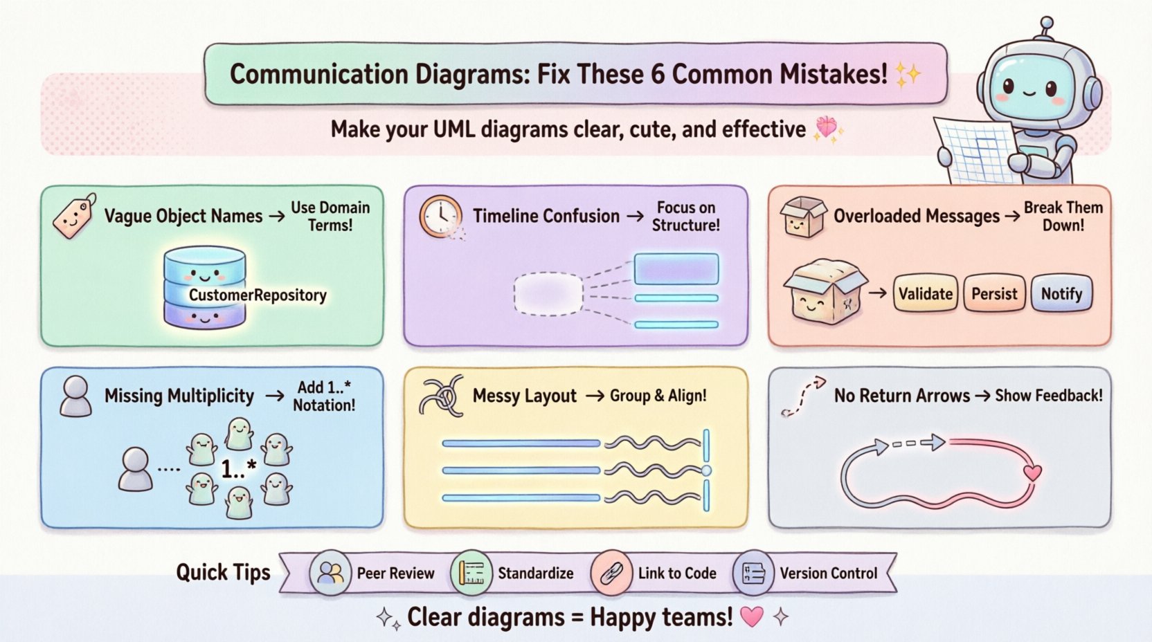
❌ Mistake 1: Ambiguous Object Identification 🏷️
One of the most common issues is the use of generic or unclear names for objects. Developers often label objects simply as Object1, Manager, or Service. While these names might make sense to the author at the time of creation, they offer no context to a new team member or an auditor.
The Impact
Ambiguity forces stakeholders to ask questions that delay progress. If a diagram shows a Process object, it is unclear what kind of process it handles. Is it a payment process? A data validation process? Without specificity, the diagram fails its primary purpose of communication.
The Fix
- Use Domain Language: Name objects based on the business domain. Instead of
DataHandler, useCustomerRepositoryorOrderProcessor. - Be Specific: Avoid generic terms like
ObjectorSystem. Define the scope of responsibility clearly. - Consistency: Ensure the naming convention matches the codebase. If the code uses
UserService, the diagram must useUserService.
❌ Mistake 2: Confusing Sequence with Structure ⏱️
Communication diagrams are often confused with sequence diagrams. Sequence diagrams prioritize time and strict ordering. Communication diagrams prioritize the structural links between objects. A frequent error is trying to force a strict chronological timeline onto a communication diagram, cluttering it with unnecessary timing details.
The Impact
When you over-index on time in a communication diagram, you lose the view of the topology. You might miss the fact that Object A needs to talk to Object B regardless of when in the process it happens. This confusion leads to designs that are rigid and hard to refactor.
The Fix
- Focus on Links: Emphasize the connections (associations) between objects rather than the exact sequence number.
- Use Numbering Sparingly: While message numbers (1, 2, 3) are useful for showing order, do not overuse them to the point where the layout looks like a sequence diagram.
- Highlight Relationships: Make sure the lines connecting objects represent the structural relationship (e.g., aggregation, composition) clearly.
❌ Mistake 3: Overloading Messages 📦
Another significant error is placing too much logic into a single message. A developer might draw a message labeled ProcessOrder that implies a complex series of validations, database writes, and external API calls. While this looks clean, it hides complexity.
The Impact
Hidden complexity makes the system brittle. If ProcessOrder fails, it is difficult to trace where in the chain the failure occurred. It also makes unit testing difficult because the responsibility of the object is unclear.
The Fix
- Decompose Messages: Break large actions into smaller, distinct messages. For example, instead of
ProcessOrder, useValidateOrder,ChargePayment, andSaveRecord. - Define Responsibilities: Ensure each message represents a single responsibility. This aligns with the Single Responsibility Principle.
- Add Context: If a message is complex, add a note or a separate sub-diagram to explain the internal logic.
❌ Mistake 4: Ignoring Multiplicity and Lifecycle ♻️
Communication diagrams often show objects as single instances. However, in reality, a system often deals with collections of objects. Failing to indicate multiplicity (e.g., one-to-many) creates confusion about how many instances are involved in the interaction.
The Impact
If a diagram shows a Customer talking to an Order, but the code actually handles a list of orders, the developer might write code that only supports a single order. This leads to runtime errors or the need for significant refactoring later.
The Fix
- Specify Multiplicity: Use standard notation to show ranges (e.g.,
1..*or0..1) on the association lines connecting objects. - Clarify Lifecycle: Indicate if an object is created or destroyed during the interaction. Use lifecycle states if necessary to show when objects are active.
- Iterate Clearly: If a message is sent to a collection, indicate that the receiving object handles an iteration loop.
❌ Mistake 5: Poor Layout and Visual Clutter 🎨
Even a logically correct diagram can fail if it is visually overwhelming. Crossing lines, overlapping objects, and inconsistent spacing make the diagram difficult to read. This is often a result of adding elements without reorganizing the canvas.
The Impact
Visual fatigue causes errors. If a reader cannot easily trace the path of a message, they will skip reading the diagram entirely, relying solely on code comments or assumptions.
The Fix
- Group Related Objects: Use visual grouping or zones to separate different subsystems or modules.
- Minimize Crossings: Arrange objects so that message lines do not intersect unnecessarily. Use orthogonal routing (right angles) for lines.
- Align Elements: Maintain consistent spacing between objects. A tidy diagram conveys professional care and attention to detail.
❌ Mistake 6: Missing Feedback or Return Messages 🔄
Many diagrams show the request but omit the response. In a synchronous system, an object sends a message and waits for a return value. Leaving this out implies an asynchronous or fire-and-forget system, which might not be the case.
The Impact
This omission leads to misunderstandings about data flow. Developers might assume they need to handle asynchronous callbacks when they actually need to wait for a return value, or vice versa.
The Fix
- Show Return Paths: Use dashed lines with arrows to indicate return messages.
- Label Returns: If the return value is significant (e.g., a boolean or an object), label the return line.
- Clarify Asynchrony: If the system is truly asynchronous, use specific notation (like an open arrow) to distinguish it from synchronous returns.
📊 Summary of Common Errors and Solutions
| Mistake | Consequence | Recommended Solution |
|---|---|---|
| Ambiguous Names | Confusion about object roles | Use domain-specific terminology |
| Confusing Sequence | Rigid design, loss of topology view | Focus on structure, minimize timing |
| Overloaded Messages | Hidden complexity, hard to test | Decompose into smaller messages |
| Ignoring Multiplicity | Runtime errors with collections | Use notation like 1..* |
| Visual Clutter | Readers skip the diagram | Organize layout, minimize crossings |
| Missing Feedback | Incorrect data flow assumptions | Draw return paths clearly |
🛠️ Implementing Fixes in Your Workflow
Identifying mistakes is only the first step. Integrating these fixes into your daily workflow requires discipline. Here is how to approach the correction process systematically.
1. Peer Review Sessions
Do not create diagrams in isolation. Schedule review sessions where team members analyze the communication diagrams. Ask them to trace the message flow without looking at the code. If they get stuck, the diagram is unclear.
2. Standardize Notation
Ensure the team agrees on a standard set of symbols. If some team members use solid lines for associations and others use dashed lines, the diagram becomes a puzzle. Document these standards in a style guide.
3. Link to Code
Where possible, link diagram elements to the actual code files. This ensures that if the code changes, the diagram is flagged for update. It prevents the diagram from becoming a relic of the past.
4. Version Control
Treat diagrams as code. Store them in version control. This allows you to track changes over time and revert if a new design introduces confusion.
🔎 Deep Dive: The Ripple Effect of Poor Diagrams
Why does fixing these mistakes matter beyond just aesthetics? Consider the lifecycle of a software project.
- Onboarding: New hires spend weeks trying to understand the system. A clear diagram reduces this time significantly.
- Refactoring: When changing architecture, a diagram helps predict side effects. Without it, developers might break dependencies they did not see.
- Debugging: When a bug occurs, the diagram helps trace the path of data. If the path is unclear, debugging becomes a game of guesswork.
The cost of a bad diagram is not just the time spent drawing it. It is the time lost by the entire team navigating the confusion it creates.
✅ Best Practices Checklist
Before finalizing any communication diagram, run through this checklist to ensure quality.
- Are all objects named clearly? (Domain terms preferred)
- Is the flow of messages logical? (No circular dependencies unless intended)
- Are return messages visible? (Dashed lines where appropriate)
- Is the layout clean? (No overlapping lines, consistent spacing)
- Does it match the code? (If you changed the class, did you update the diagram?)
- Is the scope defined? (Does it cover the specific use case or the whole system?)
- Are multiplicities indicated? (1..* for collections)
- Is the notation standard? (Adheres to UML standards)
🚀 Moving Forward
Correcting mistakes in communication diagrams is an iterative process. It requires a mindset shift from “drawing to document” to “drawing to clarify.” When you treat these diagrams as active tools for thought rather than passive records, the quality of your design improves.
Start by auditing your current diagrams against the list provided here. Pick one major diagram and apply the fixes. Observe how much easier it becomes to discuss the system with your team. Small improvements in documentation lead to large improvements in system reliability.
Remember, the goal is not perfection, but clarity. A diagram that is 90% clear is better than one that is 100% perfect but unreadable. Focus on reducing ambiguity and enhancing communication between you and your team.
📝 Final Thoughts on Diagram Maintenance
Maintaining these diagrams is an ongoing commitment. As features are added, the interaction models change. A static diagram becomes a liability if it does not reflect the current state of the system. Integrate diagram updates into your definition of done for every feature.
By addressing the common mistakes outlined in this guide, you ensure that your communication diagrams serve their true purpose. They become a bridge between design and implementation, reducing friction and increasing the speed of delivery. Take these steps today to elevate the quality of your system architecture documentation.