
Understanding how software behaves requires more than just reading code. It demands a visual language that bridges the gap between technical logic and business requirements. This is where activity diagrams come into play. These diagrams map out the flow of control from one action to another, offering a clear picture of system processes. Whether you are documenting a user journey or designing a backend workflow, visualizing these steps is essential for clarity and communication.
An activity diagram is essentially a flowchart for software. It shows the sequence of activities, the decisions made, and the parallel processes that occur within a system. Unlike static diagrams, activity diagrams capture the dynamic behavior of a system. They answer questions like: What happens next? What are the conditions for moving forward? How do multiple tasks interact? By using standard notation, teams can discuss complex logic without getting lost in implementation details.
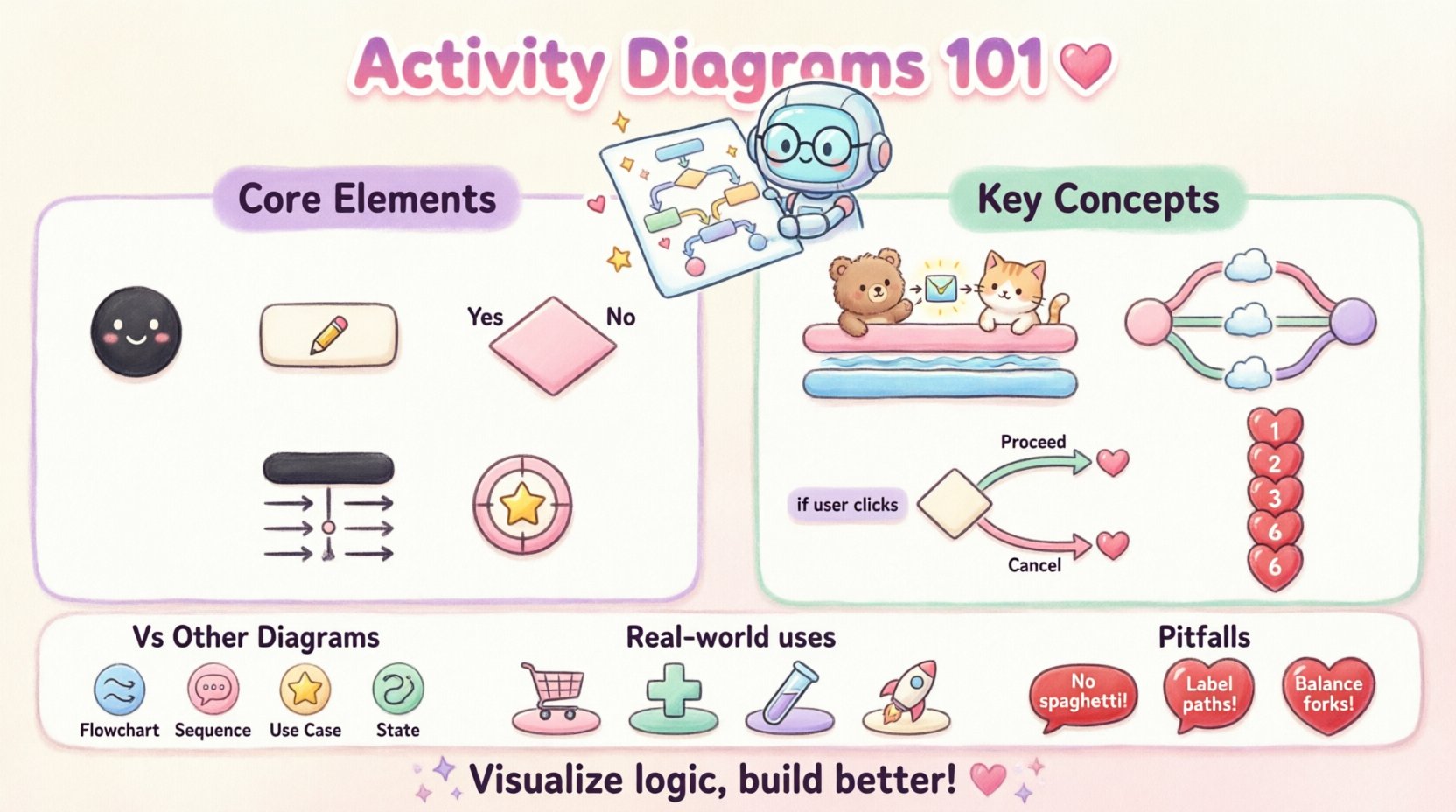
Core Components of an Activity Diagram 🧩
Every diagram is built from specific building blocks. To create a meaningful model, you must understand the fundamental elements. These elements work together to define the start, the process, and the end of an action sequence.
- Initial Node: Represents the starting point of the workflow. It is typically a filled black circle.
- Activity: A period of processing where an action occurs. It is shown as a rounded rectangle.
- Control Flow: The arrows that connect actions. They indicate the order in which actions occur.
- Final Node: The end point of the activity. It is a black circle with a white ring around it.
- Object Node: Represents data or objects being passed between activities. It looks like a rectangle with a folded corner.
- Decision Node: A diamond shape that splits the flow based on a condition.
When drawing these diagrams, consistency is key. The arrows must flow logically from top to bottom or left to right. Avoid crossing lines where possible to maintain readability. If a line must cross, ensure the junction is clear so it does not look like a node.
Understanding Swimlanes and Partitions 🏊
Complex systems often involve multiple actors or departments. Swimlanes allow you to organize activities by responsibility. This visual separation clarifies who or what performs each action. It is particularly useful in business process modeling where different teams interact.
There are two primary types of swimlanes:
- Vertical Swimlanes: Activities are grouped horizontally. Each column represents a specific actor.
- Horizontal Swimlanes: Activities are grouped vertically. Each row represents a specific actor.
When an action crosses a swimlane boundary, it indicates a handoff or interaction between actors. This helps identify bottlenecks. For example, if a process waits too long in one lane, that specific actor might be overloaded. Swimlanes also help in identifying parallelism. If two lanes have actions at the same time, those processes can occur concurrently.
Example of Swimlane Usage
Consider a loan approval process. One lane represents the Customer, another the Bank System, and a third the Credit Officer. The flow moves from the customer submitting an application, to the system checking data, to the officer making a decision. This structure makes it immediately obvious where responsibilities lie and where communication happens.
Handling Concurrency with Fork and Join 🔄
Software rarely executes tasks in a single linear line. Often, multiple processes run at the same time. This is where concurrency becomes important. Activity diagrams represent this using fork and join nodes.
- Fork Node: A thick horizontal or vertical bar that splits a single flow into multiple concurrent flows. It indicates that all outgoing branches start at the same time.
- Join Node: A thick bar that merges multiple concurrent flows back into a single flow. It waits for all incoming branches to complete before proceeding.
Using fork and join nodes prevents the model from implying sequential execution where none exists. For instance, when a user logs in, the system might simultaneously validate credentials, check session history, and log the access attempt. These three actions happen in parallel. Without a fork node, the diagram would incorrectly suggest that logging happens, then validation happens, then history happens.
It is crucial to balance forks and joins. Every fork should generally have a corresponding join. If a flow splits but never rejoins, the diagram represents a process that ends prematurely or creates orphaned threads. This can lead to confusion about the state of the system.
Decision Nodes and Logic Flow 🧠
Real-world logic is full of conditions. A system does not always follow the same path. Decision nodes allow you to model these branching paths. They are represented by a diamond shape with outgoing arrows labeled with guard conditions.
Guard conditions are expressions that determine which path is taken. They must be mutually exclusive. For example, if a condition is user is logged in, the outgoing arrow should be labeled true. The other arrow should be labeled false. If you have multiple conditions, ensure they cover all possibilities.
Decision vs Merge:
- Decision: Splits the flow. One incoming line, multiple outgoing lines.
- Merge: Combines the flow. Multiple incoming lines, one outgoing line.
It is common to use a merge node after a decision node. This brings the different paths back together. For example, after a payment is approved or declined, the system might proceed to update the order status regardless of the outcome. The merge point represents this convergence.
Activity Diagram vs Other Diagram Types 📊
Confusion often arises between activity diagrams and other UML diagrams. Understanding the distinction ensures you use the right tool for the job. The table below clarifies when to use an activity diagram compared to similar models.
| Diagram Type | Primary Focus | Best Used For |
|---|---|---|
| Activity Diagram | Workflow and Logic | Mapping complex processes, concurrent actions, and step-by-step flows. |
| Sequence Diagram | Interaction over Time | Showing how objects communicate and the order of messages. |
| Use Case Diagram | Functional Requirements | High-level overview of user interactions and system goals. |
| State Machine Diagram | Object States | Tracking the lifecycle of a specific object (e.g., an Order). |
While sequence diagrams focus on message passing between objects, activity diagrams focus on the flow of control. Use activity diagrams when the logic involves complex branching, loops, or parallel execution. Use sequence diagrams when the exact timing of interactions is critical.
Steps to Create a High-Quality Diagram 🛠️
Creating an effective diagram requires a structured approach. Rushing leads to clutter and ambiguity. Follow these steps to ensure clarity.
- Define the Scope: Determine the start and end points. What triggers the activity? What is the successful outcome?
- Identify Actors: Who or what is involved? Use swimlanes to assign responsibilities.
- Map the Main Flow: Draw the happy path first. This is the scenario where everything goes right.
- Add Decisions: Introduce conditions where the flow might change. Label all branches clearly.
- Handle Exceptions: Model error paths. What happens if a payment fails? Where does the process exit?
- Review for Completeness: Ensure every node has a path to the final node. Check for dead ends.
During the mapping process, keep the level of abstraction consistent. Do not mix high-level business steps with low-level technical logic in the same diagram. If a step is complex, create a separate sub-activity or a nested diagram.
Common Pitfalls to Avoid ⚠️
Even experienced modelers make mistakes. Recognizing these common errors early can save time during development. Below are frequent issues encountered when designing activity diagrams.
- Spaghetti Diagrams: Excessive crossing lines make the diagram unreadable. Use orthogonality (right angles) and minimize line crossings.
- Missing Exit Points: Every decision node should have paths for all possible outcomes. If a condition is not met, where does the flow go?
- Unbalanced Forks: If you split a flow into three branches, ensure they all converge correctly. Unbalanced joins can cause deadlocks in the model.
- Too Much Detail: Do not include database queries or API calls unless they are critical to the flow. Focus on the logical steps.
- Ambiguous Labels: Action labels should be verb-noun phrases (e.g., “Validate Input”). Avoid single words like “Process” or “Check”.
Advanced Features: Object Flows 📦
Control flow shows the sequence of actions. Object flow shows the movement of data. In some diagrams, you need to track how data changes state as it moves through the system. Object nodes represent this data.
When an activity modifies data, it produces an object. When another activity consumes data, it reads an object. Connecting these with object flow arrows illustrates the data lineage. This is helpful for understanding data dependencies. For example, a “Calculate Tax” activity produces a tax amount, which is then passed to a “Generate Invoice” activity.
Distinguishing between control flow and object flow is vital. Control flow dictates when something happens. Object flow dictates what data is involved. Mixing them up can lead to confusion about whether an action waits for data or simply uses it.
Integration with System Design 🏗️
Activity diagrams do not exist in isolation. They are part of a larger documentation suite. They often complement class diagrams and sequence diagrams. When designing a system, start with use cases to identify requirements. Then, use activity diagrams to detail the logic within those use cases. Finally, use sequence diagrams to define the internal object interactions.
This layered approach ensures that the business logic is sound before the technical implementation is designed. If the activity diagram reveals a logical flaw, it is much cheaper to fix it now than after the code is written. It serves as a blueprint for developers and a reference for testers.
Refining Readability and Maintenance 📝
A diagram is a living document. As the system evolves, the diagram must update. To maintain a diagram over time, follow these guidelines:
- Keep it Flat: Avoid nesting too many levels. If a sub-process is complex, extract it into its own diagram.
- Use Consistent Naming: Ensure actions are named consistently across all diagrams. This helps in linking concepts.
- Limit Width: If a diagram is too wide, it becomes hard to print or view on standard screens. Consider splitting the process into multiple diagrams linked by entry points.
- Document Assumptions: Add notes to explain why a specific path was chosen. This helps future maintainers understand the rationale.
Maintaining clarity is more important than capturing every single edge case. A diagram that is too detailed becomes a reference manual that no one reads. Aim for a level of detail that facilitates understanding without overwhelming the viewer.
Real-World Application Scenarios 🌍
Activity diagrams are versatile. They apply to various domains beyond pure software engineering.
- E-Commerce: Map the checkout process from cart to confirmation. Identify where payment gateways interact with inventory systems.
- Healthcare: Model patient admission workflows. Ensure that data privacy steps are clearly defined in the process.
- Automated Testing: Define the flow of a test suite. Show how test cases run in parallel and how results are aggregated.
- DevOps: Visualize the deployment pipeline. Show the stages of build, test, and deployment with decision points for rollback.
In each scenario, the goal is the same: reduce ambiguity. By visualizing the flow, stakeholders can spot logical gaps before they become bugs. This proactive approach reduces rework and improves system reliability.
Final Thoughts on Visual Modeling 💡
Mastering the notation of activity diagrams is a skill that pays dividends. It forces you to think about logic before writing code. It encourages collaboration between technical and non-technical team members. While the notation has specific rules, the underlying principle is simple: clarity.
Start small. Model a single feature first. Once you are comfortable with basic flows, introduce concurrency and swimlanes. Over time, you will find that these diagrams become an integral part of your design process. They are not just documentation; they are a thinking tool. By externalizing your logic, you can critique it, improve it, and communicate it effectively to anyone involved in the project.
Remember, a diagram is only as good as its ability to convey information. If a stakeholder looks at it and asks questions, the diagram may need refinement. Keep iterating until the flow is intuitive. In the end, the goal is to build systems that work as intended, and visual modeling is a powerful step toward that objective.