
Designing robust APIs requires more than just writing code. It demands clear communication between developers, stakeholders, and system architects. Visual diagrams serve as the universal language for these discussions. However, selecting the wrong visualization tool can lead to confusion, misalignment, and technical debt. 🤔
Two of the most common tools in the arsenal of system design are the Sequence Diagram and the Flowchart. While they both map out processes, they serve distinct purposes. Understanding when to deploy each one is critical for maintaining clarity in complex system architectures. This guide breaks down the nuances of both, specifically within the context of API design. 📊
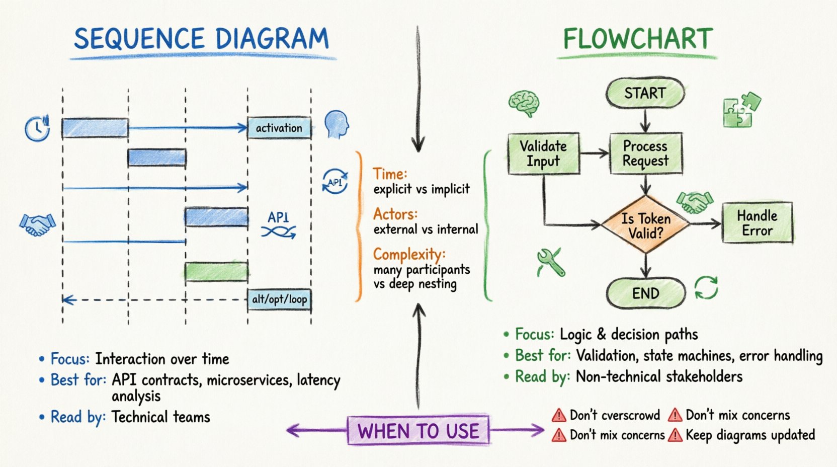
Understanding the Sequence Diagram 📊
A Sequence Diagram focuses on interaction over time. It visualizes how objects or system components communicate with one another to achieve a specific goal. In the context of API design, this is often the primary tool for mapping request-response cycles. ⏱️
Core Components of a Sequence Diagram
- Lifelines: Vertical dashed lines representing participants. These could be a client application, the API gateway, a database, or an external service.
- Messages: Horizontal arrows indicating data transfer. Solid arrows typically denote synchronous calls, while dashed arrows represent return values or asynchronous responses.
- Activation Bars: Rectangular boxes on lifelines showing when a participant is actively processing a request.
- Combined Fragments: Boxes labeled with keywords like alt (alternative), opt (optional), or loop to show conditional logic or repeated actions.
Why Use Sequence Diagrams for APIs?
APIs are fundamentally about interaction. A client sends a request, and the server processes it to return a response. The Sequence Diagram excels here because it highlights:
- Timing: The order in which events occur. Did the authentication happen before the data retrieval? Was the logging done in parallel?
- State Changes: How the internal state of the service shifts between requests.
- Error Handling: Where exceptions bubble up. You can map out what happens if the database is unreachable during a specific step.
- Third-Party Dependencies: How external calls fit into the main flow.
When designing a RESTful endpoint, for instance, a Sequence Diagram clarifies the HTTP verbs used. It shows exactly where the POST request hits the gateway, how it traverses the middleware stack, and where the final 201 Created status code originates. 🚀
Understanding the Flowchart 🔄
A Flowchart focuses on logic and decision-making. It maps the flow of control through a process. Unlike the Sequence Diagram, which emphasizes time and interaction, the Flowchart emphasizes the path taken based on conditions. 🧭
Core Components of a Flowchart
- Start/End Nodes: Ovals indicating the entry and exit points of the process.
- Process Steps: Rectangles representing specific actions or tasks.
- Decision Points: Diamonds indicating a branch in the logic (e.g., Yes/No, Success/Fail).
- Connectors: Arrows showing the direction of flow between steps.
Why Use Flowcharts for APIs?
While Sequence Diagrams show who talks to whom, Flowcharts show what happens inside the logic. They are ideal for:
- Business Logic: Complex validation rules that determine if an API call should proceed.
- Data Transformation: Steps involved in parsing, validating, and enriching incoming payloads.
- State Machines: Workflows that move an entity through different statuses (e.g., Pending → Approved → Shipped).
- Error Recovery: Detailed logic for retry mechanisms or fallback strategies.
Consider a payment processing API. A Flowchart can detail the validation of card details, the check for sufficient funds, the authorization with the bank, and the update of the ledger. It answers: “If the bank rejects the card, what is the next step?”
Key Differences at a Glance 📊
Choosing between these two tools can be difficult if their purposes are blurred. The table below highlights the structural and functional distinctions.
| Feature | Sequence Diagram | Flowchart |
|---|---|---|
| Primary Focus | Interaction over time | Logic and flow control |
| Key Actors | External systems, clients, services | Internal processes, functions, decisions |
| Time Dimension | Explicit (Top to bottom) | Implicit (Flow direction) |
| Best For | API Contracts, Message Passing | Algorithm Logic, Business Rules |
| Complexity | High (Many participants) | Medium (Deep nesting) |
| Readability | Good for technical teams | Good for non-technical stakeholders |
When to Use Sequence Diagrams for API Design 🛠️
There are specific scenarios where the Sequence Diagram is the superior choice. Using the right tool for the right job reduces cognitive load during code reviews and architectural planning.
1. Defining API Contracts 📝
When establishing the contract between a client and a server, a Sequence Diagram is indispensable. It documents the expected request headers, body structure, and response codes. This acts as a single source of truth for integration testing.
- Authentication Flow: Show where the token is validated. Is it in the header? Does it pass through an OAuth provider?
- Rate Limiting: Indicate where the rate limiter intercepts the request before it hits the core logic.
- Versioning: Visualize how version headers are parsed and routed to different handlers.
2. Microservices Communication 🌐
In a distributed system, services talk to each other. A Sequence Diagram clarifies the synchronous vs. asynchronous nature of these calls.
- Synchronous: Service A waits for Service B. Use solid arrows.
- Asynchronous: Service A sends a message and continues. Use dashed arrows or message queues.
This distinction is vital for understanding latency and potential bottlenecks in the architecture.
3. Identifying Latency Points ⚡
Because Sequence Diagrams map time vertically, you can visually estimate where delays occur. If a database call sits deep in the chain, it becomes obvious that this step impacts the total response time. This helps in optimizing critical paths.
When to Use Flowcharts for API Design 🧠
Flowcharts shine when the internal mechanics of the API are more important than the external communication.
1. Complex Validation Logic 🔍
If your API requires intricate data validation, a Sequence Diagram can become cluttered. A Flowchart isolates the logic tree.
- Input Sanitization: Check for nulls, check for types, check for length.
- Permission Checks: Does the user have Role A or Role B? What if neither?
- Conditional Enrichment: Should we fetch related data based on the user’s tier?
2. State Management and Workflows 🔄
For APIs that manage resources with states (e.g., Orders, Tickets, Subscriptions), the lifecycle is best represented as a flow.
- Transitions: From Draft to Published.
- Triggers: What event causes the transition?
- Constraints: Can we skip the review step?
3. Error Handling Strategies 🛡️
Robust APIs handle errors gracefully. A Flowchart allows you to map out every failure point and its corresponding recovery path.
- Retry Logic: If the network fails, do we retry 3 times?
- Circuit Breakers: When do we stop calling the downstream service?
- Logging: At what point do we record the error for auditing?
Bridging the Gap: A Hybrid Approach 🤝
In practice, professional architecture rarely relies on just one. The most effective documentation strategy often involves a hybrid approach. You might use a Sequence Diagram to show the high-level request flow and a Flowchart to detail the internal processing of a specific endpoint.
Best Practices for Combined Documentation
- Link Diagrams: Embed a reference to the Flowchart within the Sequence Diagram description. For example, “The Validation Step (see Flowchart A) checks…”
- Consistent Naming: Ensure that terms like “Authentication Service” mean the same thing in both diagrams.
- Layered Detail: Keep the Sequence Diagram at a high level. Keep the Flowchart at a granular level.
Common Pitfalls to Avoid 🚫
Even with the right tool, poor execution can lead to confusion. Here are common mistakes to watch out for when documenting API design.
1. Overcrowding the Sequence Diagram
Attempting to map every single internal function call in a Sequence Diagram makes it unreadable. It turns into a spaghetti chart. Instead, abstract internal logic into a single block or reference a Flowchart.
2. Ignoring Asynchronous Events
Many modern APIs rely on webhooks or background jobs. If your Sequence Diagram only shows the initial request, it is incomplete. Include the callback or the background task initiation to provide a full picture.
3. Mixing Logic and Interaction
Do not try to force a Flowchart to show HTTP requests. Conversely, do not try to show complex algorithmic branching in a Sequence Diagram. Keep the concerns separated for clarity.
4. Outdated Diagrams
Documentation decays quickly. If the API changes but the diagram remains static, it becomes a liability. Treat diagrams as code: version them, review them in pull requests, and update them alongside the implementation.
Impact on Development Workflow 🚀
Choosing the right visualization tool impacts the speed and quality of the development workflow.
For Developers
Developers benefit from Sequence Diagrams when integrating new clients. They need to know the exact message sequence to avoid connection timeouts or protocol errors. Flowcharts help when debugging complex logic bugs without needing to trace through every line of code.
For Product Managers
Product Managers often prefer Flowcharts. They focus on the business logic: “If the user pays, does the order ship?” They may find the technical nuances of a Sequence Diagram too dense. Providing a Flowchart ensures alignment on feature scope.
For QA Engineers
QA teams need both. Sequence Diagrams help design integration tests that simulate real-world user journeys. Flowcharts help design unit tests that cover every decision branch and edge case.
SEO and Searchability Considerations 📈
While diagrams are visual assets, their text labels and alt tags contribute to the searchability of your internal documentation. Use keywords relevant to your API design process.
- Use Descriptive Labels: Instead of “Step 1,” use “Validate User Token”.
- Consistent Terminology: Use industry-standard terms like Request Payload, Response Code, and Callback URL.
- Metadata: Tag diagrams with the API version and endpoint path for easy retrieval later.
Maintaining Diagram Hygiene 🧹
Documentation is an ongoing process, not a one-time task. Here is how to keep your visual assets accurate.
- Automated Generation: Where possible, generate diagrams from code annotations or OpenAPI specifications. This reduces manual drift.
- Regular Reviews: Include diagram updates in your sprint definition of done.
- Version Control: Store diagram files in the same repository as the source code. This ensures that when code is rolled back, the documentation matches.
Final Thoughts on Visualization 🎯
Selecting between a Sequence Diagram and a Flowchart is not about which one is better. It is about which one serves the specific communication need at hand. Sequence Diagrams excel at mapping the external interactions and timing of API requests. Flowcharts excel at mapping the internal logic and decision paths.
By understanding the strengths of each, you can create a documentation strategy that reduces ambiguity, accelerates onboarding, and minimizes errors. The goal is clarity. Whether you choose the vertical timeline of a Sequence Diagram or the branching logic of a Flowchart, the result should be a system that is easier to build, easier to test, and easier to maintain. 🛠️