
Understanding how data travels through a distributed system is critical for maintaining stability and performance. When multiple backend services interact, the complexity grows exponentially. A sequence diagram walkthrough provides the clarity needed to visualize these interactions without getting lost in code implementation details. This guide focuses on mapping data flow across multiple backend services, ensuring every request, response, and error state is accounted for.
Whether you are designing a new microservices architecture or auditing an existing one, visualizing the chronological order of interactions is essential. This document breaks down the mechanics of these diagrams, the specific elements required for backend service mapping, and the best practices for maintaining accurate documentation.
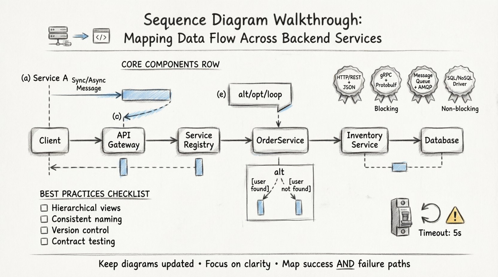
🧩 Core Components of Backend Service Diagrams
Before diving into the walkthrough, it is necessary to understand the building blocks used to represent data flow. A standard sequence diagram relies on specific symbols to denote actions and relationships between services.
- Lifelines: Vertical dashed lines representing the existence of a participant (user, client, or service) over time. Each backend service gets its own lifeline.
- Messages: Horizontal arrows indicating communication. These can be synchronous (blocking) or asynchronous (non-blocking).
- Activation Bars: Rectangular boxes on a lifeline showing when a service is actively processing a request.
- Return Messages: Dashed arrows indicating the return of data or status to the caller.
- Combined Fragments: Boxes labeled with keywords like alt (alternative), opt (optional), or loop to handle logic variations.
When mapping data flow, precision in these components prevents ambiguity. A single mislabeled arrow can lead to significant misunderstandings regarding system latency or state management.
🔄 Step-by-Step Walkthrough: Mapping the Flow
The following section details how to construct a sequence diagram for a typical multi-service transaction. We will trace a single user request from initiation through to the final response.
1. Defining the Initiator and Entry Point
Every interaction begins with an initiator. In backend architectures, this is often an API Gateway or a Load Balancer. The gateway acts as the single entry point, routing traffic to the appropriate internal service.
- Identify the Trigger: Is this an HTTP request, a message queue event, or a scheduled cron job?
- Draw the First Lifeline: Place the client or gateway on the far left.
- Draw the First Message: Represent the incoming request arrow pointing to the first service.
2. Service Discovery and Routing
Once the request hits the entry point, it must be routed to the correct backend. This often involves a lookup process.
- Service Registry Call: The gateway may query a registry to find the instance of the target service.
- Load Balancing Logic: If multiple instances exist, the gateway selects one based on round-robin or least-connection algorithms.
3. The Primary Service Interaction
The request now reaches the primary service responsible for the business logic. This service often needs to coordinate with others.
- Business Logic Execution: The service processes the input parameters.
- Internal Dependencies: Does this service need data from a database? Does it need to trigger another service?
- Activation Bar: Extend the activation bar on this service’s lifeline to cover the duration of this processing.
4. Inter-Service Communication
This is the most complex part of the diagram. In a distributed system, services rarely operate in isolation.
- Synchronous Calls: Use solid arrows for direct API calls where the caller waits for a response.
- Asynchronous Calls: Use open arrows for fire-and-forget messages, such as sending an email notification after a purchase.
- Data Payloads: Ensure the message labels describe the data being transferred (e.g.,
GET /users/123orPOST /orders).
📊 Data Flow Mapping Table
To ensure clarity, use a structured approach to document the data types and protocols used at each step. The table below outlines common interaction patterns.
| Interaction Type | Protocol | Blocking? | Use Case |
|---|---|---|---|
| HTTP REST | HTTPS/JSON | Yes | Direct user-facing API calls |
| gRPC | Protobuf | Yes | High-performance internal microservices |
| Message Queue | AMQP/MQTT | No | Background processing, notifications |
| Database Query | SQL/NoSQL Driver | Yes | Persisting or retrieving state |
⚠️ Handling Complex Scenarios
Real-world systems rarely follow a straight line. Exceptions, retries, and conditional logic must be represented clearly to avoid confusion during troubleshooting.
1. Alternative Paths (Alt)
Use the alt combined fragment to show different outcomes based on conditions.
- Condition 1: If the user exists, proceed to profile data retrieval.
- Condition 2: If the user does not exist, trigger an error response.
Label each frame clearly with the condition (e.g., [user found] vs [user not found]).
2. Loops (Loop)
When a service iterates over a collection, do not draw every single arrow. Use the loop fragment.
- Iteration Count: Note the expected range (e.g.,
[for each item in list]). - State Changes: Show how the state updates with each iteration if necessary.
3. Optional Steps (Opt)
Some services might run in a feature flag or optional mode. Use the opt fragment for steps that are not always executed.
- Logging: Debug logging might be enabled only in staging environments.
- Caching: Cache hits skip the database query.
4. Time Constraints
Latency is a critical factor in backend services. You can annotate messages with time constraints to indicate expected performance thresholds.
- Timeouts: Mark messages with
[timeout: 5s]if the system should fail over after a certain period. - Max Duration: Indicate the maximum allowable time for a specific transaction.
🛡️ Error Handling and Resilience
A complete sequence diagram walkthrough must include failure scenarios. Systems that only map success paths will fail when reality deviates from expectations.
- Network Failures: Show what happens when a service is unreachable. Does the caller retry? Does it return a 503?
- Validation Errors: If data is malformed, the receiving service must return a 400 error with a specific message.
- Idempotency: If a request is retried, ensure the diagram reflects that the action is not duplicated. Use notes to indicate idempotency keys.
- Circuit Breakers: If a downstream service is down, show the circuit breaker opening to prevent cascading failures.
Mapping these paths helps development teams build robust error handling logic. It ensures that every try-catch block has a corresponding visual representation in the design phase.
🔍 Common Pitfalls in Data Flow Mapping
Avoiding mistakes is just as important as drawing the correct lines. The table below highlights frequent errors and their solutions.
| Pitfall | Impact | Solution |
|---|---|---|
| Missing Return Messages | Confusion about data availability | Always draw dashed return arrows for every request. |
| Overlapping Lifelines | Difficulty reading message flow | Ensure lifelines are parallel and do not cross unnecessarily. |
| Ambiguous Message Labels | Unclear data payload | Specify method and endpoint (e.g., PUT /api/v1/resource). |
| Ignoring Time | Performance bottlenecks hidden | Annotate critical paths with latency expectations. |
| Too Much Detail | Diagram becomes unreadable | Abstract internal logic; focus on inter-service communication. |
🚀 Best Practices for Scalability
As your system grows, your diagrams must evolve. A diagram that works for a monolith will not suffice for a microservices architecture. Here are strategies to maintain clarity at scale.
1. Hierarchical Diagrams
Do not attempt to map every service in a single view. Use a layered approach.
- Level 1: High-level user journey across major domains.
- Level 2: Detailed breakdown of specific domain interactions.
- Level 3: Internal logic within a single service (if needed).
This hierarchy keeps the primary diagram clean while allowing deep dives where necessary.
2. Standardize Naming Conventions
Consistency is key for maintainability. Establish a team-wide standard for how services and messages are named.
- Service Names: Use domain-driven naming (e.g.,
OrderService,InventoryService) rather than technical names (e.g.,App1,App2). - Message Names: Use verb-noun pairs (e.g.,
CreateOrder,UpdateInventory). - Data Formats: Clearly label JSON structures or Protobuf messages.
3. Version Control
Sequence diagrams are living documents. Treat them like code.
- Review Process: Require diagram updates during pull requests for significant architectural changes.
- History: Maintain versioning to track how data flow has evolved over time.
- Documentation Linkage: Link the diagram directly to the API documentation or architecture decision records.
🧪 Testing the Flow
Once the diagram is complete, validate it against the actual system behavior. A diagram is only useful if it matches reality.
- Contract Testing: Use tools to verify that API contracts match the defined messages in the diagram.
- Chaos Engineering: Intentionally fail services to see if the actual flow matches the error paths in the diagram.
- Performance Profiling: Measure actual latency against the annotated time constraints in your walkthrough.
If the diagram diverges from reality, update the diagram immediately. Outdated documentation is more dangerous than no documentation.
🧠 Advanced Considerations
For complex distributed systems, additional factors come into play that affect how you map data flow.
1. State Management
Services often need to maintain state. In a stateless architecture, the client sends all necessary context. In a stateful architecture, the service stores context.
- Session Tokens: Show the exchange of tokens between the client and services.
- Database Writes: Indicate where state is persisted (e.g.,
Write to DB).
2. Eventual Consistency
In many microservices setups, data is not immediately consistent across all services.
- Event Publishing: Show services publishing events to a stream.
- Event Consumption: Show other services subscribing to those events to update their own state.
- Consistency Lag: Annotate where data might be stale for a short period.
3. Security Context
Security is not an afterthought. It must be part of the data flow.
- Authentication: Show the initial token exchange or OAuth flow.
- Authorization: Indicate where permissions are checked within the service chain.
- Encryption: Note where data is encrypted in transit (TLS) or at rest.
🛠️ Implementation Checklist
Before finalizing your sequence diagram walkthrough, run through this checklist to ensure completeness.
- ☐ All backend services have distinct lifelines.
- ☐ Every request has a corresponding return message.
- ☐ Error paths are defined for critical failure points.
- ☐ Message labels include HTTP methods and endpoints.
- ☐ Combined fragments (alt/opt/loop) are properly labeled.
- ☐ Time constraints are noted for performance-critical paths.
- ☐ The diagram aligns with current production architecture.
- ☐ Naming conventions are consistent across the entire diagram.
- ☐ Security checkpoints (authn/authz) are visible.
- ☐ The diagram is stored in a version-controlled repository.
📈 Maintaining the Documentation
A diagram is not a one-time task. It requires maintenance as the system evolves.
- Refactoring: If you refactor code that changes the API, update the diagram.
- Onboarding: Use the diagram as a primary tool for training new engineers.
- Incident Response: Refer to the diagram during troubleshooting to identify the point of failure.
By treating the sequence diagram as a core artifact of your architecture, you ensure that the data flow remains transparent and manageable. This transparency reduces the cognitive load on your team and accelerates the development lifecycle.
🎯 Final Thoughts
Mapping data flow across multiple backend services requires discipline and attention to detail. By following a structured walkthrough, you create a blueprint that guides development, testing, and operations. The goal is not just to draw arrows, but to understand the flow of information and state.
Focus on accuracy, keep the diagrams up to date, and prioritize clarity over complexity. A clear sequence diagram is a powerful tool for maintaining system integrity and team alignment.