
Designing software is often described as translating requirements into logic. However, the translation process frequently encounters friction when moving from abstract theory to concrete implementation. This friction often stems from a lack of shared understanding regarding how different parts of a system interact over time. A sequence diagram serves as a critical bridge in this process, visualizing the dynamic behavior of a system. Unlike static models that show structure, this type of diagram captures the flow of messages between objects within a specific timeframe. This guide provides a detailed examination of how to construct these diagrams effectively, focusing on clarity, accuracy, and practical utility.
Understanding the Purpose of Interaction Modeling 🧠
Before drawing a single line, it is essential to understand why this modeling technique is necessary. Software systems consist of multiple components that must coordinate to fulfill a user request. These components might be separate classes, microservices, or external APIs. Without a visual representation of their interaction, developers often rely on verbal descriptions or text-based specifications, which are prone to misinterpretation.
The primary value of a sequence diagram lies in its ability to depict time as a vertical axis. This orientation allows stakeholders to see the chronological order of events. When a request is initiated, the diagram shows the exact path it takes through the system. It reveals where delays occur, where data is transformed, and where potential bottlenecks might exist. It is not merely a drawing exercise; it is a cognitive tool for debugging logic before writing code.
Key objectives include:
- Clarifying Logic: Ensuring all team members understand the order of operations.
- Identifying Gaps: Spotting missing error handling or unaccounted states.
- Communication: Providing a visual reference during code reviews and planning meetings.
- Validation: Checking if the design matches the initial requirements.
Core Components and Structural Elements 🔍
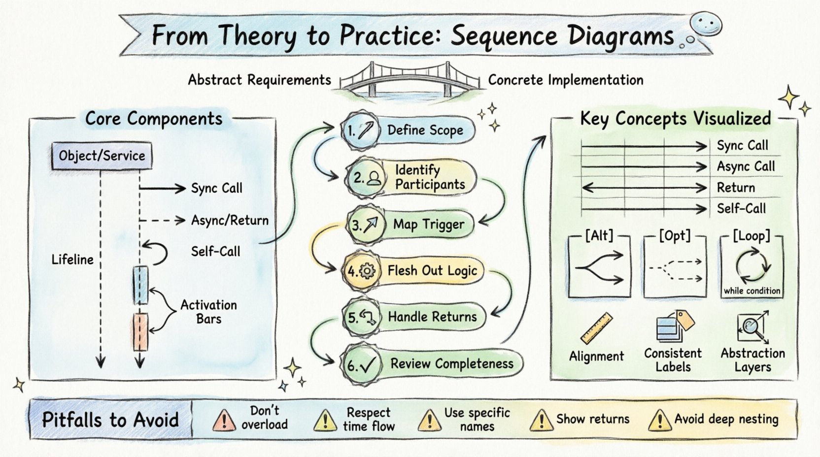
Constructing a functional diagram requires familiarity with its fundamental building blocks. These elements form the grammar of the visual language. Misusing them leads to confusion. Each component has a specific meaning that must be adhered to strictly.
Participants and Lifelines
Participants represent the objects or systems involved in the interaction. In the context of object-oriented design, these are instances of classes. In a service-oriented architecture, they might be API endpoints or database servers. Each participant is represented by a rectangle at the top of the diagram. Extending downwards from this rectangle is a vertical dashed line known as the lifeline.
The lifeline signifies the existence of the object over time. It does not necessarily represent the lifetime of the object in the database, but rather its active participation in the specific scenario being modeled. If an object is not involved in a particular interaction flow, it should not appear on the diagram. This keeps the visualization focused and reduces cognitive load.
Messages and Interactions
Messages are the arrows connecting lifelines. They represent the transfer of data or the invocation of a method. The style of the arrow indicates the nature of the interaction. Solid arrows typically denote synchronous calls, where the sender waits for a response. Dashed arrows often represent return messages or asynchronous notifications.
When drawing messages, precision is key. The label on the arrow should describe the action, not just the data. For example, “GetUser” is better than “User Object”. This focuses the reader on the behavior rather than the data structure.
Activation Bars
An activation bar is a thin rectangle placed on top of a lifeline. It indicates the period during which the object is actively performing an operation. If an object receives a message and immediately processes it, the activation bar begins. If it then sends another message to a third party, the bar continues. This visual cue helps identify who is doing the work at any given moment.
Step-by-Step Construction Workflow 🛠️
Creating a diagram from scratch can be overwhelming without a structured approach. Following a consistent workflow ensures that no critical details are missed. This process moves from high-level abstraction to specific interaction details.
Step 1: Define the Scenario Scope
Start by identifying the specific user story or use case you are modeling. A sequence diagram should not attempt to show every possible function of a system. It should focus on a single flow, such as “User Logs In” or “Order Is Placed”. Defining the start and end points is crucial. The start is usually triggered by an external actor, and the end is the return of a response or a completed state.
Step 2: Identify the Participants
List all the objects or systems required to complete the scenario. Start with the actor triggering the event. Then, identify the immediate system components that handle the request. Finally, include any external dependencies, such as third-party services or storage systems. Do not include components that are not directly involved in this specific flow.
Step 3: Map the Initial Trigger
Draw the first message from the actor to the system. This is the entry point of the interaction. Ensure this message represents the actual user action, such as clicking a button or submitting a form. This sets the context for the rest of the diagram.
Step 4: Flesh Out the Internal Logic
Once the system receives the trigger, trace the path of data through the internal components. Determine which methods are called and in what order. Ask questions like, “Does this component need to validate data before proceeding?” or “Does it need to fetch information from another service?” Draw these messages sequentially from top to bottom.
Step 5: Handle Return Values
Ensure that every action that produces a result has a corresponding return path. While some diagrams omit return messages to reduce clutter, including them adds clarity to the flow. Use dashed lines for these returns. They indicate that the caller is waiting for a response.
Step 6: Review for Completeness
Walk through the diagram as if you were executing the code. Does every path lead to a logical conclusion? Are there any dangling arrows? Does the timing make sense? This review step is often where the most value is found, as it reveals logical inconsistencies in the design.
Managing Message Flows and Timing ⏱️
Not all messages are created equal. Understanding the distinction between different types of interactions is vital for accurate modeling. The following table outlines the common message types and their meanings.
| Message Type | Visual Representation | Behavior Description | Use Case |
|---|---|---|---|
| Synchronous Call | Solid line, filled arrowhead | Caller waits for the receiver to finish and return. | Calculating a result, saving data. |
| Asynchronous Call | Dashed line, open arrowhead | Caller sends the message and continues without waiting. | Notifications, background tasks. |
| Return Message | Dashed line, open arrowhead | Response sent back to the original caller. | Returning a value, status confirmation. |
| Self-Call | Arrow looping back to the same lifeline | An object calls a method on itself. | Internal state updates, helper methods. |
Timing is another critical factor. While sequence diagrams do not measure exact seconds, they imply causality. A message sent at the top of the diagram must occur before a message sent lower down. If two messages originate from the same point in time, they are parallel. This parallelism can indicate independent processes that do not depend on each other.
Control Structures and Logical Branching 🔄
Real-world systems are rarely linear. They involve conditions, loops, and optional steps. Sequence diagrams have specific notations to represent these control structures. Using these correctly prevents the diagram from becoming a confusing web of lines.
Alt and Opt Frames
These frames represent conditional logic. An Alt (Alternative) frame indicates that different paths can occur based on a condition. For example, if a user is logged in, one path is taken; if not, another is taken. These paths are mutually exclusive. An Opt (Optional) frame indicates a step that may or may not happen. It is used for non-critical flows.
When drawing these frames, clearly label the condition. Place the condition in brackets at the top of the frame. This ensures that anyone reading the diagram understands the logic governing the branching.
Loop Frames
When a process repeats, a loop frame is used. This is common when iterating over a collection of items. For instance, if a system processes a list of orders, a loop frame indicates that the processing logic repeats for each item. The condition for the loop should be specified, such as “While items exist”.
It is important to note that a loop does not mean the entire diagram repeats indefinitely. It usually refers to a specific sub-section of the interaction. Avoid drawing infinite loops, as they imply a system error rather than a designed behavior.
Design Principles for Readability and Clarity 🎨
A diagram that is hard to read defeats its purpose. Clarity is more important than completeness. If a stakeholder cannot understand the diagram in five minutes, the design needs refinement. Adhering to specific design principles helps maintain this clarity.
Consistent Alignment
Keep lifelines aligned vertically. Messages should not cross each other unnecessarily. If messages cross, it creates visual noise. Try to reorder the participants if possible to minimize crossing lines. If crossing is unavoidable, ensure the arrows are distinct and do not overlap.
Labeling Conventions
Use consistent naming for participants and messages. If you call a method “GetUser” in one place, do not call it “RetrieveUser” in another. Consistency reduces the cognitive effort required to map the diagram to the codebase. Keep labels concise. If a label is too long, it forces the diagram to expand horizontally, which can break the layout.
Abstraction Levels
Do not include every single method call. Focus on the high-level interactions. If a method calls five internal helper methods, represent that as a single block of processing. This keeps the diagram at the appropriate level of abstraction for the intended audience. Technical implementation details belong in the code, not the design diagram.
Common Pitfalls and How to Avoid Them 🚫
Even experienced practitioners make mistakes when creating these diagrams. Being aware of common errors can save time and prevent confusion.
- Overloading the Diagram: Trying to show every possible error case and success case in one diagram. Instead, create separate diagrams for the happy path and the error path.
- Ignoring Time: Drawing messages that happen in parallel but drawing them sequentially. If two messages happen at the same time, they should start at the same vertical level.
- Vague Participants: Using generic names like “System” or “Object”. Use specific names like “AuthenticationService” or “OrderRepository” to provide context.
- Missing Return Paths: Forgetting to show the return message can make the flow feel incomplete. It implies the system hangs or the user waits indefinitely.
- Complex Nesting: Nesting too many Alt or Loop frames inside each other. This creates a deep hierarchy that is hard to follow. Flatten the logic where possible.
Integrating Diagrams into the Development Lifecycle 🔄
Sequence diagrams are not static artifacts. They should evolve alongside the software. During the planning phase, they help define the architecture. During development, they serve as a reference for implementation. During testing, they verify that the actual behavior matches the design.
It is common for diagrams to become outdated as code changes. To mitigate this, treat them as living documents. If a major feature is added, update the diagram. If a flow is deprecated, remove it. Automated tools can sometimes keep diagrams in sync with code, but manual review is often necessary to ensure the logic remains sound.
Troubleshooting Ambiguity
Sometimes, a diagram will feel ambiguous. A reader might ask, “What happens if this service fails?” or “Is this step required?” If you encounter this, add a note or a separate diagram to clarify. Do not try to force complex logic into a single linear flow. Splitting the diagram into “Happy Path” and “Exception Path” is often the most effective way to resolve ambiguity.
Another source of ambiguity is the lack of context. Ensure the diagram includes a title and a brief description of the scenario. This helps new team members understand what part of the system is being discussed without needing to ask questions.
Final Considerations for Implementation
When you move from the diagram to the code, the diagram acts as a contract. If the code deviates significantly from the diagram, it signals a need for documentation updates. The goal is not perfection, but alignment. A good diagram reduces the time spent explaining the system. It serves as a shared mental model for the entire team.
Focus on the flow of information. Ask yourself what data is being passed and what transformations are occurring. If you can explain the diagram to a non-technical stakeholder, you have achieved the right level of abstraction. If they are confused by the technical details, simplify the model. The diagram should serve the communication, not the other way around.
By following these guidelines, you can create sequence diagrams that are not just drawings, but functional tools for building robust software. They turn abstract requirements into concrete visual plans, reducing the risk of errors and improving the quality of the final product.