
In the architecture of complex software systems, clarity is currency. When engineers discuss how data moves between components, words often fail to capture the nuance of timing, state, and responsibility. This is where visual modeling becomes essential. Specifically, the communication diagram offers a unique perspective on system behavior, focusing on the relationships between objects rather than the strict timeline found in other models.
This guide provides a deep dive into creating and reading communication diagrams. We will explore the structural elements, the logic behind message numbering, and how this specific diagram type fits into the broader context of Unified Modeling Language (UML). Whether you are refining a legacy system or designing a new microservice architecture, understanding this visualization technique improves collaboration and reduces ambiguity.
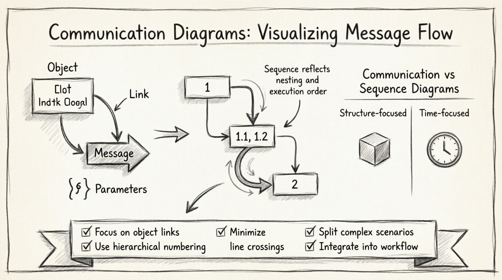
Understanding the Core Components 🛠️
A communication diagram is a type of interaction diagram. While it shares the goal of showing interactions with a sequence diagram, its visual layout emphasizes the structural links between objects. To build an effective diagram, you must understand the building blocks. Each element serves a specific purpose in defining the flow of control and data.
- Objects: These represent instances of classes or roles within the system. They are the active participants. An object is typically drawn as a rectangle with the object name at the top and the class name below, separated by a horizontal line.
- Lifelines: In communication diagrams, the concept of a lifeline is implied by the object’s presence. However, unlike sequence diagrams, there are no vertical time bars. The focus remains on the static connections.
- Links: These are the lines connecting objects. They represent the associations or relationships that allow objects to communicate. A link signifies that one object holds a reference to another.
- Messages: These are the arrows indicating the flow of information. A message represents a method call, a signal, or an event. It travels along the link from a sender to a receiver.
- Parameters: Data passed between objects is often shown within parentheses next to the message label. This clarifies what information is being transferred.
- Return Values: These are often shown as dashed arrows or simply noted in the text to indicate the response from the receiver back to the sender.
Visualizing these components correctly ensures that the diagram remains readable. Overcrowding the diagram with too many objects can obscure the actual logic. It is better to focus on the specific scenario you are modeling rather than trying to capture every possible interaction in a single view.
Message Flow and Numbering Systems 🔢
One of the most critical aspects of a communication diagram is the numbering system. Because the diagram does not rely on vertical position to denote time (as a sequence diagram does), the order of messages must be explicit. This is achieved through a hierarchical numbering scheme.
The primary messages are numbered sequentially (1, 2, 3). Subsequent messages triggered by a primary message are numbered with decimals (1.1, 1.2). This structure creates a clear dependency map.
| Number | Meaning | Example Scenario |
|---|---|---|
| 1 | First message in the sequence | User requests login |
| 1.1 | Message triggered by message 1 | Controller validates credentials |
| 1.2 | Another message triggered by message 1 | Controller logs the attempt |
| 2 | Parallel or subsequent top-level message | User requests profile update |
This system allows readers to reconstruct the timeline mentally. If you see 3.1, you know it cannot happen until message 3 has completed. This is crucial for understanding synchronous calls versus asynchronous signals.
When labeling messages, be precise. Use active verbs. Instead of “Send Data,” use “Transmit Packet.” Instead of “Check Status,” use “Verify Availability.” Clarity in naming prevents confusion during code implementation.
Communication Diagrams vs. Sequence Diagrams ⚖️
It is common to confuse communication diagrams with sequence diagrams. Both depict interactions, but they serve different cognitive purposes. Choosing the right one depends on what information you need to convey to your audience.
- Sequence Diagram Focus: Emphasizes time. The vertical axis represents the progression of time. It is excellent for showing concurrency, activation bars, and exact timing of events.
- Communication Diagram Focus: Emphasizes structure. The spatial layout shows which objects are connected. It is better for understanding the topology of the system and how many objects participate in a flow.
Consider the following comparison when deciding which to use:
| Feature | Communication Diagram | Sequence Diagram |
|---|---|---|
| Primary Focus | Object Relationships | Time Sequence |
| Layout | Flexible, spatial | Vertical, linear |
| Complexity | Can become tangled with many objects | Better for complex timing |
| Readability | Good for high-level flows | Good for detailed logic |
If you are explaining the architecture to a new developer, a communication diagram might be more intuitive because it shows the network of connections. If you are debugging a race condition, a sequence diagram is likely superior.
Step-by-Step Construction Guide 📝
Creating a high-quality diagram requires a methodical approach. Rushing into drawing leads to cluttered visuals that are difficult to maintain. Follow this structured process to ensure your diagrams are robust and useful.
- Define the Scenario: Start with a specific use case. Do not attempt to diagram the entire system at once. Pick one user journey, such as “Place Order” or “Generate Report.”
- Identify Participants: List the objects involved. These are the classes that hold state or perform actions. Keep the list minimal to avoid noise.
- Draw the Links: Before drawing messages, establish the connections. Draw lines between objects that have a direct association. This sets the stage for where messages can travel.
- Order the Messages: Determine the logical sequence. Start with the initiating object. Trace the path of the request through the system.
- Apply Numbering: Assign the hierarchical numbers. Ensure that sub-messages (like 1.1) are clearly linked to their parent (1).
- Label Parameters: Add data details to the arrows. This helps developers understand the contract between methods.
- Review for Clarity: Look at the diagram from a distance. Do the lines cross unnecessarily? Can you trace the path without getting lost? Adjust the layout to reduce line crossings.
This iterative process ensures that the final artifact is a tool for communication, not just a record of what happened.
Layout Strategies for Clarity 🎨
The physical arrangement of objects on the page significantly impacts readability. Unlike sequence diagrams, where objects are arranged in a column, communication diagrams allow for spatial freedom. However, this freedom can lead to chaos if not managed.
- Centralization: Place the initiating object in the center. This allows messages to radiate outward, making the flow intuitive.
- Grouping: Cluster related objects together. If three objects frequently interact, place them in a tight group. This visually suggests a subsystem or module.
- Minimize Crossings: Try to arrange objects so that arrows do not cross each other. Crossing lines create visual noise and make it hard to follow the path.
- Consistent Spacing: Maintain uniform distances between objects. This creates a sense of order and makes the diagram look professional.
- Directional Flow: Where possible, arrange objects so that messages generally flow from left to right or top to bottom. This aligns with natural reading patterns.
Remember that the diagram is a static snapshot of a dynamic process. The layout should support the logic, not hinder it. If you find yourself constantly redrawing lines to fix crossings, reconsider which objects are essential for this specific scenario.
Handling Complex Scenarios: Loops and Alternatives 🔄
Real-world systems rarely follow a straight line. They involve decision points, repeated actions, and conditional logic. Communication diagrams can represent these complexities, though they require careful notation.
Loops: When a message is sent multiple times, such as iterating through a list, use a label on the arrow to indicate the repetition. You might add text like “for each item” near the message. Alternatively, some notations use a loop frame, but simple text labels are often clearer in this context.
Alternatives: If a message can result in different paths, use distinct message numbers or labels to show the branching logic. For example, message 2 might trigger a success path, while message 2.1 triggers an error path. Be explicit about the condition that triggers the alternative.
Recursion: Sometimes an object calls a method on itself. This is represented by a curved arrow originating and ending on the same object. Clearly label this as a recursive call to distinguish it from a call to another object.
Activation: While communication diagrams do not typically use activation bars, you can imply duration by the number of steps involved. If an object waits for a long process, you might add a note indicating the wait time or the blocking nature of the call.
Common Pitfalls to Avoid ⚠️
Even experienced designers make mistakes. Being aware of common errors can save you time during code reviews and refactoring sessions.
- Overcrowding: Trying to show every possible interaction in one diagram makes it unreadable. Split complex scenarios into multiple diagrams. One for “Happy Path,” one for “Error Handling.”
- Ambiguous Links: Do not draw a link between objects that do not have a direct relationship. If Object A needs to talk to Object C, but they are not directly linked, it usually implies an intermediate object (Object B) should be included.
- Inconsistent Numbering: If you skip a number (e.g., 1, 1.2, 1.4), it confuses the reader. Ensure the hierarchy is logical and continuous.
- Ignoring Data Types: When possible, specify the data type in the message label. Passing a “String” is different from passing an “Integer.” This aids in implementation.
- Missing Return Messages: If a method returns a value, show it. Even if the return value is ignored by the caller, it is part of the protocol. Use a dashed line or a distinct label to indicate the return.
By avoiding these traps, you maintain the integrity of the model. A clean diagram is a trusted document. When developers rely on the diagram to write code, it must be accurate.
Integrating Diagrams into the Development Lifecycle 🚀
Creating the diagram is only the first step. The true value lies in integrating it into your workflow. A diagram that sits in a folder is useless. It must be part of the conversation.
Design Reviews: Use the diagram during architecture reviews. Walk through the message flow with the team. Ask questions about the links. Do they match the code? Are there dependencies missing?
Documentation: Embed the diagram in your API documentation or system design documents. It provides a visual anchor for developers reading the technical specs.
Onboarding: Use these diagrams to bring new team members up to speed. They provide a high-level map of how the system behaves without requiring them to read every line of code.
Refactoring: When changing a module, update the diagram. If the flow changes, the diagram must change. Keeping this synchronized ensures the documentation remains a source of truth.
This integration turns the diagram from a static drawing into a living part of the software engineering process. It fosters a shared understanding across the team.
Summary of Key Takeaways ✅
Communication diagrams are a powerful tool for visualizing the structural aspects of message flow. By focusing on object relationships and using a clear numbering system, you can convey complex interactions without the vertical constraints of sequence diagrams.
To succeed with this technique:
- Focus on object links and relationships.
- Use hierarchical numbering (1, 1.1, 1.2) to denote time.
- Keep layouts clean to minimize line crossings.
- Split complex scenarios into multiple diagrams.
- Integrate the diagrams into your documentation and reviews.
Mastering this visualization method improves the precision of your system design. It reduces miscommunication between architects and developers. In a field where ambiguity leads to bugs, clarity is the most valuable asset you can provide.