
Introduction to Evolving System Visualization 📊
Software architecture is undergoing a significant transformation. As systems move away from monolithic structures toward distributed microservices, the tools we use to document and understand these systems must evolve. The sequence diagram, a staple in software engineering for decades, is no longer just a static drawing. It is becoming a dynamic representation of complex interactions.
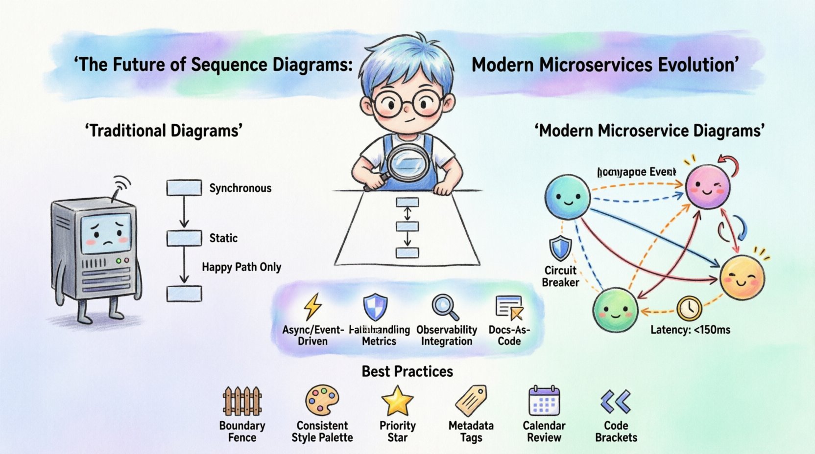
In the past, a sequence diagram was a snapshot. It showed a linear path of communication between two or more components. Today, that linear path is insufficient. Modern distributed systems operate concurrently, asynchronously, and often unpredictably. The format of these diagrams must adapt to reflect the reality of latency, failure, and scale.
This guide explores the technical shifts required in sequence modeling. We examine how asynchronous messaging, event-driven architectures, and observability integrations are reshaping the way engineers visualize system behavior. The goal is not just to draw lines, but to communicate the true nature of the system.
Why Traditional Static Diagrams Fall Short 📉
Traditional sequence diagrams were designed for synchronous, request-response patterns. In a monolithic application, a user action triggers a function, which calls another function, and returns a result. This flow is easy to map on a vertical timeline. However, microservices introduce complexity that breaks this model.
Consider the following limitations of the classic format in a distributed environment:
- Lack of Concurrency: Standard diagrams struggle to show multiple processes happening at the same time without cluttering the visual space.
- Missing Context: A static image cannot convey the volume of traffic or the frequency of specific interactions.
- Static Failure Modes: Diagrams often show the “happy path.” They rarely illustrate what happens when a service is down, slow, or returning incorrect data.
- Decoupled Timing: In a monolith, time is relative. In microservices, network latency and clock synchronization matter significantly.
To address these gaps, the format of the sequence diagram is expanding. It is moving from a purely visual aid to a documentation standard that includes metadata, state changes, and temporal data.
The Rise of Asynchronous Communication ⚡
One of the most significant changes in microservices architecture is the shift from synchronous calls to asynchronous messaging. Services no longer wait for an immediate response. Instead, they publish events and consume messages from queues. This decoupling improves resilience but complicates visualization.
When modeling these interactions, the sequence diagram must represent the flow of events rather than just direct calls.
- Event Sources: Instead of a direct arrow from Service A to Service B, the diagram shows Service A publishing to a broker.
- Consumer Groups: Multiple services might listen to the same event. The diagram needs to show branching paths without losing the origin point.
- Delivery Guarantees: Visual cues are needed to indicate whether the message is fire-and-forget, at-least-once, or exactly-once.
Designers are increasingly using distinct line styles or markers to differentiate between synchronous API calls and asynchronous event streams. This distinction is crucial for understanding where the system waits and where it continues processing immediately.
Visualizing Failure and Retry Logic 🛑
Resilience is a core tenet of modern architecture. Systems must handle partial failures without bringing down the entire workflow. Traditional diagrams often omit failure scenarios to keep the drawing clean. Modern documentation requires these scenarios to be explicit.
Effective sequence diagrams now incorporate patterns for handling errors:
- Retry Loops: Visual representations of exponential backoff strategies show a service attempting a call multiple times before giving up.
- Circuit Breakers: Diagrams can indicate when a service stops sending requests to a failing dependency to prevent cascading failures.
- Fallback Mechanisms: When a primary service fails, the system might switch to a secondary service. This branching logic must be documented.
- Timeouts: Explicit markers showing how long a component waits before timing out help developers understand system responsiveness.
By including these elements, the diagram becomes a blueprint for stability. It answers the question: “What happens when things go wrong?” This is vital for incident response and post-mortem analysis.
Time, Latency, and Performance Metrics ⏱️
In a distributed system, time is not linear. Network hops add milliseconds that accumulate across a request chain. A sequence diagram must reflect the temporal reality of the system. The vertical axis represents time, but the spacing between messages carries meaning.
Modern approaches to diagramming introduce performance metrics directly into the visualization:
- Latency Indicators: Labels on message arrows can specify expected round-trip times.
- Processing Duration: Activation bars (the vertical rectangles on lifelines) can be sized proportionally to the processing time.
- Concurrency Windows: Gaps between messages can represent background processing tasks running in parallel.
This level of detail transforms the diagram from a logic map into a performance map. It helps architects identify bottlenecks before code is written. For example, if a diagram shows a long wait time on a specific database query, the team knows to optimize that interaction early.
Integrating with Observability and Tracing 🔍
Documentation should not exist in a vacuum. Modern sequence diagrams are increasingly integrated with runtime observability. This means the diagrams are not just drawn by hand; they are generated or updated based on actual system traces.
The connection between design and reality is critical for several reasons:
- Validation: Engineers can compare the diagram against actual distributed traces to ensure the system behaves as designed.
- Root Cause Analysis: When an issue occurs, the trace can be overlaid on the diagram to pinpoint exactly where the flow deviated.
- Version Control: Diagrams are stored alongside code in version control systems. Changes in the codebase can trigger updates to the diagram.
This integration reduces the risk of documentation drift. Often, documentation becomes outdated because it is too hard to maintain. By linking diagrams to automated trace data, the documentation stays current without manual intervention.
Collaboration and Documentation as Code 📝
The way teams work together is also changing how diagrams are created. The era of drawing diagrams in isolation and emailing them is over. Collaboration happens in real-time, and diagrams are treated as code.
Key aspects of this shift include:
- Text-Based Definition: Diagrams are defined using text-based languages. This allows them to be reviewed, merged, and versioned like any other code artifact.
- Review Processes: Pull requests include diagram changes. This ensures that architectural decisions are scrutinized before implementation.
- Living Documentation: The diagram is updated continuously. It is not a one-time task at the start of a project.
This approach democratizes architectural understanding. Developers who do not specialize in design can read the text definition and understand the system flow. It removes the barrier of proprietary drawing tools.
Comparison: Traditional vs. Modern Modeling
To clarify the differences between the old standards and the new requirements, consider the following comparison table.
| Feature | Traditional Sequence Diagram | Modern Microservice Diagram |
|---|---|---|
| Communication Style | Synchronous, Request-Response | Asynchronous, Event-Driven, Pub/Sub |
| Failure Handling | Often omitted or simplified | Explicit retries, timeouts, and circuit breakers |
| Time Representation | Abstract vertical axis | Proportional to latency and duration |
| Concurrency | Linear flow | Parallel threads and background jobs |
| Format | Image files (PNG, JPG) | Text-based code, Version Controlled |
| Updates | Manual, periodic | Automated, trace-driven |
| Focus | Happy Path | Happy Path + Failure Scenarios |
Future Trends: Automation and AI 🤖
Looking ahead, the evolution of sequence diagrams will likely be driven by automation. The manual effort required to maintain detailed diagrams is a bottleneck. Artificial intelligence and machine learning are beginning to play a role in this space.
Potential developments include:
- Auto-Generation: Systems analyzing API contracts and code repositories to generate initial diagram structures.
- Smart Suggestions: Tools suggesting missing error handling or concurrency patterns based on industry standards.
- Predictive Modeling: Simulating traffic loads on the diagram to predict performance issues before deployment.
While AI will assist, the human element remains essential. Engineers must validate the logic and ensure the diagram reflects business intent. The tool generates the structure; the engineer defines the meaning.
Best Practices for Modern Sequence Diagrams ✅
To ensure your sequence diagrams remain effective in a microservices environment, follow these guidelines. They focus on clarity, accuracy, and maintainability.
1. Define Boundaries Clearly
Do not try to draw the entire system in one diagram. Use boundaries to define the scope. Show the interaction between specific services and external systems only.
2. Use Consistent Notation
Establish a standard for how you represent different types of interactions. For example, use dashed lines for asynchronous messages and solid lines for synchronous calls. Consistency reduces cognitive load.
3. Prioritize Critical Paths
Focus on the flows that matter most for stability and user experience. Do not clutter the diagram with minor administrative tasks unless they impact the core flow.
4. Include Metadata
Add labels for data types, security protocols, and authentication requirements. This information is often lost in a purely visual representation but is vital for implementation.
5. Review Regularly
Schedule reviews of your diagrams during sprint planning or architectural reviews. Ensure they match the current state of the codebase.
6. Embrace Text-Based Formats
Use text definitions over proprietary image files. This ensures your diagrams can be stored in your existing repository and managed with your existing workflows.
Conclusion on Adaptation 🚀
The sequence diagram is not disappearing. It is maturing. As systems become more distributed and complex, the need for clear, accurate, and dynamic documentation grows. By adapting the format to include asynchronous patterns, failure modes, and performance metrics, engineers can maintain control over their systems.
The shift requires effort. It demands a move away from static images toward living documentation. However, the payoff is a system that is easier to understand, easier to debug, and easier to scale. The future of sequence diagrams lies in their ability to bridge the gap between design intent and runtime reality.
Teams that adopt these modern practices will find themselves better equipped to handle the challenges of distributed architecture. The diagram becomes a shared language, a tool for alignment, and a record of system behavior. This is the path forward for effective system design.