
Modern software architectures rely heavily on the separation of concerns. By breaking applications into smaller, independent units known as services, teams gain flexibility and scalability. However, this architectural style introduces significant complexity when it comes to understanding how data moves between components. When a system fails, the root cause is rarely isolated to a single line of code. It is often a chain reaction across multiple boundaries. To navigate this complexity, developers need a shared language and a visual method for tracing execution paths. This is where interactive thinking combined with sequence diagrams becomes essential.
Debugging distributed systems is not just about reading logs; it is about reconstructing the story of a transaction. A static diagram helps, but an interactive approach allows you to simulate the flow in real-time as you investigate. This guide explores how to leverage sequence diagrams as a primary tool for diagnosing communication issues in microservice environments.
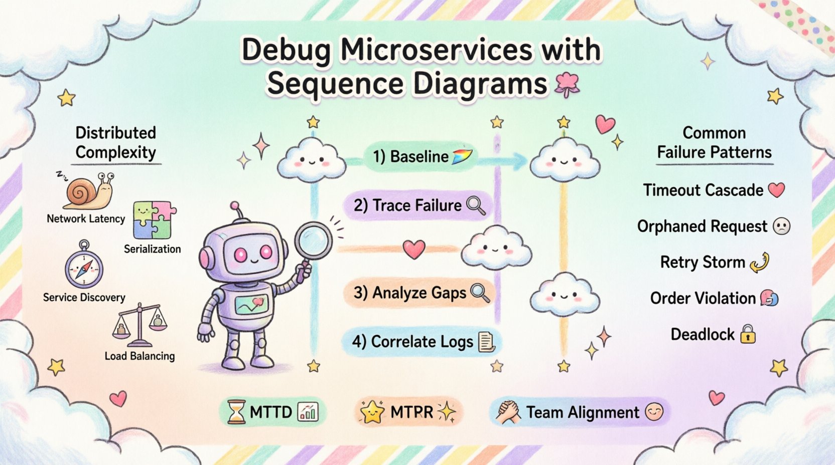
🕸️ The Complexity of Distributed Communication
In a monolithic application, function calls happen within the same process space. The latency is minimal, and the state is shared. In a microservice architecture, services communicate over a network. This shift introduces new variables that must be accounted for during troubleshooting.
When a request enters the system, it traverses several layers:
- Network Latency: Physical distance and packet routing affect speed.
- Serialization: Data must be converted to a transmittable format and back.
- Service Discovery: Finding the correct instance of a service adds overhead.
- Load Balancing: Requests may be routed to different nodes, each with unique states.
- Timeouts and Retries: Network instability triggers automatic recovery mechanisms.
Each of these steps represents a potential point of failure. Without a clear map, identifying where the process breaks is akin to finding a needle in a haystack. A sequence diagram provides that map. It visualizes the chronological order of interactions, showing who talks to whom, in what order, and when.
📊 The Role of Sequence Diagrams in Debugging
While often used during the design phase, sequence diagrams are incredibly powerful during the debugging phase. They serve as a hypothesis generator. When you observe a failure, you can draw the expected flow and compare it against the actual flow observed in logs or traces.
Why Visualize the Flow?
Textual logs are linear and dense. They list events chronologically but often lack context regarding the broader conversation between services. A visual representation highlights gaps. For instance, if Service A sends a message and never receives a response, the diagram clearly shows the missing acknowledgment line.
Key benefits include:
- Clarity: Complex interactions become simple arrows.
- Context: You can see the full lifecycle of a request.
- Collaboration: Non-technical stakeholders can understand the issue.
- Pattern Recognition: Recurring issues become obvious when mapped over time.
🛠️ Preparing for the Investigation
Before drawing a single line, you need the right context. Interactive thinking requires you to be mentally prepared to trace the data. This preparation involves gathering evidence from the system.
Gathering Data
To construct an accurate diagram of what actually happened, you must collect the following information:
- Request IDs: Unique identifiers that persist across services allow you to trace a single transaction.
- Timestamps: High-precision timestamps are crucial for calculating latency between hops.
- Service Metadata: Knowing which version of a service handled the request helps rule out version mismatches.
- Error Codes: Specific HTTP status codes or internal error flags indicate the nature of the failure.
Setting the Scene
Start by defining the actors. These are the participants in the communication. In a typical setup, this includes:
- Client: The external system or user interface initiating the request.
- Gateway: The entry point that routes traffic to internal services.
- Core Services: The business logic handlers.
- Infrastructure: Databases, caches, and message brokers.
🔄 The Interactive Thinking Workflow
Debugging with sequence diagrams is an iterative process. It is not a one-time drawing exercise. It involves hypothesizing, verifying, and refining.
Step 1: Establish the Baseline
Begin by drawing the happy path. This is the ideal flow where everything works perfectly. Use a standard format where time flows downwards. Draw vertical lines (lifelines) for each actor. Draw horizontal arrows for messages. This baseline acts as your control group.
Once the baseline is set, you can overlay the actual events. This comparison is where the magic happens.
Step 2: Trace the Failure Point
Identify the exact moment the system deviates from the baseline. Did the request time out? Did it receive a 500 error? Did it enter a retry loop?
Mark this deviation on your diagram. Use distinct colors or symbols to indicate errors. For example:
- Red Arrow: Failed request.
- Green Arrow: Successful response.
- Dashed Line: Timeout or cancellation.
Step 3: Analyze the Gaps
Look for missing arrows. If Service A sent a message but Service B never acknowledged it, there is a communication breakdown. This could be due to:
- Network partition.
- Service B being down.
- Service B receiving the message but failing to process it.
- Firewall or security rules blocking the traffic.
Step 4: Correlate with Logs
Once you have a visual hypothesis, go back to the logs. Do the timestamps match the diagram? If the diagram shows a 2-second gap, do the logs reflect that wait? This correlation validates your visual model.
🚦 Common Failure Patterns and Solutions
Over time, certain patterns of failure emerge in distributed systems. Recognizing these patterns accelerates the debugging process. The following table outlines common scenarios and how sequence diagrams help identify them.
| Pattern | Visual Indicator | Root Cause | Mitigation Strategy |
|---|---|---|---|
| Timeout Cascade | Long horizontal gaps followed by error arrows. | Downstream service is slow or overloaded. | Implement circuit breakers and adjust timeouts. |
| Orphaned Request | Arrow exists, but no return arrow follows. | Service crashed before sending response. | Ensure logging happens before processing. |
| Retry Storm | Multiple identical request arrows in a short time. | Client perceives failure and retries aggressively. | Implement exponential backoff. |
| Order Violation | Message B arrives before Message A. | Asynchronous processing without ordering guarantees. | Use queues with ordering capabilities. |
| Deadlock | Two services waiting on each other indefinitely. | Circular dependency in transaction logic. | Refactor transaction boundaries. |
⏳ Handling Asynchronous Communication
Not all communication is immediate. In many architectures, services use message queues or event streams. This adds a layer of complexity to the sequence diagram because the timeline is no longer strictly linear.
Representing Async Flows
When using asynchronous messaging, the sender does not wait for a response. Instead, it sends a message and continues. The diagram must reflect this with specific notation.
- Send Message: Use a dashed arrow to indicate fire-and-forget.
- Callback: If the consumer sends a response later, draw a return arrow from a future point in time.
- Events: Label the message as an event rather than a request.
The Challenge of Visibility
Asynchronous flows are harder to debug because the correlation between the initial trigger and the final outcome is looser. To debug this:
- Ensure correlation IDs are passed into the message payload.
- Visualize the queue depth to see if messages are piling up.
- Map the consumption rate against the production rate.
If a message is stuck in a queue, the diagram will show a gap between the “Send” arrow and the “Process” arrow. This visual gap helps pinpoint whether the issue is at the producer or the consumer.
🧩 Integrating with Observability Tools
Modern systems generate vast amounts of telemetry. Sequence diagrams should not exist in isolation; they should integrate with observability platforms. This integration turns a static diagram into a dynamic debugging interface.
Linking Diagrams to Traces
When you click on a step in your diagram, it should ideally link to the specific log entry or trace span associated with that event. This allows you to jump from a visual representation directly to the raw data.
Key integration points include:
- Distributed Tracing: Map trace spans to diagram steps.
- Log Aggregation: Link log snippets to specific service lifelines.
- Metrics: Display latency graphs alongside the timeline.
Automating Diagram Generation
While manual drawing is valuable for understanding, automated generation helps keep diagrams up to date. Some systems can generate sequence diagrams from trace data automatically. This ensures that your visual model matches the current state of the system.
However, automated diagrams can be noisy. They often include every single heartbeat or health check. You need to filter the data to focus on the critical business transactions. Use filters to hide internal retries and focus on the end-to-end flow.
🤝 Collaboration and Documentation
Debugging is often a team effort. A sequence diagram serves as a bridge between developers, operations, and business analysts. It provides a common ground for discussion.
Living Documentation
Do not treat diagrams as static documents filed away. Update them as the system evolves. When a new service is added or a flow changes, update the diagram. This keeps the knowledge base accurate.
Post-Incident Reviews
After resolving a critical issue, use the sequence diagram as the centerpiece of the post-mortem. It visually demonstrates what went wrong and what was done to fix it. This aids in knowledge transfer to new team members.
Best practices for collaboration:
- Shareable Formats: Use formats that can be viewed in a browser without special software.
- Version Control: Store diagrams in the same repository as the code.
- Annotations: Add notes explaining decisions made during the fix.
🛡️ Troubleshooting Specific Scenarios
Let’s look at how this applies to specific, real-world scenarios without relying on specific tool names.
Scenario 1: The Slow Service
Imagine a checkout process that takes longer than expected. You draw the diagram and see that most of the time is spent in one specific service. The arrow between the gateway and that service is long. The diagram highlights the bottleneck. You then investigate that specific service for database locks or external API slowness.
Scenario 2: The Missing Response
A user reports an error, but the logs show no error on the receiving end. You draw the diagram and see the request arrow reaching the service, but no return arrow. This suggests the service crashed silently. You check the health metrics and find a spike in CPU usage at the exact time, indicating an out-of-memory error.
Scenario 3: The Data Mismatch
Data looks correct in the database but wrong in the UI. You trace the flow. The diagram shows the service writing to the database and then reading it back. You notice the read happens before the write is committed. This reveals a transaction isolation issue. The diagram made the timing visible.
🧠 The Cognitive Benefit of Diagramming
There is a psychological aspect to drawing these diagrams. The act of drawing forces you to slow down and think through every step. It prevents the common pitfall of assuming things work as expected.
Forcing Explicit Assumptions
When you draw a line, you are making an assumption: “Service A calls Service B.” If you cannot draw the line, you don’t know how they connect. This forces you to verify the connection details before debugging the logic.
Breaking Down Complexity
Large systems are overwhelming. Diagrams break them into manageable chunks. You can zoom in on a specific interaction or zoom out to see the whole system. This scalability of thought is crucial for effective debugging.
📈 Measuring Success
How do you know if this approach is working? Look for metrics related to your debugging efficiency.
- Mean Time to Detect (MTTD): Does it take less time to find the root cause?
- Mean Time to Resolve (MTTR): Does fixing the issue take less time?
- Recurring Issues: Are the same types of failures happening less often?
- Team Alignment: Do team members agree on the cause of issues faster?
Implementing sequence diagrams in your debugging workflow takes practice. It requires discipline to maintain the diagrams and the patience to draw them during high-pressure incidents. However, the return on investment is a more stable system and a more knowledgeable team.
🔍 Final Thoughts on Debugging Architecture
Debugging microservices is an exercise in understanding relationships. The code within a service matters, but the interaction between services matters more. By using sequence diagrams as a tool for interactive thinking, you bring structure to chaos. You turn a tangled web of network calls into a clear narrative.
Start small. Pick one critical flow and diagram it. Then pick another. Over time, you will build a library of knowledge that serves as a safety net for your architecture. The goal is not to create perfect documentation, but to create a shared understanding of how your system behaves. When the system inevitably breaks, you will have the map you need to find your way back.
Remember that tools change, but the principles of communication remain the same. Whether you use a specific platform or a whiteboard, the value lies in the visualization of the flow. Keep your diagrams simple, keep them updated, and keep them visible. That is the path to resilient distributed systems.