
When building modern software, communication is just as critical as code. For junior API developers, understanding how different parts of a system interact is often the steepest learning curve. One of the most powerful tools for visualizing this interaction is the sequence diagram. It provides a clear, chronological view of how messages pass between objects or services over time.
Many newcomers find themselves overwhelmed by the symbols and notation used in these diagrams. They might see a vertical line and wonder what it represents, or a dotted arrow and question its meaning. This guide addresses the most frequent questions asked by developers entering the field of system architecture and API design. We will break down the mechanics, the purpose, and the best practices for creating effective sequence diagrams without relying on specific vendor tools or hype.
What Exactly Is a Sequence Diagram? 🤔
A sequence diagram is a type of Unified Modeling Language (UML) diagram. Its primary function is to show how objects or system components interact with one another in a specific scenario. Unlike a flowchart, which focuses on logic and decision points, a sequence diagram focuses on time and message flow.
For API developers, this distinction is vital. It helps you visualize:
- The order of operations: What happens first, and what follows?
- The actors involved: Which services, databases, or clients are talking?
- The data payload: What information is being requested or returned?
- The latency: Where might delays occur in the chain?
Imagine a request coming from a mobile app to your backend. A sequence diagram maps out the journey of that request as it hops from the load balancer, to the API gateway, to the authentication service, and finally to the database. It turns abstract logic into a readable story.
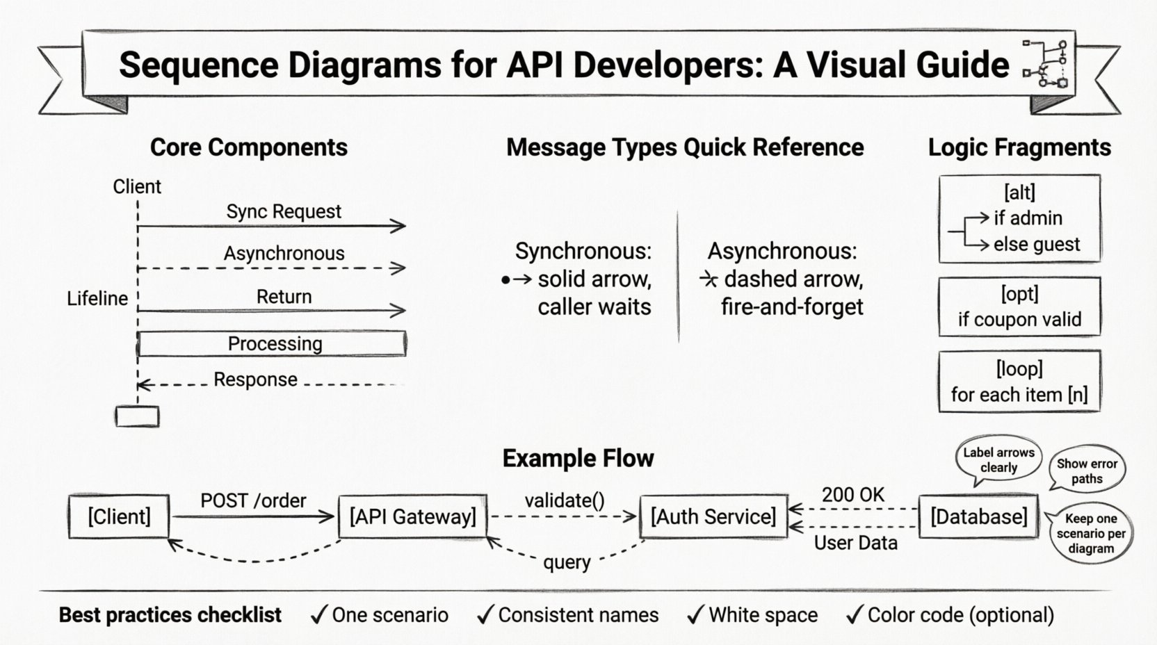
Core Components Explained 🔧
Before diving into complex scenarios, it is essential to understand the building blocks. If you miss these basics, the diagram becomes confusing rather than helpful.
1. Lifelines
The vertical dashed lines running down the page are called lifelines. Each lifeline represents an instance of an object, a service, or a user. It is not just a line; it represents the existence of that entity over the duration of the interaction.
- Top of the line: The moment the entity is created or becomes active.
- Bottom of the line: The moment the entity is destroyed or goes out of scope.
- Label: Usually placed at the top, identifying the participant (e.g.,
Client,PaymentService).
2. Messages (Arrows)
Messages are the horizontal arrows connecting lifelines. They represent the communication between entities. There are different styles for different types of communication:
- Solid line with a solid arrowhead: A synchronous message. The sender waits for a response before continuing.
- Solid line with a hollow arrowhead: Often used for return messages or specific framework conventions.
- Dashed line with a solid arrowhead: An asynchronous message. The sender sends the data and continues immediately without waiting.
- Dashed line with a hollow arrowhead: A return message, indicating a response to the caller.
3. Activation Bars
These are the thin rectangles drawn on top of a lifeline. They indicate the period during which an object is performing an action or is actively processing a message.
Why does this matter? If you see an activation bar extending for a long time, it indicates a potential bottleneck. A long activation bar means the service is busy, blocking other requests or holding resources. This is a crucial insight for performance tuning.
Common Questions and Detailed Answers 📝
Below, we address the most common technical questions encountered when learning sequence diagrams for API development.
Q1: How Do I Represent a Database Interaction? 🗄️
Junior developers often struggle with how to show a database query. The database should be treated as a distinct participant, just like an API service.
- Label it clearly: Use names like
Database,Cache, orExternalStorage. - Draw the message: Send a request from the API service to the database lifeline.
- Show the return: Draw a dashed arrow returning from the database to the service.
- Indicate the data: You can label the arrow with the query name, such as
SELECT * FROM users.
Do not group the database with the application code. It is a separate resource with its own lifecycle and potential for failure. Showing this separation helps in designing retry logic and circuit breakers.
Q2: Synchronous vs. Asynchronous: When to Use Which? ⏱️
This is a critical architectural decision. The diagram should reflect the actual behavior of your system.
| Feature | Synchronous | Asynchronous |
|---|---|---|
| Response | Immediate return to caller | No immediate return |
| Blocking | Caller waits | Caller continues |
| Use Case | API Endpoints, Immediate Data | Background Jobs, Notifications |
If you are designing an API that returns a status code immediately, use a synchronous message. If you are sending a notification email after a purchase is completed, use an asynchronous message. The diagram helps stakeholders understand the latency implications.
Q3: How Do I Show Error Handling? ⚠️
Happy paths are easy to draw. The real value lies in showing what happens when things go wrong. Errors should be treated as messages returning from the recipient.
- Label the arrow: Use names like
404 Not Found,500 Internal Error, orTimeout. - Return path: Ensure the error message travels back up the chain to the original caller.
- Optional Fragments: Use
alt(alternative) fragments to show the error branch alongside the success branch.
By visualizing the error path, you ensure that the client application has a strategy for handling failures. It prevents the common issue of an API returning a 500 error without a clear client-side response.
Q4: What Are Alt, Opt, and Loop Fragments? 🔄
nThese are frames that group specific behaviors within the diagram. They add logic without cluttering the main flow.
- Alt (Alternative): Represents an
if/elsestatement. You can only have one option active at a time. Example:if (user is admin)vselse (user is guest). - Opt (Option): Represents an optional block. The condition might not be true. Example:
if (coupon code is valid). - Loop: Represents a loop structure. It indicates that a set of messages repeats. Example:
for each item in cart.
Using these frames keeps the diagram clean. Instead of drawing every single iteration of a loop, you draw one iteration and label it Loop [n]. This reduces visual noise significantly.
Q5: How Do I Handle Multiple Participants? 👥
Complex systems involve many moving parts. You might have a Client, an API Gateway, an Auth Service, a User Service, and a Notification Service.
Order matters. Place participants in the order of interaction flow.
- Left to Right: Generally, the initiator is on the left, and the final recipient is on the right.
- Relevance: Only include participants involved in the specific scenario. If the Notification Service is not involved, do not draw it.
- Grouping: If you have multiple microservices, consider grouping them under a broader lifeline like
Backend Clusterto reduce clutter.
Clarity is more important than technical completeness. A diagram with too many participants becomes unreadable. Simplify the view to the essential actors for the specific use case.
Q6: What Does the Dotted Return Line Mean? 📏
In many diagrams, the return message is drawn as a dashed line. This distinguishes the request (solid) from the response (dashed).
However, some conventions use a solid line for return messages if they are synchronous. The key is consistency within your team.
- Synchronous Return: The caller is blocked until the response arrives. The return arrow completes the activation bar.
- Asynchronous Return: If the response comes later, it might be a separate message. This is less common in standard sequence diagrams but possible in event-driven architectures.
Always label your return messages with the data being returned, such as 200 OK or User Data.
Q7: How Do I Show Authentication? 🔐
Security is paramount in API design. A sequence diagram can illustrate where authentication happens.
- Pre-request: The client sends a token before the main request.
- Gateway Check: The API Gateway validates the token before passing it to the service.
- Service Check: The service validates the token internally.
Draw a separate message for the authentication check. This highlights that authentication is a distinct step that adds latency. It helps in optimizing the flow, perhaps by moving token validation to the edge (Gateway) to save internal service resources.
Q8: Can I Show Data Transformation? 🔄
Yes, but be careful not to overcomplicate the diagram. Sequence diagrams are about flow, not data structure.
- Label the message: Instead of showing the JSON payload, label the message with the intent, such as
Convert Order to Invoice. - Notes: You can add a note attached to a lifeline to describe complex transformations happening in the background.
Do not try to draw the actual data objects. That belongs in an API documentation specification or a data dictionary. Keep the sequence diagram focused on the interaction.
Q9: How Do I Document Timeout Scenarios? ⏳
Timeouts are critical for reliability. A sequence diagram can show what happens when a service does not respond.
- Time Limits: You can add a note on the message arrow indicating the timeout duration, e.g.,
timeout: 5s. - Failure Path: Draw a separate branch where the client receives a
Timeout Errormessage if the service does not respond within the limit. - Retry Logic: Indicate if the client retries the request. This shows resilience in the system design.
Visualizing timeouts helps in setting expectations for the client. It prevents the client from hanging indefinitely and ensures a graceful degradation of service.
Q10: How Do I Keep the Diagram Updated? 📅
Software changes. APIs evolve. A diagram that is outdated is worse than no diagram at all.
- Integrate with CI/CD: Some tools allow you to generate diagrams from code or API specifications automatically.
- Code Review: Treat diagram updates as part of the pull request process. If the API changes, the diagram must change.
- Simplification: If a diagram becomes too complex, split it into multiple diagrams for different scenarios (e.g., one for Login, one for Checkout).
Maintainability is a shared responsibility. Ensure the team understands that the diagram is a living document.
Best Practices for Clarity ✨
To ensure your sequence diagrams serve their purpose, follow these guidelines.
- One Scenario Per Diagram: Do not mix the “Happy Path” with error handling in the same visual space unless using clear frames. It makes the diagram harder to read.
- Consistent Naming: Use the same names for participants throughout the document. Do not switch between
UserandClient. - Focus on Flow: Avoid showing internal method calls within a service unless they are critical to the logic. It adds noise.
- Use White Space: Don’t cram elements together. Spacing helps the eye follow the path.
- Color Coding: If your tool allows, use colors to distinguish between different types of messages (e.g., blue for requests, green for responses).
Why This Matters for Career Growth 🚀
Mastering sequence diagrams is not just about drawing lines. It is about thinking like an architect. It forces you to consider:
- Decoupling: Are your services too tightly coupled?
- Latency: Where are the bottlenecks in your system?
- Failure Modes: What happens when the network drops?
Junior developers who can communicate these concepts visually are highly valued. They bridge the gap between code and business requirements. They show that they understand the system, not just the syntax.
Final Thoughts on Diagramming 🎨
Sequence diagrams are a language. Like any language, they require practice to speak fluently. Start with simple interactions and gradually add complexity as you become more comfortable with the notation. Remember that the goal is communication, not perfection.
When you present a diagram to a team, you are telling a story. Make sure the story is clear, accurate, and helpful. If a stakeholder looks at your diagram and understands the flow immediately, you have succeeded. If they are confused, simplify the diagram further. The most complex diagram is the one that nobody can read.
Keep your diagrams updated, keep your notation consistent, and always prioritize clarity over detail. This approach will serve you well as you advance in your career as an API developer and systems architect.
By answering these top questions and following these practices, you will build a strong foundation for system design. The path to expertise is paved with clear communication and thoughtful planning. Keep drawing, keep learning, and keep refining your architectural skills.