
In the complex architecture of modern software systems, communication is the backbone of functionality. When developers, architects, and stakeholders collaborate, they often face the challenge of explaining how different parts of a system interact over time. This is where the sequence diagram becomes an indispensable tool. It transforms abstract logic into a visual narrative, allowing teams to trace the journey of data from initiation to completion.
This guide provides a structured approach to understanding and creating sequence diagrams. We will break down the components, explore common patterns, and establish best practices that prevent the diagram from becoming a tangled web of lines. By focusing on clarity and logical flow, you can document interactions effectively without getting lost in technical details.
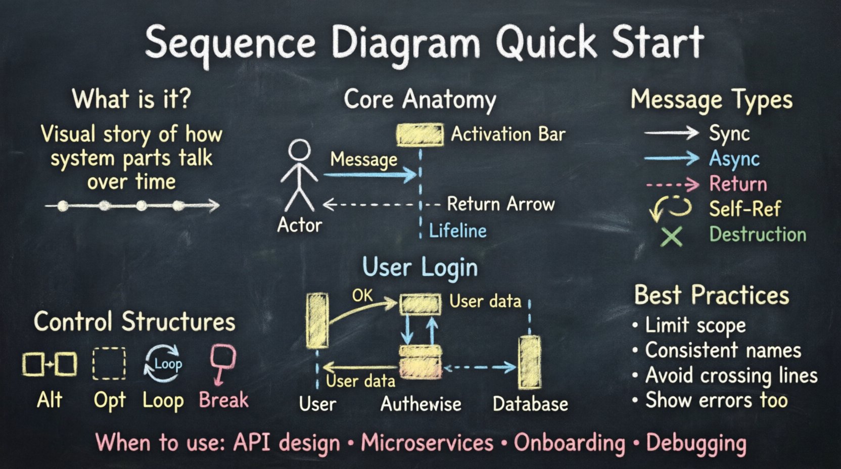
What Exactly is a Sequence Diagram? 🧐
A sequence diagram is a type of interaction diagram in the Unified Modeling Language (UML). Its primary purpose is to show how objects or components communicate with one another in a specific scenario. Unlike a class diagram that focuses on structure, a sequence diagram focuses on behavior and timing.
Imagine a conversation between two people. You speak, they listen, they respond, and you acknowledge. A sequence diagram maps this exact rhythm onto your system. It displays objects vertically and time horizontally. Events are represented as arrows moving between these objects, ordered from top to bottom. This chronological representation is crucial for debugging logic errors, defining API contracts, and onboarding new team members.
The Core Anatomy of the Diagram 🧩
To build a clear diagram, you must first understand the building blocks. Every valid sequence diagram relies on a specific set of visual elements. Skipping any of these can lead to ambiguity later in the development process.
- Lifelines: These are the vertical dashed lines representing an object, user, or external system. They indicate that the entity exists for the duration of the interaction.
- Actors: Usually depicted as stick figures, actors represent the human users or external triggers initiating the process.
- Messages: The arrows connecting lifelines. These carry the actual data, commands, or signals between components.
- Activation Bars: The thin rectangles placed on top of lifelines. They show when an object is actively processing a request. A longer bar means more processing time.
- Return Messages: Often shown as dashed arrows pointing back to the sender. They indicate the completion of a task or the data returned from the call.
When constructing your diagram, ensure every lifeline has a distinct name. Generic labels like “Object A” confuse readers. Use domain-specific names like PaymentService or DatabaseConnection to provide immediate context.
Understanding Message Types 💬
Not all arrows are created equal. The style of the arrow conveys critical information about how the system behaves. Understanding the difference between synchronous and asynchronous messages is fundamental to accurate modeling.
Below is a comparison of common message types to help you select the right notation for your scenario.
| Message Type | Visual Style | Behavior | Use Case |
|---|---|---|---|
| Synchronous Call | Solid line, filled arrowhead | Sender waits for response before continuing | Standard function calls, API requests |
| Asynchronous Call | Solid line, open arrowhead | Sender sends and continues immediately | Event triggers, fire-and-forget tasks |
| Return Message | Dashed line, open arrowhead | Response sent back to caller | Data retrieval, confirmation signals |
| Self-Reference | Arrow looping back to the same lifeline | Object performs internal logic | Calculations, state changes within an object |
| Destruction | X mark on the lifeline | Object is removed from memory | Session end, resource cleanup |
Choosing the correct arrow type prevents misinterpretation. If a user clicks a button and expects a button to light up immediately, an asynchronous message might be inaccurate if the system actually waits for a database confirmation. Always align the diagram with the actual technical implementation.
Step-by-Step Guide to Creating a Diagram 🏗️
Building a sequence diagram without a specific tool requires a logical workflow. Whether you are sketching on a whiteboard or using a digital canvas, follow these steps to maintain structure.
1. Identify the Actors and Participants
Start by listing who or what is involved in the process. Who is the user? Which service handles the request? Is there a database involved? Draw these as vertical lines at the top of your workspace. Ensure the main actor is on the left, as the flow typically moves from left to right or top to bottom.
2. Define the Initial Trigger
What starts the interaction? Place the first message arrow at the very top. This is the entry point. For example, a user logging in starts with a “Submit Credentials” message from the Actor to the Authentication Service.
3. Map the Processing Logic
Once the message is received, the receiving object activates. Draw a bar over its lifeline. From this activation, draw the next internal or external calls. Do not clutter the diagram with every single line of code. Focus on the high-level interactions between major components.
4. Handle Returns and Responses
Every call should ideally have a return path, unless the system is designed to be fire-and-forget. Use dashed lines to show data returning to the original requester. This closes the loop and confirms the action was completed.
5. Review for Vertical Flow
Check the timing. Does the diagram read naturally from top to bottom? If you have a long chain of calls, ensure the lines do not cross excessively. Crossing lines make the diagram hard to follow. If necessary, group related interactions together.
Control Structures and Logic 🔁
Real-world systems are rarely linear. They involve decisions, loops, and conditional logic. Sequence diagrams support specific fragments to represent these complexities. Using these correctly keeps your diagrams accurate without becoming messy.
Alt and Opt Fragments
Use the Alt (Alternative) fragment to show branching paths. For example, if a login fails, the system might show an error screen. If it succeeds, it shows a dashboard. This is often drawn as a box with a vertical bar separating the different outcomes.
The Opt (Optional) fragment indicates a step that might not happen. This is useful for optional features, such as saving a user’s preferences. If the user declines, that part of the diagram is skipped.
Loop Fragments
When a system iterates over a collection of data, a loop fragment is appropriate. Instead of drawing the same message ten times for ten items, draw one interaction inside a box labeled “Loop”. This keeps the diagram concise and readable.
Break Fragments
Use the Break fragment to indicate a specific condition where the flow stops. This is common in error handling or timeout scenarios. It shows a specific path that interrupts the normal flow.
Best Practices for Clarity ✨
A diagram that is difficult to read is a diagram that fails its purpose. To ensure your sequence diagrams are effective, adhere to the following guidelines.
- Limit Scope: Do not try to capture the entire system in one diagram. Break complex flows into smaller, focused diagrams. One diagram per feature or use case is better than one massive diagram for the whole app.
- Consistent Naming: Use the same terminology throughout. If you call a component “PaymentGateway” in one diagram, do not call it “BillingService” in another. Consistency reduces cognitive load.
- Avoid Spaghetti Lines: If lines cross too much, reorder the lifelines. Place the most frequently interacting components closer together.
- Keep it Time-Agnostic: While sequence diagrams show time, do not try to represent exact milliseconds. They are logical representations, not performance benchmarks.
- Use Headers: Give every diagram a clear title that describes the scenario, such as “User Checkout Flow” or “Data Synchronization Process”.
Common Pitfalls to Avoid 🚫
Even experienced engineers make mistakes when documenting interactions. Being aware of these common errors can save you time during code reviews and architecture discussions.
- Too Much Detail: Including every variable passed in a function call makes the diagram unreadable. Stick to the high-level payload, like “UserData” instead of “User{ID:1, Name:John, Email:[email protected]}”.
- Mixing Layers: Do not mix the user interface logic with the database logic in the same diagram unless necessary. Keep the presentation layer separate from the data layer.
- Unclear Actors: If you use a stick figure for a user, ensure you specify what kind of user. A guest user has different permissions than an administrator.
- Ignoring Error States: A diagram showing only the happy path is incomplete. Show what happens when the database is down or the authentication token is invalid.
- Static vs Dynamic Confusion: Ensure you are not describing what an object contains (class diagram) but rather what it does (sequence diagram).
Reading and Interpreting Diagrams 📖
Creating diagrams is only half the battle. Reading them is equally important for maintenance and troubleshooting. When you encounter a diagram you did not create, follow this reading strategy.
- Start at the Top: Identify the trigger. What started the process?
- Follow the Arrows: Trace the path of the main request. Do not get distracted by return messages until you understand the request path.
- Identify the Actors: Recognize who is responsible for each step. If a lifeline has no activation bar, it is just waiting.
- Check the Logic: Look for Alt, Opt, or Loop fragments. Understand the conditions that change the flow.
- Verify the End: Does the diagram end with a clear return to the user or a system state change?
This reading process helps you quickly understand system behavior without needing to dive into the code immediately. It is a powerful skill for onboarding new developers or auditing existing systems.
When to Use Sequence Diagrams 📅
Documentation is not always necessary. Use sequence diagrams when the interaction complexity warrants visual aid. Here are the specific scenarios where they add the most value.
- API Design: Before writing code, map out how the API endpoints interact with internal services.
- Microservices Communication: In distributed systems, understanding how Service A talks to Service B is critical for defining contracts.
- Onboarding: When a new developer joins the team, a sequence diagram explains the flow of a feature faster than a README file.
- Troubleshooting: When a bug occurs, diagramming the expected flow helps isolate where the logic diverges from reality.
- Architecture Reviews: Stakeholders often prefer visual representations over text descriptions during technical reviews.
Integrating into the Workflow 🔗
To make sequence diagrams a standard part of your development lifecycle, integrate them early. Do not wait until the code is finished to document the flow. Create them during the design phase.
This practice, often called “Design First,” allows you to catch logical errors before they become bugs. If the diagram shows a circular dependency or a missing response, you can fix it on paper before it costs time in production.
Furthermore, keep the diagrams versioned alongside your code. If the API changes, the diagram should update. An outdated diagram is worse than no diagram, as it leads to incorrect assumptions.
Conclusion on Documentation Standards 📝
Effective documentation is about communication, not decoration. A sequence diagram is a language that bridges the gap between technical implementation and business logic. By mastering the components, message types, and control structures, you create a resource that serves your team well.
Remember that the goal is clarity. If a diagram requires a legend to explain the arrows, it is too complex. Simplify. Focus on the data flow and the critical interactions. With practice, you will find that visualizing data flow becomes an intuitive part of your design process, helping you build systems that are robust, understandable, and maintainable.
Start with a simple interaction today. Draw a single lifeline. Add a message. Add a return. Build from there. The complexity will grow naturally, but the foundation will remain solid.