
Debugging distributed systems is often compared to solving a complex puzzle where the pieces are moving. In a monolithic architecture, a bug usually resides in a single codebase. However, when you shift to microservices, the complexity multiplies. Calls traverse multiple services, databases, and network boundaries. 🔄 This fragmentation makes traditional debugging methods insufficient. You need a tool that visualizes the flow of data and control across these boundaries.
Sequence diagrams are not just for documentation; they are powerful diagnostic instruments. By mapping out interactions, you can reveal hidden issues that logs often miss. This guide explores how to leverage sequence diagrams to identify race conditions, timeouts, and orchestration failures in your distributed environment. ⚡
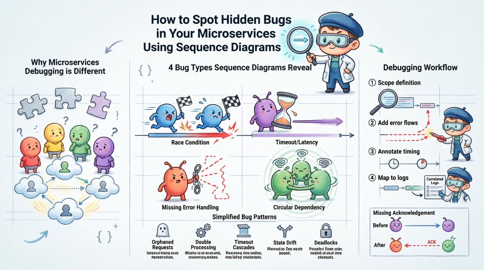
📉 Why Microservices Debugging is Different
In a traditional application, the stack trace tells you exactly where the error occurred. In a microservices architecture, an error might originate in Service A but manifest in Service B due to a dependency failure. This latency obscures the root cause. 🕵️♂️
Here are the core challenges that make hidden bugs prevalent:
- Asynchronous Communication: Messages are often sent without immediate confirmation, leading to lost requests or state inconsistencies.
- Network Instability: Intermittent connectivity can cause partial failures that appear random.
- Data Consistency: Ensuring data remains accurate across multiple databases requires careful transaction management.
- Dependency Chains: A slow response from a downstream service can cascade upwards, causing timeouts upstream.
Without a visual representation of these interactions, developers often resort to guessing. Logs provide a timeline, but they lack context about the broader flow. A sequence diagram fills this gap by showing who talked to whom and when. 📊
🔍 What Sequence Diagrams Reveal About Bugs
A sequence diagram depicts objects or services and the messages exchanged between them over time. When analyzing these diagrams for debugging, you are looking for deviations from the expected happy path. These deviations often point to specific classes of bugs.
1. Race Conditions 🏎️
Race conditions occur when the outcome depends on the relative timing of events. In microservices, two services might try to update the same resource simultaneously. A sequence diagram can highlight where concurrent requests overlap without proper locking mechanisms.
Look for:
- Multiple activation bars overlapping on a single service.
- Missing synchronization messages between parallel flows.
- Overlapping request and response timelines that suggest a lack of atomicity.
2. Timeouts and Latency Spikes ⏱️
Network latency is invisible in code but visible in a timeline. If Service A sends a request to Service B, and Service B takes too long to respond, Service A might time out. Sequence diagrams make these delays explicit.
Look for:
- Long gaps between a request message and the corresponding return message.
- Repeated re-tries indicating flaky connections.
- Messages sent after a logical timeout threshold has passed.
3. Missing Error Handling 🚫
Many systems only diagram the “happy path”. However, hidden bugs often live in the error paths. If a service fails, does the caller know? Does it retry? Does it compensate?
Look for:
- Missing error return messages in the diagram.
- Broken chains where a failure in Service C is not communicated to Service A.
- Dead ends where no response is returned to the initial client.
4. Circular Dependencies 🔗
Circular dependencies can cause infinite loops or deadlocks. While architecture diagrams show this statically, sequence diagrams show it dynamically during execution.
Look for:
- Service A calling Service B, which immediately calls Service A back.
- Messages bouncing back and forth without a termination condition.
- Increasing depth of calls without returning to the origin.
📋 Common Bug Patterns in Distributed Flows
The following table summarizes common bugs, how they appear in a sequence diagram, and the likely root cause.
| 🐛 Bug Type | 👁️ Diagram Indicator | 💡 Likely Root Cause |
|---|---|---|
| Orphaned Requests | Request sent, no response received | Service crashed or network packet loss |
| Double Processing | Two activation bars for the same request ID | Retry logic without idempotency checks |
| Timeout Cascades | Upstream service waits indefinitely | Downstream service overloaded or hung |
| State Drift | Subsequent calls use stale data | Caching inconsistencies or delayed updates |
| Deadlocks | Messages waiting on each other forever | Resource contention or lock ordering issues |
🛠️ How to Construct Effective Diagrams for Debugging
To use sequence diagrams effectively, you must create them with debugging in mind. Generic diagrams are often too abstract. You need specific details that highlight the flow of control and data. 🛠️
Step 1: Define the Scope
Do not try to diagram the entire system at once. Focus on a specific transaction or user journey. For example, if users report “Checkout Failure”, diagram the flow from the Client -> Order Service -> Payment Service -> Inventory Service. 🔍
Step 2: Include Error Flows
Most diagramming tools default to success paths. You must manually add failure scenarios. Draw dashed lines for error messages. Label them with the specific exception type or error code.
Step 3: Annotate Timing and Constraints
Use annotations to indicate constraints. For example, write “Timeout: 5s” near the message line. Indicate if a call is synchronous or asynchronous. This context helps you spot violations later.
Step 4: Map to Logs
Correlate the diagram nodes with actual log entries. If the diagram shows a message from Service A to Service B, ensure you have a log entry confirming that transmission. If the log is missing, you have found a bug in the observability pipeline itself.
🧩 Analyzing the Diagram: A Step-by-Step Walkthrough
Once you have the diagram, how do you analyze it? Follow this systematic approach to find hidden flaws.
1. Verify the Entry and Exit Points
Start at the top (the Client). Does every request result in a response? If a message enters the system and never leaves, where did it go? Check the bottom of the diagram. If the return message is missing, trace the path backward.
2. Check Message Ordering
Microservices often rely on strict ordering. For instance, an “Update Profile” message must arrive before an “Authenticate User” message in some workflows. Look for messages that cross each other in ways that violate logic. 📉
3. Identify Parallelism Bottlenecks
If Service A calls Services B and C in parallel, look at the activation bars. If Service B finishes much faster than C, Service A might be waiting unnecessarily. This indicates a lack of async handling or pooling.
4. Review Resource Allocation
Does the diagram show the same resource being accessed concurrently? If two services try to write to the same database table simultaneously without locking, you have a concurrency bug waiting to happen. 🗃️
5. Simulate the Flow
Walk through the diagram as if you are the system. Imagine being the message. “I am sent from A to B. B receives me. B calls C. C fails. Does B tell A?” This mental simulation often reveals missing error handling logic.
🔧 Advanced Techniques for Deep Debugging
Beyond basic visualization, there are advanced techniques to extract more value from sequence diagrams in a debugging context.
Dynamic vs. Static Diagrams
Static diagrams represent the design. Dynamic diagrams represent the actual runtime behavior. Comparing the two is powerful. If your static diagram shows a synchronous call, but your dynamic trace shows an asynchronous callback, you have a configuration drift. This often leads to state loss. 🔄
Integrating with Distributed Tracing
Modern systems generate trace IDs. You can map these trace IDs directly to your sequence diagram nodes. This creates a “living diagram” that updates with real data. When a bug occurs, you can highlight the specific segment of the diagram where the failure happened.
Versioning Your Diagrams
As services evolve, the interaction patterns change. Keep versions of your sequence diagrams. If a bug appears after a deployment, compare the “Before” and “After” diagrams. The difference often points to the new logic that introduced the flaw. 📅
📝 Best Practices for Maintenance
A sequence diagram is only useful if it is accurate. Outdated diagrams can be more confusing than helpful. Here is how to keep them relevant.
- Automate Updates: Where possible, generate diagrams from code or API contracts. This ensures the diagram matches the implementation.
- Assign Ownership: Every service owner should be responsible for updating the parts of the diagram that involve their service.
- Review in Retrospectives: Make diagram updates a part of your post-incident review process. When a bug is fixed, update the diagram to reflect the fix.
- Keep it Simple: Do not diagram every single internal method call. Focus on the service boundaries and network messages. Too much detail obscures the bugs you are looking for.
🧪 Case Study: The Missing Acknowledgement
Consider a scenario where an Order Service sends an order to a Notification Service. The Order Service expects an acknowledgement. However, users report that notifications are sometimes not sent.
Initial Hypothesis: The Notification Service is down.
Sequence Diagram Analysis:
- We draw the flow: Order Service -> Notification Service -> Ack.
- We add a failure path: Notification Service -> Timeout -> Order Service.
- We notice the Order Service has no logic to handle the Timeout. It simply closes the connection.
- The diagram reveals the gap: The Order Service assumes success if it doesn’t get a rejection, but the network might have dropped the packet.
Resolution: The diagram highlighted a missing retry mechanism. The fix was to add a re-try loop in the Order Service for failed acknowledgements. Without the diagram, this logic might have remained hidden in the codebase for months. 🛠️
🧭 Moving Forward with Visual Debugging
Adopting sequence diagrams for debugging requires a shift in mindset. You are no longer just reading logs; you are interrogating the flow of your system. This visual approach forces you to confront the complexity of distributed interactions. It makes the invisible visible.
By focusing on the interactions between services rather than just the code within them, you gain a higher-level view of your architecture. This perspective is crucial for spotting the subtle bugs that cause intermittent failures and data inconsistencies. 🌐
Start small. Pick one critical path in your system. Draw the sequence diagram. Annotate the error paths. Compare it to the current behavior. You will likely find discrepancies that were previously invisible. Over time, this practice will become a standard part of your development lifecycle, leading to more robust and reliable systems. 🚀
Remember, the goal is not to create a pretty picture for documentation. The goal is to find the bugs that hide in the spaces between your services. Use the diagram as a lens to focus on those spaces. With patience and precision, you can eliminate the hidden errors that plague distributed applications. 🔦