
Creating a sequence diagram is often seen as a rite of passage for anyone entering the world of system design. It is a visual representation of how objects or components interact over time. For a novice, the temptation is to capture every single detail of the system’s behavior. However, this approach frequently leads to diagrams that are dense, confusing, and ultimately useless for their intended audience.
When a beginner creates a sequence diagram, they often prioritize technical completeness over communicative clarity. The result is a wall of arrows and activation bars that overwhelms the reader. This guide explores why this complexity arises, how to identify it, and practical steps to streamline your documentation without losing necessary information.
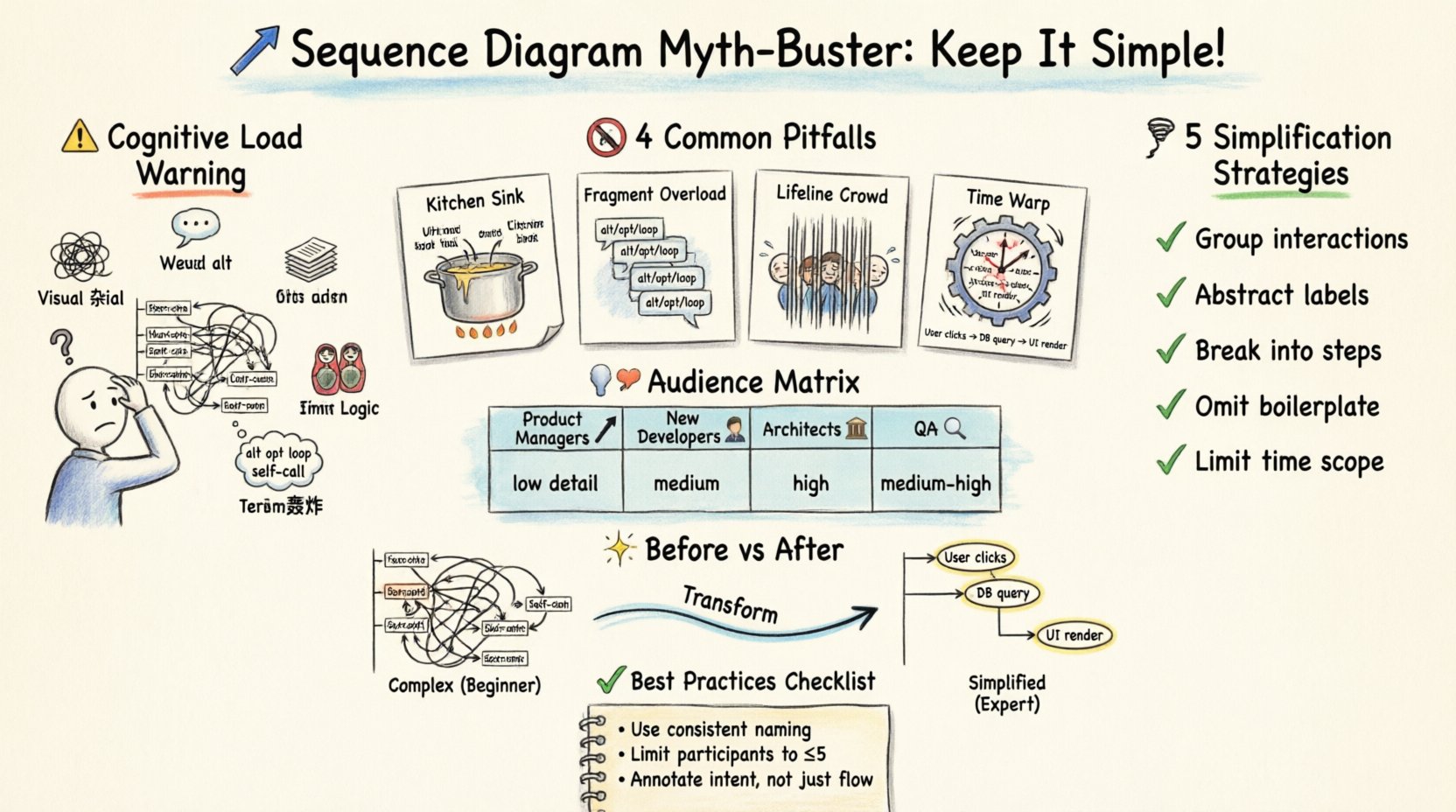
🧠 The Cognitive Load Problem
One of the primary reasons sequence diagrams fail is the sheer cognitive load they impose on the reader. A diagram is a tool for communication, not a repository for every function call. When a diagram attempts to show the entire lifecycle of a request, including error handling, retries, and database transactions in one view, it exceeds the working memory capacity of most humans.
Consider the following factors that contribute to high cognitive load:
- Visual Clutter: Too many vertical lines (lifelines) competing for attention.
- Message Density: Arrows crossing each other create a “hairball” effect that is hard to trace.
- Nested Logic: Deeply nested decision points (If/Else) within a single flow.
- Terminology: Using internal variable names instead of business concepts.
For a beginner, the goal is often to prove they understand the code. However, the goal of documentation should be to help others understand the flow. When you prioritize proving your knowledge over facilitating understanding, the diagram becomes a barrier rather than a bridge.
🚫 Common Pitfalls for Newcomers
There are specific patterns that frequently appear in diagrams created by those new to system design. Recognizing these patterns is the first step toward simplification.
1. The “Kitchen Sink” Approach
Beginners often feel compelled to include every possible scenario. They map out the happy path, but then immediately add the exception path, the timeout path, and the database rollback path. While technically accurate, this creates a diagram that is too long to fit on a single screen or page. This forces the reader to scroll or flip pages, breaking their mental model of the process.
2. Over-Use of Fragments
UML provides fragments like alt (alternative), opt (optional), and loop. Beginners often use these extensively to show every conditional branch. While valid, overusing them creates a fragmented narrative. A reader has to jump between different frames to understand the overall flow. It is often better to describe the condition in the message label or use a separate diagram for the exception flow.
3. Excessive Lifelines
Every component, service, database, and user interface element gets its own vertical line. When a diagram has ten or more lifelines, the horizontal distance between interactions becomes too wide. This makes it difficult to see which messages belong to which context. Grouping related components or abstracting them into a single “System” lifeline can reduce this width significantly.
4. Ignoring Time Scale
Sequence diagrams imply a chronological order. Beginners often group actions that happen at vastly different times together. For example, placing a user login, a long-running background job, and a final email confirmation all on the same vertical timeline can be misleading. It suggests a linear flow where, in reality, there are gaps of seconds or minutes.
📉 The “Show Everything” Fallacy
There is a persistent myth that a diagram must be exhaustive to be valuable. This is incorrect. A diagram serves a specific purpose. If the purpose is to explain the authentication flow, you do not need to show how the session is stored in Redis. If the purpose is to show error handling, you do not need to show the happy path in detail.
Thinking of your diagram as a chapter in a book is a better analogy than thinking of it as a map. A chapter focuses on a specific topic. It does not need to cover the entire history of the subject. When you try to show everything, you show nothing clearly.
👥 Who is the Audience?
Complexity is relative to the reader. A diagram designed for a senior architect will look very different from one designed for a product manager or a new developer.
| Audience | Focus | Detail Level | Complexity Tolerance |
|---|---|---|---|
| Product Managers | Business Value & Flow | Low (High Level) | Low (Needs simplicity) |
| New Developers | Entry Points & Logic | Medium | Medium |
| System Architects | Integration & Data | High (Technical) | High (Can handle detail) |
| QA Engineers | Test Scenarios & Errors | Medium-High | Medium |
If you create a single diagram for all these groups, it will inevitably be too complex for the Product Managers and potentially too vague for the Architects. It is better to create multiple views of the same system. This approach is often called “Abstraction Layers”.
🛠 Strategies for Simplification
Reducing complexity does not mean removing information. It means organizing it better. Here are practical techniques to make your diagrams more readable.
1. Group Related Interactions
Instead of drawing every single method call, group them. If a controller calls a service, and the service calls a repository, you can represent this as a single interaction from Controller to Repository, or use a combined fragment to denote the internal processing. This hides the implementation details that are not relevant to the current flow.
2. Use Abstract Labels
Avoid naming messages with internal function names like getUserById(int id). Instead, use descriptive labels like Fetch User Data. This shifts the focus from implementation to intent. It makes the diagram understandable to non-technical stakeholders without losing the meaning.
3. Break Down into Steps
If a process has distinct phases (e.g., Authentication, Processing, Notification), split them into separate diagrams. Label them clearly, such as “Phase 1: Login” and “Phase 2: Data Retrieval”. This allows the reader to digest the system in chunks rather than one massive block.
4. Omit Standard Patterns
Some interactions are standard boilerplate. For example, every request usually involves a network call, a database connection, and a return. Unless the exception handling for these specific parts is the focus of the diagram, you do not need to draw the TCP handshake or the SQL commit. Focus on the business logic.
5. Limit the Scope of Time
Ensure the diagram represents a coherent time window. If a process spans hours (e.g., a batch job), do not try to represent every second. Use a note to indicate delays or state changes over time. This keeps the diagram focused on the logic rather than the clock.
📊 Comparison: Complex vs. Simplified
Understanding the difference between a complex diagram and a simplified one is crucial. The table below contrasts the two approaches.
| Feature | Complex Diagram (Beginner) | Simplified Diagram (Expert) |
|---|---|---|
| Message Names | calculateTax(double amount) |
Calculate Tax |
| Error Handling | Shown inline with every step | Shown in a separate “Exception Flow” diagram |
| Components | All services listed separately | Grouped by functional domain |
| Visual Flow | Vertical lines span full page height | Vertical lines start/end at relevant points |
| Readability | Requires zooming out to see context | Readable at 100% zoom |
| Maintainability | Hard to update without breaking layout | Easy to update; structure is stable |
📉 The Hidden Cost of Complexity
When diagrams are too complex, the cost is not just visual. It impacts the development lifecycle.
- Outdated Documentation: Complex diagrams are harder to update. Developers stop updating them because it feels like too much work. An outdated diagram is worse than no diagram at all because it builds false trust.
- Communication Breakdown: If a diagram takes 10 minutes to decipher, it will not be read. Decisions made based on assumptions rather than the diagram lead to implementation errors.
- Onboarding Friction: New team members spend hours trying to understand a system that should be clear. This slows down productivity and increases frustration.
- Code Drift: When the diagram is too detailed, developers tend to match the code to the diagram exactly, even if the code could be simpler. This reduces technical flexibility.
✅ Best Practices Checklist
Before finalizing a sequence diagram, run through this checklist to ensure it is fit for purpose.
- Is the purpose of this diagram clearly stated in the title?
- Are all lifelines necessary for the current context?
- Are message labels descriptive rather than technical?
- Is the diagram readable without scrolling or zooming excessively?
- Are error paths handled in a separate view if they clutter the main flow?
- Have internal processing steps been abstracted where possible?
- Is the audience identified and the detail level appropriate for them?
- Are the arrows and lines crossing minimized to reduce visual noise?
- Is the timing of events clear (linear vs. asynchronous)?
- Are there any comments or notes that explain the “why” behind the flow?
🔄 Iterative Refinement
Creating a good sequence diagram is rarely a one-time task. It is an iterative process. Start with a high-level view. Show the main actors and the primary flow. Then, refine it based on feedback.
If a reviewer says, “I don’t understand how this error is handled,” do not simply add the error path to the existing diagram. Ask if a separate diagram is needed. This preserves the clarity of the main flow while still addressing the concern. This iterative approach ensures that the documentation evolves alongside the system without becoming stagnant.
🔍 When Complexity is Necessary
It is important to note that simplicity is not always the goal. There are scenarios where a detailed, complex diagram is required.
- Security Protocols: When explaining encryption handshakes, every step matters.
- Concurrency Issues: When showing race conditions or locking mechanisms, specific timing and ordering are critical.
- Legacy System Integration: When connecting to old systems, the specific message formats and protocols must be explicit.
In these cases, the complexity is justified because the detail is the value. The key is to ensure that the audience knows this complexity is intentional and necessary.
🎯 Summary of Key Takeaways
To summarize, the goal of a sequence diagram is communication, not documentation for the sake of documentation. Beginners often fail because they try to replicate the code structure visually. Instead, they should focus on the flow of value and control.
By reducing cognitive load, grouping related interactions, and tailoring the detail to the audience, you create diagrams that are actually used. A simple diagram that is understood is infinitely more valuable than a complex one that is ignored. Focus on clarity, consistency, and the needs of the reader. This approach leads to better design, better communication, and a healthier development environment.
Remember that your diagrams are living documents. They should evolve as the system does. Do not be afraid to delete elements that no longer serve a purpose. A lean, clean diagram is a sign of a mature design process. It shows that you understand the system well enough to explain it simply.
Start small. Focus on the happy path first. Add complexity only when it adds value. This disciplined approach will separate your diagrams from the noise and establish them as reliable references for your team.