
Workflow modeling is a cornerstone of system design, yet it frequently suffers from a lack of clarity. When stakeholders review a diagram, they need to understand the process flow immediately, not decipher a tangled web of symbols. This guide focuses on creating concise activity diagrams that communicate intent without unnecessary noise. By stripping away the excess, you ensure that the core logic shines through. Let’s explore how to achieve this balance between technical accuracy and visual simplicity.
Understanding the Activity Diagram 🧩
An activity diagram is a type of behavioral diagram used in Unified Modeling Language (UML). It represents the flow of control and data from one activity to another. While often compared to flowcharts, activity diagrams handle concurrency and object flows better. They are essential for describing the dynamic aspects of a system.
However, the power of this tool is often diluted by over-engineering. A diagram that tries to show every single variable state or micro-step becomes unreadable. The goal is to model the business logic, not the implementation details at this stage. Keep the focus on the high-level flow.
- Start Node: Represents the beginning of the process.
- Activity: A step or action within the flow.
- Decision Node: A diamond shape indicating a branching path based on a condition.
- Object Flow: Shows how data or objects move between activities.
- Fork and Join: Symbols used to manage parallel processes.
When you understand these building blocks, you can construct diagrams that are both accurate and easy to digest. The key lies in how you arrange them.
Why Clarity Wins Over Complexity 📉
In the context of software development and business analysis, communication is the primary currency. A complex diagram creates friction. It slows down decision-making and increases the risk of misinterpretation. Here is why prioritizing conciseness matters:
- Faster Onboarding: New team members can grasp the system logic quickly without getting lost in details.
- Reduced Errors: Simple diagrams are easier to validate. You are less likely to miss a logic gap when the path is straight.
- Better Stakeholder Alignment: Non-technical stakeholders can review the diagram and provide feedback without needing a translation.
- Maintainability: When requirements change, a simple diagram is easier to update than a dense, interconnected web.
Complexity often creeps in when we try to prove our intelligence or cover every edge case in a single view. Resist that urge. If a diagram is too crowded, split it into sub-activities.
Core Principles of Concise Modeling ✨
To create effective diagrams, you must adhere to specific design principles. These rules help maintain a clean look and logical flow.
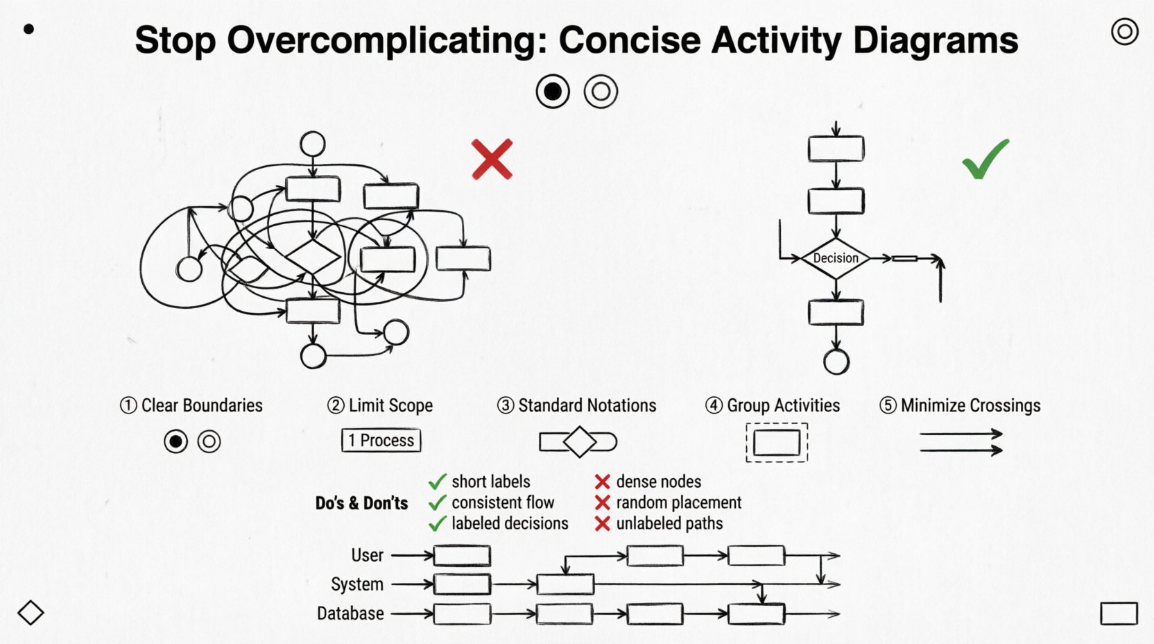
1. Define Clear Boundaries
Every diagram should have a distinct start and end. Avoid creating open-ended flows that leave the reader wondering what happens next. Use the initial node to mark the trigger and the final node to mark the completion. This creates a contained narrative.
2. Limit the Scope
Do not attempt to model the entire system in one diagram. Break down complex processes into smaller, manageable chunks. If a process involves multiple departments, use a swimlane diagram to separate responsibilities without cluttering the main flow.
3. Use Standard Notations
Stick to the standard UML shapes. Custom shapes or non-standard arrows confuse readers. Consistency reduces cognitive load. If you use a diamond for a decision, do not switch to a circle later.
4. Group Related Activities
Use activity partitions or frames to group related tasks. This visually separates concerns. For example, group all “Data Processing” steps together and all “Validation” steps together.
Visual Hygiene and Layout 🎨
How a diagram looks is just as important as what it says. Poor layout can make a simple process look confusing. Follow these guidelines for visual cleanliness:
- Minimize Line Crossings: Arrange nodes so that arrows do not cross over each other unnecessarily. Crossing lines create visual noise.
- Consistent Spacing: Keep equal distances between nodes. A crowded cluster looks like a mistake, even if it is intentional.
- Directional Flow: Generally, flows should move from top to bottom or left to right. Avoid zig-zagging paths.
- Labeling: Ensure every arrow has a label if it represents a condition (e.g., “Yes” or “No”).
A clean diagram respects the reader’s time. It guides the eye naturally through the process.
Abstraction Levels: High vs. Low 📝
One of the biggest mistakes is mixing abstraction levels. A diagram should not show a high-level business process and a low-level code function simultaneously. Distinguish between these levels:
- High-Level: Focus on the user journey and major milestones. Ignore internal validations or database calls.
- Low-Level: Focus on the specific logic, data transformations, and system interactions. This is for developers.
When you mix these, the diagram becomes a mess. Create separate diagrams for different audiences. A manager needs the high-level view; a developer needs the low-level view. Do not try to serve both with one image.
Managing Concurrency and Parallelism 🔄
Real-world processes often happen in parallel. Fork and join nodes are the standard way to represent this. However, they can quickly clutter a diagram if overused.
When to use Fork and Join:
- When tasks can happen at the same time.
- When a process depends on multiple parallel tasks completing.
When to avoid them:
- If the tasks are sequential in reality.
- If the parallelism is too complex to visualize clearly.
If you have too many parallel paths, consider using a separate diagram for the sub-process. This keeps the main diagram focused on the flow logic rather than the timing details.
Common Patterns and Pitfalls 🚧
There are recurring patterns in activity diagrams that indicate complexity. Identifying them helps you refactor the design.
The “Spaghetti” Flow
This occurs when arrows crisscross the diagram extensively. It usually indicates that the process is too large for one view. Solution: Decompose the process into sub-activities.
The “Decision Fatigue”
When a single node has too many outgoing arrows (e.g., more than five), it becomes hard to scan. Solution: Group related decisions or move them to a separate activity.
Missing End States
Leaving a flow hanging implies an incomplete process. Ensure every path leads to a final node. This is crucial for error handling paths as well.
Do’s and Don’ts Table ✅❌
Use this table as a quick reference guide during your design process.
| Aspect | Do ✅ | Don’t ❌ |
|---|---|---|
| Scope | Focus on one specific process flow. | Combine unrelated business processes. |
| Detail Level | Keep labels short and meaningful. | Write paragraphs of text inside nodes. |
| Layout | Use vertical or horizontal flow consistently. | Allow random placement of nodes. |
| Concurrency | Use forks only when necessary. | Show every possible parallel step. |
| Labels | Label decision arrows clearly (e.g., True/False). | Leave decision paths unlabeled. |
| Swimlanes | Use for distinct roles or systems. | Use for every single step. |
Refining Your Diagrams 🔍
Creating a diagram is an iterative process. The first draft is rarely the best. Use the following steps to refine your work:
- Review the Flow: Trace the path from start to finish. Are there any dead ends?
- Check the Logic: Do all decision paths converge correctly?
- Remove Redundancy: Are there duplicate activities that can be merged?
- Ask for Feedback: Show the diagram to a peer who hasn’t seen it before. If they are confused, the diagram is too complex.
This feedback loop is essential. It forces you to step back and view the diagram from an outsider’s perspective.
The Role of Swimlanes 🏊
Swimlanes are a powerful feature for organizing responsibility. They divide the diagram into horizontal or vertical sections, each representing a specific actor or system component.
Benefits of Swimlanes:
- Clarity of Responsibility: It is immediately obvious who performs which action.
- Handoff Visibility: You can easily see where the process moves from one team to another.
- Reduction of Crossings: By grouping actions by actor, you often reduce the number of crossing lines.
However, too many swimlanes can make the diagram wide and hard to read. Limit them to the primary actors involved in the process. If you have more than five, consider splitting the diagram.
Handling Exceptions Gracefully ⚠️
Error handling often complicates diagrams. Every process can fail, but showing every failure mode creates clutter. Adopt a strategy for exceptions:
- Group Errors: Instead of showing every specific error, group them into a single “Error Handling” path.
- Use Exception Nodes: Some modeling standards allow for specific exception markers. Use them to denote failure points without drawing a full path.
- Document Separately: If error handling is complex, document the logic in a separate text or sequence diagram, and reference it in the activity diagram.
This approach keeps the main flow clean while acknowledging that errors exist.
Collaboration and Documentation 🤝
A diagram is not a static artifact. It is a living document that supports collaboration. When you share a diagram:
- Provide Context: Always include a brief description of what the diagram represents.
- Version Control: Ensure that changes to the diagram are tracked. This prevents confusion when requirements evolve.
- Link to Details: If a node is complex, link it to a more detailed diagram or a text document.
By treating the diagram as part of a larger documentation strategy, you add value without adding visual weight.
Maintaining Simplicity Over Time 🛠️
As systems grow, diagrams tend to grow with them. This leads to bloat. To combat this:
- Archive Old Versions: Do not clutter the current diagram with obsolete paths. Keep a history folder.
- Refactor Regularly: Schedule time to review and simplify diagrams. Remove unused nodes.
- Standardize Templates: Use templates that enforce spacing and font consistency.
Discipline is required to keep diagrams concise. It is easier to add a node than to remove one later. Plan ahead.
Final Thoughts on Design 🎯
The journey to a better activity diagram starts with a mindset shift. You are not documenting code; you are communicating logic. When you prioritize the reader’s understanding over your own technical completeness, the results speak for themselves. A simple diagram is a powerful tool. It aligns teams, reduces risk, and accelerates development.
Remember that every line drawn should serve a purpose. If a node does not add value to the understanding of the process, consider removing it. This discipline is the hallmark of a skilled modeler. By following these guidelines, you will create diagrams that are not just technically correct, but truly useful.
Start small, focus on clarity, and iterate. The path to simplicity is always worth the effort.