
Understanding how software components interact is crucial for building robust systems. When you visualize the flow of messages between objects, clarity emerges from complexity. This guide addresses the most frequent inquiries regarding Communication Diagrams, providing clear, technical insights without the fluff.
🤔 What Exactly Is a Communication Diagram?
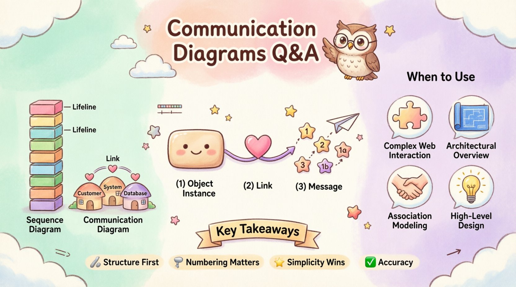
A Communication Diagram, often referred to as a Collaboration Diagram in earlier Unified Modeling Language (UML) versions, is a type of interaction diagram. It focuses on the structural organization of objects and the messages they exchange. Unlike other diagrams that prioritize time sequences, this view emphasizes the relationships and connections between instances.
- Primary Focus: How objects relate to one another physically or logically within the architecture.
- Key Element: The messages passed between these connected objects.
- Visual Style: Objects are represented as nodes, and links represent the connections between them.
This diagram type helps developers and stakeholders understand the topology of a system without getting bogged down in the chronological order of every single event. It answers the question: “Who talks to whom?” rather than “What happens first?”
🔄 How Does It Differ From a Sequence Diagram?
Many professionals confuse Communication Diagrams with Sequence Diagrams because both model interactions. However, their strengths lie in different areas. Choosing the right tool depends on what aspect of the system you need to illuminate.
| Feature | Communication Diagram | Sequence Diagram |
|---|---|---|
| Primary Emphasis | Structural relationships and object links | Temporal order and timing of messages |
| Layout | Organized by object proximity or hierarchy | Organized by vertical time axis |
| Readability | Better for seeing overall connections | Better for seeing step-by-step flow |
| Complexity | Can get messy with many objects | Can become vertical and lengthy |
If you need to show the lifecycle of a request, a sequence diagram is often preferred. If you need to show the architecture of the interaction partners, the communication diagram is the superior choice.
🔗 What Are the Core Components of This Diagram?
To create an effective diagram, you must understand the building blocks. Each element serves a specific purpose in defining the interaction model.
1. Objects and Instances
Objects are depicted as rectangles. They represent specific instances of classes participating in the interaction. You might see a label like Customer:Client or Order:Factory. These names indicate the role the object plays in the specific scenario.
- Instance Name: Identifies the specific object (e.g.,
c1,o1). - Class Name: Defines the type of object (e.g.,
Customer,Order).
2. Links
Links are the lines connecting objects. They represent the association relationships that allow one object to know about another. A link must exist for a message to be sent. If two objects are not connected by a link, they cannot interact directly.
- Direction: Links are typically bidirectional, allowing messages to flow either way.
- Role Names: Sometimes links are labeled with the role name from the class definition (e.g., “owns”, “manages”).
3. Messages
Messages are the arrows indicating the flow of information. They are labeled with numbers to indicate the sequence of execution. Unlike sequence diagrams, the numbers are placed near the arrow, not along a vertical axis.
- Operation Name: The function or method being called (e.g.,
placeOrder()). - Return Value: Often shown as a dashed arrow returning from the recipient.
- Activation: While less explicit than in sequence diagrams, you can imply processing time.
📝 How Do You Determine the Order of Messages?
One of the most common questions is how to represent time. Communication diagrams use numeric labels on the message arrows. This numbering system establishes the sequence of execution.
- Sequential Numbers: Messages are numbered 1, 2, 3, etc., based on when they occur.
- Parallel Execution: If two messages happen at the same time, they might share a parent number (e.g., 1a, 1b).
- Recursion: If an object calls itself, the number increases, but the arrow loops back to the same object.
Consider a scenario where a User requests a Profile.
- Message 1:
UsersendsgetProfile()toSystem. - Message 2:
SystemsendsfetchData()toDatabase. - Message 3:
DatabasereturnsdatatoSystem. - Message 4:
SystemreturnsProfiletoUser.
This numbering ensures that anyone reading the diagram knows the exact order of operations without needing to trace a vertical timeline.
🧩 When Should You Use a Communication Diagram?
Not every interaction needs a diagram. Knowing when to deploy this specific type saves time and reduces documentation clutter. Here are the ideal scenarios for use.
- Complex Object Structures: When you have many objects interacting in a web, a sequence diagram becomes a tall, unreadable wall of text. A communication diagram spreads them out, showing the network.
- Architectural Reviews: When presenting to stakeholders who care about system topology rather than code-level timing.
- Defining Associations: When you need to prove that an object has access to another object before a method call occurs.
- High-Level Design: During the early phases of design where the logic is more important than the precise timing.
Conversely, if you are debugging a race condition or a timeout issue, a sequence diagram is likely more appropriate.
🚫 What Are the Common Mistakes to Avoid?
Even experienced designers make errors when creating these diagrams. Avoiding these pitfalls ensures your documentation remains accurate and useful.
1. Ignoring Links
Do not draw a message arrow between two objects that do not have a link connecting them. In UML semantics, an object cannot send a message to another object unless it holds a reference to it. If you draw a message without a link, the diagram is technically invalid.
2. Overcrowding
Trying to fit the entire system into one diagram leads to a “spaghetti diagram.” If the number of objects exceeds a manageable limit (usually around 10-15), split the diagram into logical sub-systems or scenarios.
3. Ambiguous Message Labels
Do not use generic terms like “process data.” Be specific. Use validateInput() or calculateTax(). Ambiguity creates confusion during implementation.
4. Missing Return Messages
For every synchronous message, there should ideally be a corresponding return message. If a method is called, it returns something, even if it is null or void. Showing the return path completes the interaction loop.
🛠️ How Do You Handle Loops and Conditions?
Real-world systems are rarely linear. They involve loops, decisions, and alternative paths. Communication diagrams handle these using specific notations.
- Iteration (Loops): You can label a message with a guard condition like
[for each item]. This indicates the message is sent multiple times. - Selection (If/Else): You can use a guard condition like
[if valid]to indicate a message is only sent under certain conditions. - Alt/Opt Frames: While less common than in sequence diagrams, you can annotate the diagram to show alternative flows (e.g.,
altfor alternative,optfor optional).
For example, if a PaymentProcessor retries a transaction, you might label the message retryTransaction [count < 3]. This clearly communicates the logic without needing a separate state chart.
🔍 How Do You Read Multiplicity and Cardinality?
Multiplicity defines how many instances of an object can participate in the interaction. This is often visible in the class structure, but it impacts the diagram design.
- 1:1: One object connects to exactly one other object.
- 1:*: One object connects to many instances of another object.
- 0..1: An object may or may not exist (optional).
When drawing the diagram, if you have a 1:* relationship, you might draw a single line representing the link, but acknowledge in the notes that the message could be broadcast to multiple recipients. This prevents the diagram from becoming cluttered with hundreds of individual lines.
📐 What Are the Best Practices for Layout?
A messy diagram is a useless diagram. Follow these layout principles to ensure readability.
- Centralize Key Objects: Place the initiating object in the center or top-left.
- Minimize Crossing Lines: Arrange objects so that message arrows do not cross each other unnecessarily. Crossing lines add cognitive load.
- Use Color Sparingly: While text is black and white, you can use colors to group related objects (e.g., all database objects in blue, all user interface objects in green). However, keep it consistent.
- Group by Function: Cluster objects that work together closely. This creates "zones" of activity.
🤝 How Does This Aid Team Collaboration?
Documentation is not just for the future; it is for the present team. Communication diagrams serve as a shared language.
- Onboarding: New developers can see the system architecture quickly without reading thousands of lines of code.
- Code Reviews: Reviewers can check if the implementation matches the designed interaction model.
- Testing: QA engineers can use the diagrams to generate test cases based on the defined message flows.
By agreeing on the diagram first, teams reduce the risk of misinterpretation during the coding phase. It acts as a contract between design and implementation.
🔄 Can You Update It During Development?
Yes, diagrams should evolve. As requirements change, the diagram should reflect those changes. If a new service is added to the architecture, update the diagram to include the new object and the links it requires.
However, maintain version control for your diagrams. A significant change in interaction flow should be documented as a revision. This history helps in understanding why certain decisions were made in the past.
🧠 What Is the Relationship With Design Patterns?
Communication diagrams are excellent for visualizing design patterns.
- Observer Pattern: You can show one subject object sending messages to multiple observer objects.
- Factory Pattern: You can illustrate the creation message sent to a factory object.
- Facade Pattern: You can show a client sending a simple message to a facade, which then distributes messages to complex subsystem objects.
Seeing these patterns in diagram form helps developers understand the structural intent behind the code. It bridges the gap between abstract theory and concrete implementation.
📉 What Are the Limitations?
Every tool has boundaries. Understanding the limitations of Communication Diagrams prevents misuse.
- Time Sensitivity: They are poor at showing deadlines or execution time.
- Concurrency: Showing complex concurrent threads is difficult without creating a cluttered mess.
- State Changes: They do not explicitly show the state of an object before and after a message, only the interaction.
For these specific needs, combine the Communication Diagram with State Machine Diagrams or Sequence Diagrams to get a complete picture.
🎯 Summary of Key Takeaways
Communication Diagrams are a vital tool in the software design arsenal. They provide a structural view of interactions that complements the temporal view of sequence diagrams.
- Structure First: Focus on the links and connections.
- Numbering Matters: Use message numbers to define order.
- Simplicity Wins: Avoid clutter and splitting complex systems.
- Accuracy: Ensure links exist before drawing messages.
By adhering to these principles, you create documentation that stands the test of time. It remains a reliable reference point for developers, testers, and architects alike. The goal is clarity, not complexity. When done right, these diagrams simplify the understanding of complex systems without requiring deep technical expertise to read.
Keep your diagrams updated, your labels precise, and your focus on the relationships between objects. This approach leads to better software architecture and fewer integration issues down the line.