
Within the context of software engineering coursework and academic research, the ability to model system interactions is a fundamental competency. Communication diagrams serve as a critical visual tool for representing how objects within a system interact to fulfill specific behaviors. Unlike sequence diagrams, which prioritize time-ordered events along a vertical axis, communication diagrams emphasize the structural organization of objects and the relationships between them. For students submitting academic projects, precision in these diagrams is not merely aesthetic; it reflects a deep understanding of the underlying architecture.
Creating a high-quality communication diagram requires adherence to established standards while maintaining clarity for the reader. In academic settings, graders often look for specific indicators of competence, such as correct notation, logical flow, and alignment with the class diagram. This guide outlines five essential rules for drawing communication diagrams that align with academic expectations and industry standards. By following these principles, you ensure your work communicates technical intent clearly and effectively.
1. Understanding the Communication Diagram Context 🧩
Before applying specific drawing rules, it is necessary to understand the purpose of the diagram. A communication diagram, sometimes referred to as a collaboration diagram in older UML versions, illustrates the interactions between objects. It shows the sequence of messages passed between instances of classes. In academic projects, these diagrams are typically used to demonstrate the logic behind a specific use case or operation.
When constructing these diagrams for university submissions, consider the following foundational aspects:
- Focus on Objects: Unlike sequence diagrams that focus on lifelines, communication diagrams focus on the object instances themselves.
- Relationship Over Time: While sequence diagrams show time progression, communication diagrams show the structural path of the interaction.
- Message Identification: Each arrow represents a message sent from one object to another.
- Contextual Accuracy: The diagram must align with the requirements defined in the project specification.
Failure to grasp this distinction often leads to diagrams that look correct visually but fail to meet the technical requirements of the assignment. Academic evaluators expect you to know when to use this diagram type over others. If the structural relationship is more important than the timing, this is the appropriate choice.
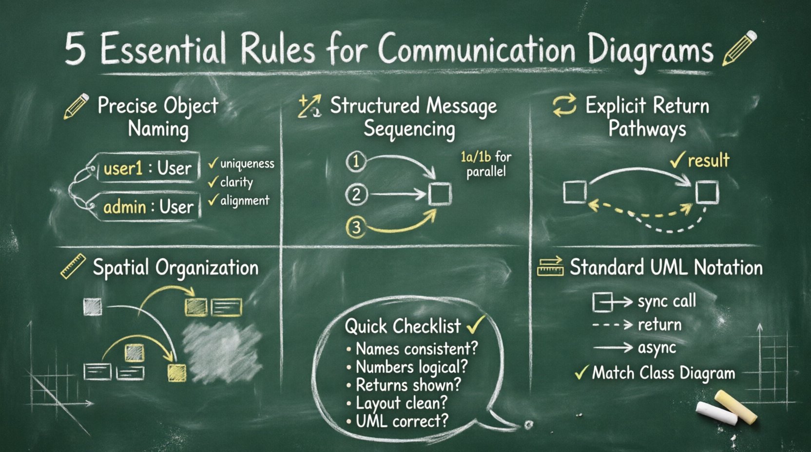
Rule 1: Precise Object Instance Naming 🏷️
The first rule concerns the identification of the actors within your system. Every object depicted in a communication diagram must have a clear and consistent name. These names are not arbitrary labels; they represent specific instances of classes defined in your class diagram.
Instance Naming Conventions
In academic projects, consistency is key. When you create an instance of a class, such as User, the instance name in the diagram should follow a standard convention. Typically, this involves using a colon followed by the class name, or simply the class name if the context is clear. However, specific academic guidelines may vary, so always check the project rubric.
- Uniqueness: If multiple instances of the same class exist (e.g., multiple users), they must be distinguished. Use suffixes like
user1,user2, oradmin. - Clarity: Avoid generic names like
obj1orsystemunless the object is truly generic. Specific names aid in understanding the business logic. - Alignment: Ensure the names match the class names in your documentation. A mismatch here suggests a disconnect between your design and implementation.
The Role of Multiplicity
Sometimes, an object represents a collection of items. In communication diagrams, you may need to indicate that an object holds multiple instances of another object. This is often done by specifying the multiplicity near the association line or by creating multiple distinct instances in the diagram. For academic work, showing this detail demonstrates an understanding of data relationships.
Consider a scenario where a Library object holds multiple Book objects. If your diagram shows a message passing from the Library to a single Book, you must clarify if this applies to one specific book or all books. Precision in naming and instance representation prevents ambiguity during the review process.
Rule 2: Structured Message Sequencing 🔢
The second rule addresses the ordering of messages. Even though communication diagrams do not explicitly display time on an axis, the order of execution is implicit in the numbering of the messages. This numbering system is crucial for conveying the flow of control.
Message Numbering Standards
Every message sent between objects should have a unique identifier. This identifier is typically a number placed at the head of the arrow or near the label of the interaction. The numbering provides a logical sequence that the reader can follow.
- Sequential Logic: Message 1 must occur before Message 2, unless branching logic is involved. This ensures the reader understands the flow of execution.
- Parallel Actions: If two objects act simultaneously, you may use the same number for both messages (e.g., 1a and 1b), though strict sequential numbering is often safer for academic submissions to avoid confusion.
- Self-Invocation: If an object calls a method on itself, this must be numbered distinctly. It represents a step in the internal processing of that object.
Control Flow vs. Data Flow
It is important to distinguish between the control flow (who calls whom) and the data flow (what information is passed). The message numbers primarily indicate control flow. However, the labels on the arrows indicate the data or method name being invoked.
In academic projects, clarity regarding this distinction is often a grading criterion. Ensure that the message labels describe the action clearly. For example, use calculateTotal() rather than do math. This level of detail shows professional attention to design patterns.
Rule 3: Explicit Return Pathways ↩️
The third rule focuses on how information is returned. In many diagrams, developers forget to show the response path. In a communication diagram, return messages are just as important as request messages because they complete the interaction cycle.
Visualizing Returns
Return messages are typically represented by dashed lines with an open arrowhead. They point back to the object that initiated the call. If you omit return paths, the diagram may appear incomplete or suggest that the system hangs after the initial request.
- Dashed Lines: Use dashed lines for return values to distinguish them from requests.
- Arrow Direction: The arrow must point from the receiver back to the sender.
- Labeling: If a value is returned (e.g., a boolean result or a data object), label the return arrow with the value type.
Handling Null Returns
Academic scenarios often involve error handling. If a method returns a null value or an error state, this should ideally be represented. While simple diagrams might skip this, a comprehensive diagram for a project should account for failure paths. You can annotate the return arrow to indicate error or invalid if the interaction fails. This demonstrates robust system thinking.
For example, if a Database object cannot find a User, it returns a null object. Showing this return path in the diagram validates that you have considered edge cases, which is a significant advantage in academic assessments.
Rule 4: Spatial Organization and Layout 📐
The fourth rule concerns the visual arrangement of the diagram. A communication diagram is a graph, and like any graph, its readability depends on how nodes (objects) and edges (messages) are arranged. Poor layout can obscure the logic of the system.
Avoiding Line Crossings
One of the primary goals of diagramming is to reduce cognitive load. Crossing lines force the reader’s eye to jump back and forth, making it difficult to trace the message path. Whenever possible, arrange objects so that connections are direct and do not intersect unnecessarily.
- Cluster Related Objects: Place objects that interact frequently near each other.
- Use Hierarchy: If there is a central controller object, place it in the center with peripheral objects around it.
- Curved Lines: If straight lines cause crossings, use curved lines to route messages around other objects.
Spacing and Whitespace
Do not cram objects together. Adequate whitespace allows the diagram to breathe and makes it easier to read. In academic submissions, a cluttered diagram is often perceived as a lack of effort or organization. Ensure that the text labels are legible and not overlapping with arrows or other objects.
Consider the aspect ratio of your canvas. If the diagram is too wide, it may look fragmented. If it is too tall, the flow may feel disjointed. Adjust the positions of the objects to create a balanced visual composition that guides the eye naturally from the start of the interaction to the end.
Rule 5: Consistency and Standard Notation 📏
The fifth rule is about adherence to the Unified Modeling Language (UML) standards. While some flexibility exists in tooling, the notation itself should remain consistent with the official UML specifications. Deviating from standard notation can lead to confusion and may result in point deductions in academic settings.
Standard Arrowheads
Ensure you use the correct arrow types for the correct message types.
- Solid Arrow: Represents a synchronous call or a standard message.
- Dashed Arrow: Represents a return message or a signal.
- Open Arrow: Represents an asynchronous signal or a return value.
Using the wrong arrow type changes the semantic meaning of the diagram. For instance, using a solid arrow for a return message implies a synchronous call, which is technically incorrect. Precision in notation is a hallmark of a well-designed system model.
Alignment with Documentation
Your diagram must align with the rest of your documentation. If your class diagram defines a class as Customer, do not label it as User in the communication diagram unless they are explicitly the same. Inconsistencies between diagrams suggest a lack of coherence in the overall design.
Additionally, ensure that the relationship types (association, aggregation, composition) shown in your class diagram are respected in the communication diagram. If two classes are not associated, they should not be sending messages directly to each other unless mediated by another object.
Comparison: Communication vs. Sequence Diagrams 📊
To further clarify the application of these rules, it is helpful to compare communication diagrams with sequence diagrams. Both serve similar purposes but prioritize different aspects of the interaction.
| Feature | Communication Diagram | Sequence Diagram |
|---|---|---|
| Primary Focus | Structural relationships between objects | Time sequence of interactions |
| Layout | Flexible; objects can be placed anywhere | Vertical timeline; lifelines at top |
| Message Order | Indicated by message numbers | Indicated by vertical position |
| Complexity | Better for complex object structures | Better for long sequences of events |
| Readability | Requires tracing lines to follow flow | Easy to read top-to-bottom |
When selecting which diagram to include in an academic project, choose the one that best highlights the specific aspect of the system you are analyzing. If the assignment focuses on the architecture, the communication diagram is the superior choice.
Common Mistakes in Student Submissions ⚠️
Even with the best intentions, errors occur. Being aware of common pitfalls can help you avoid them before submitting your work.
- Mixing Notation Types: Combining sequence diagram elements (like activation bars) into a communication diagram creates confusion. Stick to one style per diagram.
- Missing Multiplicity: Failing to show that an object can hold multiple items leads to ambiguity in the logic.
- Unclear Labels: Using vague terms like
processorhandlewithout specifying the action makes the diagram useless for implementation. - Disconnected Objects: Including objects that do not participate in the interaction adds clutter and distracts from the main flow.
- Ignoring Returns: As mentioned in Rule 3, omitting return paths makes the interaction look incomplete.
Integrating Diagrams into Reports 📝
A communication diagram does not exist in isolation. It is part of a larger documentation set. When including the diagram in your academic report, follow these best practices to ensure it enhances your presentation.
- Captions: Always provide a descriptive caption below the diagram, such as Figure 1: Interaction between User and Order System.
- References: Refer to the diagram in the text. Do not assume the reader will find it obvious. Explain what the diagram demonstrates.
- Resolution: Ensure the image is high resolution. Blurry diagrams look unprofessional and can be hard to read.
- Consistency: If you use a specific font style for text in the diagram, keep it consistent across all diagrams in the document.
By treating the diagram as an integral part of the narrative, you elevate the quality of your entire project. The diagram should support the text, and the text should explain the diagram.
Final Considerations for Academic Success ✅
Adhering to these five rules provides a strong foundation for creating communication diagrams that meet academic standards. Remember that the goal is not just to produce a drawing, but to model the logic of a system accurately. The effort you put into precision, layout, and notation directly impacts the clarity of your design.
Before finalizing your submission, review your work against this checklist:
- Are all object names consistent with the class diagram?
- Are message numbers sequential and logical?
- Are return messages clearly distinguished?
- Is the layout clean with minimal line crossings?
- Does the notation strictly follow UML standards?
By systematically addressing each of these points, you ensure that your communication diagrams serve their intended purpose. They become powerful tools for communication, not just decorative elements. In the field of software engineering, clarity is currency. A well-drawn diagram saves time, reduces errors, and demonstrates your mastery of the subject matter.
Focus on the logic. Prioritize the relationships. Maintain the standards. With these principles in mind, your academic projects will reflect the rigor and professionalism expected in the industry.