
In the complex ecosystem of modern software engineering, information often gets lost in translation between requirements, code, and design. Developers frequently rely on text-based specifications, which can lead to misinterpretation of complex system behaviors. While text has its place, visual representations provide a shared language that bridges gaps between technical and non-technical stakeholders. Among the various modeling techniques available, the Communication Diagram offers a distinct advantage for teams seeking clarity in object interactions. This guide explores the tangible advantages of integrating these diagrams into the development lifecycle without the need for hype or marketing fluff.
🧠 Understanding the Core Purpose of Communication Diagrams
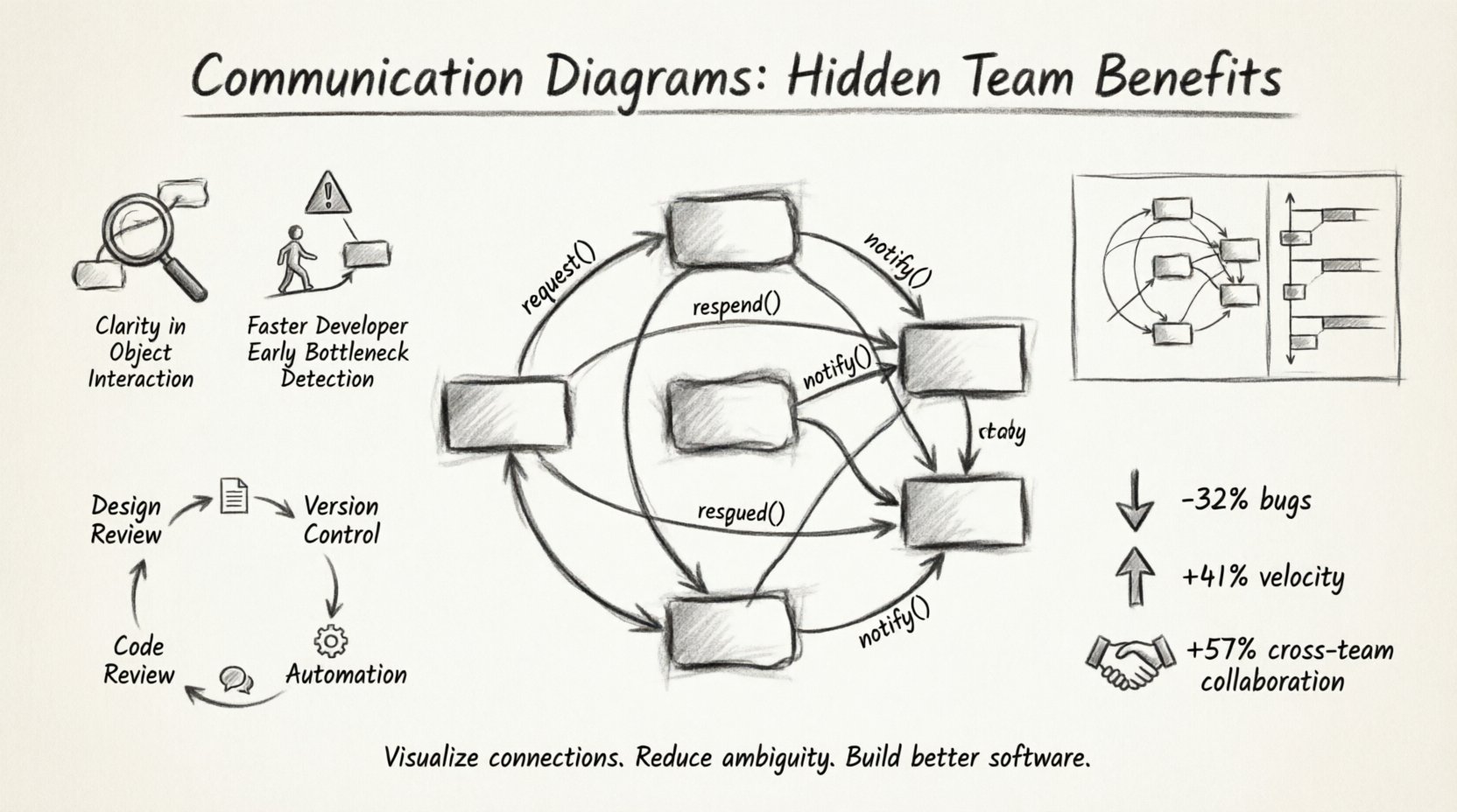
A Communication Diagram is a type of Unified Modeling Language (UML) diagram that focuses on the structural organization of objects and their relationships. Unlike other interaction diagrams that prioritize the sequence of events over time, this specific visual format emphasizes the links between objects and the messages exchanged. It answers the question: Who talks to whom, and what do they say?
When a team designs a system, they are essentially designing a network of responsibilities. Each object or component holds specific data and performs specific actions. A Communication Diagram maps these connections spatially. This spatial arrangement allows engineers to see the topology of the interaction at a glance. The diagram consists of three primary elements:
- Objects: Represented as boxes, these denote the instances or classes involved in the interaction.
- Links: Lines connecting the objects, representing the structural relationships or associations.
- Messages: Arrows or labels on the links, indicating the flow of data or method calls between the connected entities.
By visualizing these components, teams can move beyond abstract code snippets and see the actual flow of control within the application architecture.
🚀 Why Teams Struggle Without Visual Interaction Models
Text-heavy documentation is prone to ambiguity. When a developer reads a requirement that states “The user profile must update the settings,” the mental model varies based on experience level. Does this mean a direct database write? A service call? An event trigger? Without a visual aid, assumptions fill the void.
Common friction points in software development include:
- Context Switching: Developers constantly jump between code files to trace logic paths. Visual diagrams consolidate this context.
- Onboarding Delays: New team members spend weeks reading code to understand the system topology before they can contribute meaningfully.
- Refactoring Risks: Changing a component without understanding its dependencies can cause cascading failures.
- Architecture Drift: Over time, the implemented code often diverges from the original design intent, leading to technical debt.
Introducing a structured visual approach mitigates these risks by providing a single source of truth regarding interactions.
🔍 Hidden Benefit 1: Clarity in Object Interaction
The primary utility of a Communication Diagram lies in its ability to show relationships without the strict vertical timeline of a sequence diagram. In complex systems, the order of execution is sometimes less critical than the existence of the link itself. This diagram type excels at showing connectivity.
Consider a scenario involving a distributed system with multiple microservices. A developer needs to understand how an authentication service interacts with a user profile service. In a text log, this might look like a stack trace. In a diagram, it is a direct line between two nodes. This clarity helps in identifying:
- Direct Dependencies: Which services call which others directly?
- Indirect Dependencies: Are there intermediaries involved?
- Message Types: Are calls synchronous (blocking) or asynchronous (fire-and-forget)?
By focusing on the structure of the interaction, teams can spot tightly coupled components that should be decoupled, or identify missing error handling paths in the interaction flow.
👥 Hidden Benefit 2: Faster Onboarding for New Developers
Knowledge transfer is a bottleneck in many engineering organizations. Senior engineers often possess tribal knowledge that isn’t documented in the codebase. When a new hire joins, the ramp-up time can consume significant resources.
Communication diagrams serve as high-level maps for these newcomers. Instead of reading hundreds of lines of code to understand a feature, a new developer can review the diagram to see:
- The Entry Point: Where does the request enter the system?
- The Path: What objects handle the request along the way?
- The Exit Point: How is the response constructed or returned?
This reduces the cognitive load required to navigate the codebase. It allows the new engineer to form a mental model of the system architecture before diving into implementation details. Over time, this leads to fewer questions for senior staff and a more autonomous team.
🛑 Hidden Benefit 3: Identifying Bottlenecks Early
Performance issues often stem from architectural decisions made early in the development process. If a single object is responsible for too many interactions, it becomes a bottleneck. A Communication Diagram makes these hotspots visible immediately.
When reviewing a diagram, look for:
- Central Nodes: Objects with a high number of incoming and outgoing links. These are often single points of failure.
- Circular Dependencies: Loops where Object A calls Object B, which calls Object C, which eventually calls Object A back. This can lead to infinite recursion or deadlock.
- Deep Call Chains: Interactions that pass through too many layers of abstraction before reaching the core logic.
Addressing these structural issues during the design phase is significantly cheaper than fixing them in production. It allows the team to refactor the design before a single line of production code is written.
📊 Communication Diagrams vs. Sequence Diagrams
Teams often confuse Communication Diagrams with Sequence Diagrams. Both are interaction diagrams, but they serve different analytical purposes. Choosing the right tool depends on the specific information the team needs to convey.
| Feature | Communication Diagram | Sequence Diagram |
|---|---|---|
| Primary Focus | Structural relationships and object links. | Temporal ordering of messages over time. |
| Visual Layout | Objects are placed spatially based on relationships. | Objects are placed vertically; time flows down. |
| Best Used For | Understanding system topology and connectivity. | Understanding execution flow and timing. |
| Readability | Higher for complex networks of objects. | Higher for linear processes and time-based logic. |
| Complexity | Can become cluttered if too many links exist. | Can become long and narrow if many messages occur. |
Using the correct diagram type ensures that the documentation remains useful. If the goal is to show how data flows through a pipeline, a Sequence Diagram might be better. If the goal is to show which services depend on each other, a Communication Diagram is superior.
🛠️ Implementation Strategies for Engineering Teams
Adopting this modeling practice requires a shift in workflow. It is not enough to create a diagram once and file it away. The documentation must remain alive and relevant to be effective.
1. Integrate into Design Reviews
Before development begins, the architecture team should present the Communication Diagram. This serves as a peer review mechanism. If a developer cannot explain the diagram to a peer, the design is likely too complex or unclear. This ensures that the code written matches the intended architecture.
2. Keep Diagrams Version Controlled
Just like source code, diagrams should be stored in the version control system. This allows teams to track changes in the architecture over time. When a refactor happens, the diagram should be updated to reflect the new reality. This creates an audit trail of architectural evolution.
3. Use Diagrams in Code Reviews
When reviewing a pull request, developers can compare the new code against the existing Communication Diagram. If the code introduces a new interaction that isn’t documented, it flags a potential oversight. This encourages developers to think about the system impact before committing changes.
4. Automate Where Possible
While manual creation offers flexibility, some teams prefer generating diagrams from code annotations or configuration files. This reduces the maintenance burden. However, it is crucial to ensure the generated output accurately reflects the logical intent, not just the physical structure.
🚧 Common Pitfalls to Avoid
Even with the best intentions, teams can misapply this technique. Avoiding common mistakes ensures the diagrams remain valuable assets rather than clutter.
- Over-Engineering: Do not diagram every single method call. Focus on the high-level interactions that define the system boundaries. Too much detail obscures the main structure.
- Ignoring Updates: A diagram that is out of date is worse than no diagram. It provides false confidence. Commit to updating the diagram whenever significant architectural changes occur.
- Confusing Structure with Logic: Remember that this diagram shows who talks to whom, not necessarily the business logic inside the call. Keep the focus on the interaction, not the implementation details.
- Lack of Standardization: Ensure all team members understand the notation. Use consistent naming conventions for objects and messages to prevent confusion.
📈 Measuring Impact on Velocity
How does one quantify the value of documentation? While it is hard to measure directly, teams can observe specific metrics that improve over time.
- Reduced Bug Rates: Fewer integration errors suggest better understanding of interactions.
- Faster Time-to-Market: New features are implemented faster when the architecture is clear.
- Lower Rework: Less time spent fixing design flaws discovered late in the cycle.
- Improved Collaboration: Fewer meetings spent clarifying requirements because the visual aid speaks for itself.
These metrics indicate that the team is moving towards a more stable and predictable development environment. The communication diagram acts as a stabilizer, reducing the variance in system behavior.
🔄 Maintenance and Lifecycle Management
Documentation is often the first thing to be cut when deadlines loom. This short-term thinking leads to long-term technical debt. To prevent this, treat the Communication Diagram as a living artifact.
Consider the following lifecycle stages:
- Creation: Drafted during the design phase. Focus on the big picture.
- Validation: Reviewed by architects and lead developers. Ensure all critical paths are covered.
- Implementation: Developers use the diagram as a guide while writing code.
- Verification: QA and testing teams use the diagram to plan test cases based on interaction paths.
- Maintenance: Updated during refactoring or feature addition.
By embedding this process into the standard workflow, the diagram becomes an integral part of the product, not an afterthought.
🤝 Enhancing Cross-Functional Communication
Software development is not just about code; it is about people. Product managers, designers, and stakeholders often lack the technical depth to read code. A Communication Diagram translates technical complexity into a visual format that is accessible to a broader audience.
When discussing a new feature with a product owner, showing a diagram helps them visualize the impact of their request. They can see if a simple button click triggers a complex series of background processes. This transparency builds trust and allows for more informed decision-making regarding scope and priority.
🌐 The Broader Impact on System Architecture
Consistent use of these diagrams across multiple teams promotes a cohesive architectural style. When different teams work on different modules, the communication links between them must be well-defined. A standardized diagramming approach ensures that these boundaries are clear.
This is particularly important in large organizations with multiple squads. Without a shared visual language, teams may build incompatible interfaces. The diagram acts as a contract between teams, defining the expected behavior of the interaction points.
📝 Final Thoughts on Visual Engineering
Building software is an act of communication. The code communicates with the machine, but the design communicates with the team. Communication Diagrams provide a powerful medium for this exchange. They reduce ambiguity, speed up onboarding, and highlight structural risks before they become costly problems.
By prioritizing visual clarity alongside code quality, teams can build systems that are not only functional but also maintainable and understandable. The effort invested in creating and maintaining these diagrams pays dividends in reduced friction and higher team velocity. As the complexity of software systems grows, the need for clear, structured visual aids becomes increasingly critical.
Start small. Pick a module that causes confusion and draw the diagram. Share it with the team. Ask for feedback. Iterate. Over time, this practice will become a natural part of how the team thinks about and builds software. The result is a more resilient architecture and a more aligned development process.