
When you are studying software engineering or system design, few things strike more fear into the heart of a student than the UML communication diagram. While the sequence diagram often gets the spotlight for its time-based clarity, the communication diagram offers a different perspective. It focuses on the relationships between objects rather than the strict ordering of messages. However, understanding the structure is only half the battle. The other half is knowing exactly what an instructor looks for when assessing your work.
This guide breaks down the specific criteria professors use to evaluate communication diagrams. It covers the technical requirements, the common pitfalls that lead to point deductions, and the structural standards expected in academic settings. By understanding the underlying logic of object interaction, you can create diagrams that are not just visually correct, but technically sound.
🧩 Understanding the Core Purpose
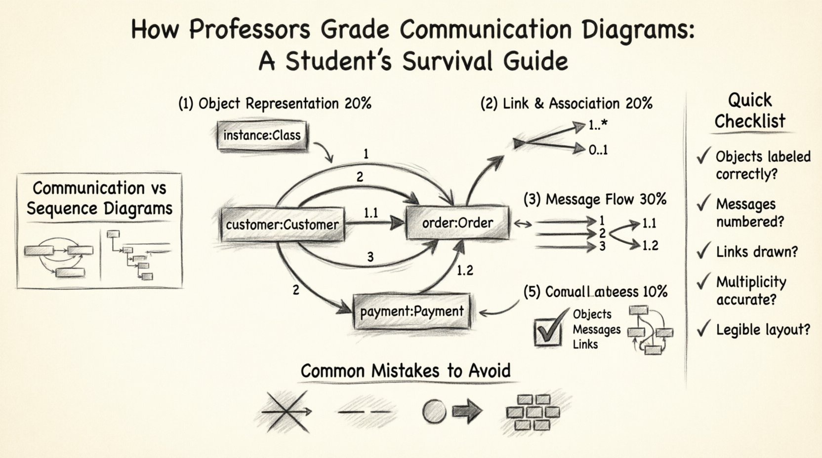
A communication diagram (formerly known as a collaboration diagram) illustrates how objects interact within a system to perform a specific task. Unlike a sequence diagram, which uses a vertical timeline, this type of diagram maps objects horizontally and uses numbered arrows to indicate the order of messages. Professors grade these diagrams based on accuracy, clarity, and adherence to UML standards.
When you submit a diagram for assessment, the instructor is not just checking if you drew boxes and arrows. They are verifying that you understand the architecture of the system. They want to see:
- Correct Object Identification: Are the classes represented correctly?
- Accurate Multiplicity: Do the links show the correct cardinality?
- Message Sequencing: Are the numbers on the arrows logical?
- Visual Clarity: Is the diagram readable without excessive overlap?
Failure to address any of these areas often results in significant point deductions. The following sections detail exactly how these elements are scrutinized.
📋 The Grading Rubric Breakdown
To help you visualize the assessment process, here is a breakdown of the typical grading criteria used in academic software engineering courses. This table outlines the weight of each section and the specific requirements for full marks.
| Criteria Category | Weight | Key Requirements for Full Marks |
|---|---|---|
| Object Representation | 20% | Objects must be labeled with class name and instance name (if applicable). Stereotypes should be used correctly. |
| Link and Association | 20% | Links must exist between interacting objects. Multiplicity must be accurate on both ends of the link. |
| Message Flow | 30% | Messages must be numbered sequentially. Arguments and return values must be clearly labeled. |
| Visual Layout | 20% | Lines should not cross unnecessarily. Text must be legible. The diagram should tell a coherent story. |
| Completeness | 10% | All necessary objects for the scenario must be present. No critical interactions should be missing. |
🛠️ Critical Elements Professors Look For
When grading your work, an instructor will zoom in on specific technical details. These are the elements that separate a passing grade from a high distinction grade.
1. Object Naming Conventions
Every box in your diagram represents an object. In a strict academic context, the label should follow a specific format. Usually, this is instanceName : ClassName. For example, customer : Customer.
- Instance Name: Often lowercase (e.g.,
c1,order1). - Class Name: Always capitalized (e.g.,
Customer,Order). - Stereotypes: If using specific types like control or boundary objects, these should be indicated clearly.
If you label a box simply as Customer without an instance name, you lose points for ambiguity. The professor needs to know which specific entity in the system is performing the action.
2. Link Multiplicity
Communication diagrams rely heavily on links. These links represent associations between classes. Professors check the multiplicity markers at the ends of these links.
- One-to-One (1:1): Used when a single object is related to exactly one other.
- One-to-Many (1..*): Common in scenarios where a customer has multiple orders.
- Zero-to-Many (0..*): Indicates an optional relationship.
Incorrect multiplicity suggests a misunderstanding of the domain model. If a link implies a one-to-one relationship where many are possible, the diagram fails to reflect the system’s reality.
3. Message Numbering
This is the defining feature of a communication diagram. Since there is no vertical timeline, the order of events is defined by the numbers on the arrows.
- Sequential Logic: Message 1 must happen before Message 2. If Message 2 depends on the result of Message 1, the numbering must reflect this dependency.
- Sub-calls: If a message triggers a nested call (e.g., message 1.1), the numbering must be indented or formatted consistently to show hierarchy.
- Return Messages: These are often dashed arrows. They should be numbered but sometimes labeled differently to distinguish them from synchronous calls.
4. Message Arguments and Returns
A complete diagram shows data flow, not just control flow. Professors look for the arguments passed between objects.
- Input Parameters: Should be listed on the message arrow (e.g.,
calculate(total)). - Return Values: Should be indicated, often with a dashed line or specific notation.
Leaving out parameters makes the diagram abstract to the point of uselessness. It shows you know the objects talk, but not what they say.
🚫 Common Mistakes That Cost Points
Students often lose marks due to recurring errors. Being aware of these pitfalls can save you from unnecessary deductions.
- Ignoring Object Orientation: Drawing a diagram that looks like a flowchart. Remember, this is about objects interacting, not just steps in a process. Avoid starting and ending with “Start” and “End” circles unless they represent specific system objects.
- Crossing Lines: A cluttered diagram is hard to grade. If lines cross, use bends or curves to make them distinct. If lines are too messy, readability is compromised.
- Missing Links: You cannot draw a message arrow between two objects unless there is a link connecting them in the class diagram. If Object A talks to Object B, there must be a line drawn between them.
- Incorrect Arrow Types: Solid arrows usually mean synchronous calls. Dashed arrows mean returns or asynchronous calls. Mixing these up confuses the timing logic.
- Overcrowding: Trying to fit every possible interaction into one diagram. If a scenario is too complex, break it into multiple diagrams rather than creating a spaghetti-like mess.
🔄 Communication vs. Sequence Diagrams
Students often confuse these two diagram types. While they convey similar information, the grading focus differs slightly.
| Feature | Communication Diagram | Sequence Diagram |
|---|---|---|
| Focus | Object relationships and structure. | Time ordering and lifelines. |
| Layout | Objects are placed spatially based on connections. | Objects are placed in a vertical line. |
| Grading Focus | Multiplicity and link accuracy. | Activation bars and precise timing. |
| Numbering | Explicit numbers on arrows. | Implicit vertical order. |
If a professor asks for a communication diagram, do not submit a sequence diagram. They are looking for the spatial relationship of objects. The spatial arrangement should reflect the domain model.
📝 Step-by-Step Construction Workflow
To ensure your diagram meets all grading criteria, follow this structured workflow. This method helps you avoid missing elements and ensures logical consistency.
- Analyze the Use Case: Read the scenario description. Identify the key actors and the primary goal. What is the system supposed to do?
- Identify Objects: List all the classes involved in this specific interaction. Do not include classes that are not directly involved.
- Draw Links: Place the objects on the canvas. Connect them with lines. Add multiplicity markers to each end of the links. This is the foundation.
- Identify Messages: Determine the sequence of actions. Which object initiates the first action? Which objects respond?
- Assign Numbers: Number the messages starting from 1. Ensure that nested calls use decimal numbering (e.g., 1.1, 1.2).
- Add Parameters: Label the arrows with the method names and arguments. Add return values where necessary.
- Review for Clarity: Check for overlapping lines. Adjust the position of objects to minimize crossings. Ensure text is legible.
✅ Pre-Submission Checklist
Before you hand in your assignment, run through this checklist. It covers the essential points that professors check first.
- Are all objects labeled correctly? (Instance : Class)
- Do all message arrows have numbers? (1, 2, 3…)
- Are the links drawn between interacting objects?
- Is the multiplicity accurate for each link?
- Are method names spelled correctly?
- Are return messages distinguished from calls? (Dashed line)
- Is the diagram legible without zooming in?
- Did you include all required objects from the prompt?
🧠 Why Structure Matters in Grading
It might seem like a minor detail, but the structure of your diagram tells the professor how you think. Software engineering is not just about writing code; it is about designing systems that are maintainable and understandable. A communication diagram is a snapshot of that design.
If your diagram is messy, the assumption is that your design is messy. If you miss a link, the assumption is that you do not understand how the objects are connected. If you number messages incorrectly, the assumption is that you do not understand the flow of control.
Professors are looking for evidence of logical thinking. They want to see that you can translate a written requirement into a visual model that accurately represents the system’s behavior. Every line you draw should have a purpose. Every number you place should indicate a specific event in time.
🎯 Advanced Tips for High Scores
If you want to go beyond the basics and secure a top grade, consider these advanced considerations.
- Grouping: If you have a complex system, consider grouping related objects together visually. This helps the reader understand the context of the interaction.
- Conditional Logic: If a scenario involves an “if” condition, indicate it clearly. Sometimes a small note near the arrow helps clarify that a message only occurs under specific circumstances.
- Consistency: Ensure your notation style is consistent throughout. If you use a specific font for labels, use it for all labels. If you use specific colors, use them for specific object types (e.g., boundary objects in blue).
- Context Notes: Sometimes adding a brief text note explaining a complex interaction can save the professor from guessing. Use this sparingly, but use it where ambiguity exists.
🔍 Deep Dive into Message Parameters
One area where students often lose the most points is in the description of message parameters. A method call is not just a trigger; it is a transfer of data.
When drawing a message arrow, you should write the method signature. For example, instead of just writing process, write process(amount, currency). This shows that the object knows what data it needs to function.
If a message returns data, you should indicate the return type. For example, return: status. While some notations use dashed lines with the return value, others use text labels. Follow the notation style taught in your course, but ensure the data flow is clear.
🛑 Handling Complex Scenarios
Not all scenarios fit into a single page. If a use case involves multiple steps or branching paths, do not force everything into one diagram.
- Split Diagrams: Create one diagram for the happy path (successful execution) and another for error handling.
- Focus on One Interaction: If the prompt asks for the “Order Processing” scenario, do not include the “User Login” scenario unless it is directly part of that process.
- Use Notes: If you need to reference an interaction that happens off-screen, use a note box to explain it.
Overcomplicating a diagram leads to confusion. Professors prefer a clear, focused diagram over a sprawling, confusing one. It is better to show a subset of the system perfectly than the whole system poorly.
📚 The Role of Documentation
While the diagram is the visual component, it is often accompanied by text. If your assignment requires an explanation of the diagram, ensure it matches the visual.
- Describe the Flow: Walk through the numbers. “First, the customer initiates the order. Second, the system validates the cart.”
- Explain the Objects: Briefly state the role of each object involved.
- Highlight Key Decisions: If a specific design choice was made (e.g., why a certain object handles the validation), explain it.
Consistency between your text and your diagram is crucial. If the text says Object A calls Object B, but the diagram shows Object C, you will lose significant marks.
🏁 Final Thoughts on Assessment
Grading communication diagrams is about verifying your understanding of object-oriented design principles. It is a test of your ability to model interactions without losing the structural context.
By focusing on the details—correct naming, accurate links, logical numbering, and clear parameters—you demonstrate that you have mastered the basics. Avoid the common traps like missing links or messy layouts. Treat every element of the diagram as a deliberate choice that communicates a specific part of the system.
When you approach the task with this level of detail, you are not just drawing pictures. You are documenting the architecture of a software solution. This is the mindset that distinguishes a student who passes from one who excels.
Keep your lines clean, your numbers logical, and your labels precise. Follow the rubric, check your work against the checklist, and ensure that every arrow tells a story that the system would actually follow.