
When building complex backend systems or designing robust APIs, understanding the flow of data is critical. A sequence diagram provides a visual representation of interactions between objects or components over time. For developers working with microservices, REST endpoints, or internal logic, these diagrams serve as a blueprint for communication.
This guide walks you through the essential elements, construction steps, and best practices for creating effective sequence diagrams. We will focus on the logic and structure required for backend and API contexts, ensuring clarity without relying on specific proprietary tools.
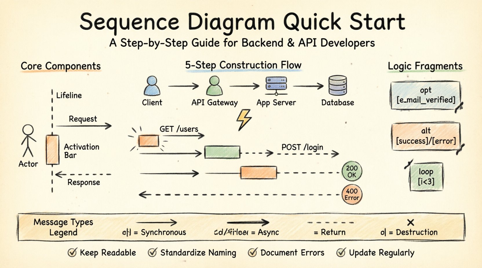
🧩 Understanding the Core Components
Before drawing any lines or shapes, you must understand the vocabulary of sequence diagrams. Each element serves a specific purpose in conveying how a system operates.
Lifelines: These represent the participants in the interaction, such as a user, a client application, a server, or a database. They are depicted as vertical dashed lines extending from the top to the bottom of the diagram.
Actors: External entities that initiate or interact with the system. These are often drawn as stick figures at the top of the lifeline.
Messages: Arrows connecting lifelines. They indicate data transfer or function calls. Direction matters: a right-pointing arrow typically means a request, while a left-pointing arrow often signifies a response.
Activation Bars: Rectangles placed on lifelines. They show when a participant is actively processing a task. The length of the bar corresponds to the duration of the operation.
Return Messages: Dashed arrows returning from the bottom lifeline to the top, indicating the completion of a request and the delivery of data back to the caller.
📋 Step-by-Step Construction Process
Creating a sequence diagram is a systematic process. Following a structured approach ensures that the final visualization accurately reflects the system’s behavior.
1. Identify the Participants
Start by listing every component involved in the specific interaction you wish to document. For an API scenario, this usually includes:
The Client (Web App, Mobile App, or Third-Party Service)
The API Gateway
The Application Server
The Database or External Storage
Any Third-Party Integrations (e.g., Payment Processor)
Place these participants horizontally across the top of your workspace. Ensure there is enough spacing to allow messages to cross clearly.
2. Define the Trigger Event
Every interaction begins with an event. This could be a user clicking a button, a scheduled job running, or an incoming webhook. Mark this clearly at the top of the initiating lifeline.
For example, if documenting a login flow, the trigger is “User submits credentials”. This initiates the first message from the Client lifeline.
3. Map the Request Flow
Draw solid arrows with open heads to represent synchronous calls. These are blocking operations where the sender waits for a response.
Request: From the Client to the API Gateway.
Authentication: From the Gateway to the Auth Service.
Data Fetch: From the Service to the Database.
Label each arrow with the method name and key parameters. Use standard naming conventions like GET /users or POST /login to maintain clarity.
4. Add Processing Logic
As messages are processed, activation bars appear. When a server receives a request, it enters an active state. Draw a rectangle over the lifeline during this period. This indicates that the component is busy and cannot process other requests simultaneously during that specific window.
5. Document the Response
Once processing is complete, draw a dashed arrow returning to the originator. Include the status code or data payload description.
Success: HTTP 200 OK with JSON body.
Failure: HTTP 400 Bad Request or 500 Internal Server Error.
🔄 Handling Logic and Control Structures
Real-world systems are not linear. They involve loops, conditions, and optional steps. Sequence diagrams must capture this complexity using specific fragments.
Opt (Optional)
Use an Opt fragment to show steps that occur only under certain conditions. For example, sending a confirmation email might happen only if the user opts in.
Draw a box around the relevant messages.
Label the frame “opt” or “optional”.
Specify the condition in the top left corner, e.g.,
[user.email_verified].
Alt (Alternative)
An Alt frame handles branching logic where one of several paths is taken. This is common in error handling.
Draw a box divided by a horizontal dashed line.
Label each section with the condition, such as
[success]and[error].Map the specific flows within each section.
Loop
Use a Loop frame for repeated actions. This is useful for iterating through a list of items or retrying a failed request.
Label the frame “loop”.
Add the iteration condition, such as
[i < 3]or[while queue not empty].
📊 Comparing Message Types
Different interactions require different arrow styles. Choosing the correct representation prevents ambiguity.
Message Type | Visual Representation | Use Case |
|---|---|---|
Synchronous Call | Solid line, open arrowhead | Standard API request waiting for response. |
Asynchronous Call | Solid line, filled arrowhead | Fire-and-forget tasks, like logging or notifications. |
Return Message | Dashed line, open arrowhead | Response data sent back to the caller. |
Creation | Dashed line, open arrowhead | Instantiating a new object or service instance. |
Destruction | X mark on lifeline | Cleaning up resources or ending a session. |
🛠️ Best Practices for API Design Documentation
When documenting backend logic, precision is key. Avoid clutter and focus on the data flow.
Keep It Readable
Do not attempt to diagram every single line of code. Focus on the architectural flow. If a sequence diagram becomes too wide, consider breaking it into multiple diagrams based on specific use cases (e.g., “Create User” vs. “Update User”).
Standardize Naming
Use consistent naming conventions across all diagrams.
Use PascalCase for components (e.g.,
AuthService).Use camelCase for methods (e.g.,
fetchUserProfile).Use HTTP methods for API endpoints (e.g.,
POST /register).
Highlight Latency Points
For backend performance discussions, indicate where delays occur. If a service waits for a database query, label that segment. This helps in identifying bottlenecks during code reviews.
Document Error States
Happy paths are important, but error paths are critical for stability. Ensure your diagrams show what happens when:
The database is unreachable.
The input validation fails.
Authentication tokens are expired.
Rate limits are exceeded.
🔗 Integration with Microservices
In distributed systems, sequence diagrams become even more vital. They map the communication between independent services.
Service Discovery
When a service needs to talk to another, it often queries a service registry. You can model this by adding a “Service Registry” lifeline. The flow would look like this:
Service A requests location of Service B.
Registry returns the endpoint.
Service A initiates the API call to Service B.
Inter-Service Communication
Decide between synchronous (HTTP/gRPC) and asynchronous (Message Queue) patterns.
Synchronous: Use solid arrows. The caller waits. Good for immediate consistency.
Asynchronous: Use filled arrows. The caller sends and continues. Good for decoupling and resilience.
Event-Driven Flows
For event-driven architectures, the sequence diagram shows events being published and consumed.
A producer publishes an event to a broker.
A consumer subscribes to that event type.
The broker delivers the message to the consumer.
🧪 Common Pitfalls to Avoid
Even experienced developers make mistakes when visualizing system interactions. Watch out for these common issues.
Overcrowding: Trying to fit too many services on one page. Split the diagram if it exceeds readability.
Vague Labels: Using generic terms like “Process” instead of “Validate Input”. Be specific about the action.
Missing Time Flow: Ensure messages are ordered chronologically from top to bottom. Time does not move backwards in a standard sequence diagram.
Ignoring Concurrency: If two operations happen in parallel, they should not be drawn as one after another unless they are logically sequential.
Tool Dependency: Do not let the capabilities of your tool dictate the design. Focus on the logic first, then apply the tool.
🔄 Maintenance and Version Control
A sequence diagram is a living document. As the code changes, the diagram must evolve.
Link to Code
If possible, link diagram steps to specific code repositories or documentation pages. This creates traceability between the design and the implementation.
Update During Refactoring
Whenever you refactor a module or change an API contract, review the relevant diagrams. Update the steps to reflect the new reality.
Use for Onboarding
These diagrams are excellent for bringing new team members up to speed. They provide a high-level view of how the system works without requiring deep code inspection.
📝 Summary of Key Takeaways
Creating sequence diagrams requires a balance between technical accuracy and visual clarity.
Start Simple: Begin with the main participants and the primary flow.
Define Interactions: Clearly distinguish between requests and responses.
Use Logic Frames: Leverage
alt,opt, andloopstructures for complex behavior.Focus on Backend: Highlight database calls, service lookups, and authentication steps.
Keep Current: Treat diagrams as documentation that requires maintenance.
By following these guidelines, you can produce diagrams that effectively communicate system behavior, reduce ambiguity during development, and serve as a reliable reference for future maintenance.
Investing time in proper visualization pays off during debugging and architectural reviews. It ensures that everyone on the team shares the same mental model of how the backend operates.