
In the landscape of modern distributed systems, clarity is currency. 🏦 Microservices architecture offers scalability and flexibility, but it introduces complexity that traditional monolithic designs rarely encounter. One of the most critical artifacts used to navigate this complexity is the sequence diagram. These visual representations map out interactions between services over time, serving as a blueprint for developers, architects, and stakeholders.
However, creating accurate and useful sequence diagrams for microservices is deceptively difficult. Many teams fall into traps that obscure the true nature of their system. These errors lead to miscommunication, integration failures, and production incidents. This guide details five specific mistakes frequently observed during the documentation process, providing a path toward more reliable architectural communication.
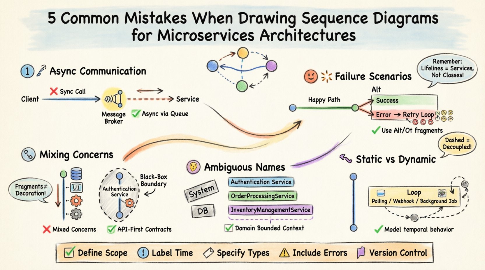
1. Ignoring Asynchronous Communication Patterns 📡
The most prevalent error in microservice documentation is the assumption that all interactions are synchronous request-response cycles. While this model works for a simple client-server application, distributed systems rely heavily on event-driven architectures, message queues, and pub/sub mechanisms. When a diagram depicts every interaction as a direct synchronous call, it misrepresents the system’s resilience and data flow.
The Mistake: Drawing a straight line from Service A to Service B and waiting for a return arrow before Service B performs any other action.
The Reality: Service A often sends a message to a broker (like a message bus) and immediately continues processing. Service B receives the message later, independently.
The Impact: Teams underestimate latency, ignore the need for buffering, and fail to design for eventual consistency.
To correct this, you must distinguish between blocking and non-blocking interactions. Use distinct arrow types or line styles to indicate asynchronous messaging. Consider the following implications:
Decoupling: The sender should not wait for the receiver to be online or ready. The diagram must reflect that the message enters a queue.
Idempotency: If a message is redelivered, the receiving service must handle it safely. This logic is often missing from diagrams that only show the happy path.
Callback Mechanisms: If an asynchronous call requires a response, the return path is often a separate message, not a direct reply line.
Visualizing this correctly requires acknowledging that time is not linear in the way a human reads a page. It is a flow of events. The timeline on the vertical axis represents real-world progression, but the horizontal gaps represent network latency or queue processing time. Ignoring these gaps creates a false sense of performance.
2. Overlooking Failure Scenarios and Resilience 💥
Most sequence diagrams document the “happy path.” They show what happens when everything works perfectly. In a microservices environment, this is insufficient. Distributed systems are inherently unreliable. Network partitions, service unavailability, and timeouts are not edge cases; they are expected behaviors.
The Mistake: Omitting timeout messages, error responses, or retry loops from the diagram.
The Reality: A service might time out after 5 seconds. The calling service might retry three times before giving up.
The Impact: Developers build code based on the diagram, only to find no error handling exists in the production environment when a dependency fails.
A robust diagram must include Alt and Opt fragments. These standard UML constructs allow you to branch the flow based on conditions. For example:
Alt Fragment: Used for alternatives. “If Service B is available, call it. Else, route to fallback service.”
Label the branches clearly:
success,timeout,error.
Opt Fragment: Used for optional steps. “If the user has a valid token, check permissions.”
This clarifies that certain flows are conditional.
Furthermore, consider the lifecycle of a failed request. Does the system log the error? Does it trigger an alert? Does it compensate for a transaction that partially completed? Including these steps in the diagram ensures that observability and reliability are baked into the design phase, not added after a production incident.
3. Mixing Concerns and Overloading Participants 🧩
Microservices are defined by their boundaries. Each service should own a specific domain of responsibility. When drawing sequence diagrams, a common mistake is blurring these lines by including internal database calls, UI rendering logic, or infrastructure details within the service lifeline.
The Mistake: Showing a service lifeline making direct database queries, rendering HTML, or managing user authentication as part of the interaction flow.
The Reality: These are internal implementation details. The sequence diagram should focus on the service-to-service contract.
The Impact: The diagram becomes cluttered and difficult to read. Changes to the internal database schema require rewriting the diagram, even though the service contract hasn’t changed.
To maintain clarity, treat each service as a black box from the perspective of the interaction. The diagram should answer: “What does Service A ask of Service B?” not “How does Service B fulfill that request?”
Consider the following rules for scope:
Exclude Database Interactions: Do not show the service talking to its own database. If the persistence layer is critical to the flow (e.g., distributed transaction), model the transaction protocol, not the SQL.
Exclude User Interface: If the diagram shows a user interacting with the system, represent the User as an actor. Do not show the UI layer calling the API layer unless the UI is a separate microservice.
Focus on APIs: Define the boundaries by the API endpoints. If a message crosses a boundary, it is an interaction. If it stays within, it is internal processing.
By stripping away internal mechanics, the diagram remains stable. Refactoring the internal code of a service does not invalidate the diagram as long as the external interface remains consistent. This separation of concerns is vital for long-term maintainability.
4. Ambiguous Lifelines and Participant Boundaries 🤷
In complex architectures, it is easy to lose track of which service is handling which responsibility. Ambiguity in lifelines leads to confusion about ownership. When a message is sent, who is the actual recipient? Is it a generic “Backend” service, or a specific “Payment Processor”?
The Mistake: Using generic names like “System,” “API,” or “Database” for lifelines.
The Reality: Every lifeline should represent a specific, deployable unit of code with a unique identity.
The Impact: Developers cannot determine which team owns the service responsible for a specific interaction. Troubleshooting becomes a game of phone tag.
Clear naming conventions are essential. Use domain-driven design (DDD) terminology. Instead of “OrderService,” consider “OrderProcessingService” if it handles logic, or “OrderRepository” if it handles data. However, in a sequence diagram, focus on the service instance.
Additionally, consider the Grouping feature. If multiple services belong to the same domain (e.g., “Inventory Management”), visually group their lifelines. This helps the reader understand the context of the interaction without needing to memorize every service name.
Here is a comparison of poor vs. strong lifeline definitions:
Weak Definition ❌ | Strong Definition ✅ | Reasoning |
|---|---|---|
|
| Specifies the technology layer and the domain entity. |
|
| Clarifies the specific responsibility of the backend component. |
| (Omitted) | Internal persistence is not an interaction partner. |
|
| Identifies the entry point and its specific role in routing. |
This level of specificity ensures that the diagram serves as an accurate contract between teams. When a new developer joins the project, they can look at the diagram and immediately understand the ownership and responsibility distribution.
5. Static Representation of Dynamic Behavior 🔄
Sequence diagrams are often created once and then forgotten. They are treated as static snapshots of a system that is actually dynamic. Microservices evolve constantly. New features are added, deprecated, and changed. A diagram that does not account for loops, iterations, or state changes becomes misleading quickly.
The Mistake: Showing a single instance of a message flow without accounting for retries, polling, or batch processing.
The Reality: Real-world interactions often involve loops. A client might poll for status, or a batch job might process thousands of items.
The Impact: The diagram fails to represent the load characteristics of the system, leading to under-provisioning of resources.
To address this, use the Loop fragment. This indicates that a set of messages repeats. This is crucial for understanding scalability requirements. If a service processes 1,000 items in a loop, the latency and throughput implications are vastly different than processing a single item.
Consider the following areas where dynamic behavior is often missed:
Webhooks: A service might send a request, and the recipient might call back later. This is not a synchronous return; it is a new interaction initiated by the recipient.
Background Jobs: A user request might trigger a background job. The diagram should show the user request returning a “Processing” status, followed by a separate flow for the background job completion.
State Changes: If a service changes state (e.g., from “Pending” to “Shipped”), ensure the diagram reflects the state transitions that trigger subsequent messages.
By acknowledging that systems are fluid, your documentation remains relevant longer. You are not just documenting a single transaction; you are documenting a pattern of interaction.
Best Practices Checklist for Microservice Diagrams ✅
To ensure your diagrams serve their purpose, apply the following checklist before finalizing any documentation.
Define Scope: Clearly state which services are included and which are out of scope.
Label Time: Ensure the vertical axis represents time progression, even if non-linear.
Specify Types: Use different arrow styles for synchronous calls, asynchronous messages, and error returns.
Include Errors: Always map out at least one failure path for critical interactions.
Version Control: Treat diagrams as code. Store them in the same repository as the source code to track changes alongside implementation.
Review with Team: Have developers review the diagram to ensure it matches the actual implementation code.
Implementation Guidelines for Long-Term Value 🛠️
Creating these diagrams is not a one-time task. It requires discipline and a shift in mindset regarding documentation. Here are actionable steps to integrate this practice into your workflow.
Integrate into Design Reviews: Before writing code, draft the sequence diagram. If you cannot draw the interaction, the design is likely incomplete.
Automate Where Possible: If your tooling supports it, generate diagrams from code annotations or API definitions. This reduces the gap between code and documentation.
Regular Audits: Schedule quarterly reviews of your critical diagrams. Mark them as “Needs Update” if the service has changed significantly.
Focus on Contracts: Ensure the diagram defines the contract. If the contract changes, the diagram must change first.
By adhering to these guidelines, you transform sequence diagrams from static images into living documents that drive architectural decisions. They become a shared language for the team, reducing friction and accelerating development.
Final Thoughts on Architectural Clarity 🧭
Documentation in distributed systems is often viewed as a burden. It is seen as time taken away from building features. However, without clear visualizations of how components interact, teams are building blind. The cost of fixing a miscommunication in production is exponentially higher than the cost of drawing a diagram during design.
Avoiding the five mistakes outlined here—ignoring asynchrony, skipping failure paths, mixing concerns, using ambiguous names, and ignoring dynamic behavior—will significantly improve the quality of your system design. It requires effort, but the return on investment is a more resilient, maintainable, and understandable architecture.
Focus on accuracy over aesthetics. A simple, accurate diagram is worth more than a complex, misleading one. Prioritize clarity, and your team will thank you when the system scales.