
Creating clear visual documentation is a critical skill for any technical team. A sequence diagram serves as a map for understanding how different parts of a system interact over time. This guide walks through the process of building these diagrams from scratch, ensuring they accurately reflect API behaviors and system logic. By following structured approaches, you can produce visuals that aid debugging, onboarding, and architectural planning.
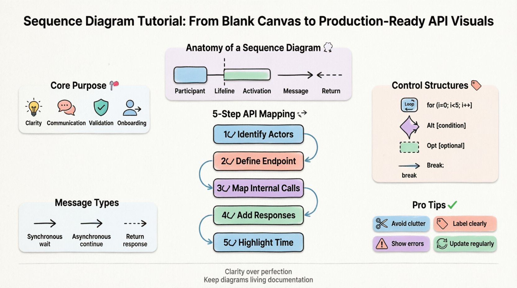
Understanding the Core Purpose 🎯
Before drawing lines and boxes, it is essential to grasp what a sequence diagram represents. It is a type of interaction diagram that shows how objects or processes interact with each other in a specific time sequence. Unlike other diagrams that focus on static structure, this format emphasizes dynamic behavior. For API documentation, it clarifies the order of requests and responses.
Why use this method for system design?
- Clarity: Complex logic becomes linear and easier to follow.
- Communication: Stakeholders can visualize data flow without reading code.
- Validation: Helps identify missing error handling or unnecessary steps.
- Onboarding: New team members understand the system architecture quickly.
Anatomy of a Sequence Diagram 🧩
Every effective diagram consists of specific building blocks. Understanding these elements ensures that your visuals are consistent and readable. Below is a breakdown of the primary components.
| Element | Visual Representation | Purpose |
|---|---|---|
| Participant | Box at the top | Identifies the actor, service, or system involved. |
| Lifeline | Vertical dashed line | Shows the existence of the participant over time. |
| Activation | Thin rectangle on lifeline | Indicates when the participant is actively processing. |
| Message | Horizontal arrow | Represents a call, request, or signal between participants. |
| Return | Dashed arrow | Shows the response or data flowing back. |
Mapping API Interactions 🔄
When documenting APIs, the focus shifts to how clients and servers exchange data. A production-ready diagram must account for success paths, failure scenarios, and asynchronous events. Start by defining the entry point, typically a client or external system.
Step-by-Step Construction
- Identify Actors: Determine who initiates the request. This could be a frontend application, a third-party service, or a user.
- Define the Endpoint: Place the API gateway or backend service as the recipient of the initial call.
- Map Internal Calls: Show how the API interacts with databases, other microservices, or external dependencies.
- Add Responses: Ensure every request has a corresponding return path, even if it indicates an error.
- Highlight Time: Vertical position represents the timeline. Earlier interactions appear higher up.
Handling Complexity with Control Structures 🧠
Real-world systems rarely follow a single straight line. You will encounter loops, conditional logic, and optional steps. Using standard notation for these patterns keeps the diagram standardized and understandable.
Common Control Structures
- Loop (Loop): Used when a process repeats. Indicate the condition under which the loop occurs.
- Alternative (Alt): Represents if/else logic. One path is taken based on a condition.
- Optional (Opt): Indicates a step that may or may not happen.
- Break: Used to exit a loop early under specific conditions.
For example, when handling a user payment, an Alt fragment separates the successful transaction from a declined one. This prevents the diagram from becoming a tangled web of lines.
Message Types
Not all messages are the same. Distinguishing between them adds precision to your documentation.
- Synchronous: The caller waits for the response before continuing. Represented by a solid line.
- Asynchronous: The caller sends a message and continues without waiting. Represented by an open arrow.
- Return: The response back to the caller. Represented by a dashed line.
Common Pitfalls in Visual Documentation 🚫
Avoiding common mistakes is just as important as following best practices. Many diagrams become unreadable due to clutter or ambiguity. Review your work against these common issues.
- Too Much Detail: Do not include every single variable or internal function. Focus on the flow of control and data between major components.
- Mixed Levels of Abstraction: Do not mix high-level system calls with low-level database queries in the same view. Keep related flows together.
- Unclear Labels: Every arrow should have a meaningful name. Avoid generic labels like “Data” or “Process”.
- Missing Error Paths: Always show what happens when a request fails. This is critical for API reliability.
- Overcrowding: If a diagram becomes too wide, split it into multiple diagrams for different scenarios.
Maintaining Accuracy Over Time 🔄
Software changes frequently. A diagram that was accurate last month may be obsolete today. To keep your documentation useful, treat it as living documentation.
Best Practices for Maintenance
- Version Control: Store diagram files alongside code repositories. This allows you to track changes.
- Review Cycles: Include diagram updates in the code review process. If logic changes, the visual must change.
- Automated Generation: Where possible, generate diagrams from code comments or API specifications to reduce manual drift.
- Clear Legends: If you use custom symbols, provide a legend within the document.
From Design to Documentation 📝
Once the diagram is complete, it needs to be integrated into your broader documentation strategy. It should not exist in isolation.
Integration Points
- API Spec: Link the diagram to your API specification file. Developers often read the spec first.
- Architecture Guides: Place the diagram in the system architecture section to provide context.
- Onboarding Docs: Use the diagram as a visual aid for new hires to understand the system flow.
- Incident Response: Reference the diagram during debugging sessions to trace request paths.
Visual Hierarchy and Readability 🎨
Even without CSS styling, the layout of your content matters. Use whitespace to separate logical groups. Align elements consistently to create a clean appearance.
- Left-to-Right Flow: Ensure the primary interaction flows from left to right where possible.
- Grouping: Group related lifelines together. For example, keep all database lifelines on one side.
- Spacing: Add space between distinct message sequences to avoid visual clutter.
- Labels: Keep text on arrows short. Move detailed explanations to the diagram description below.
Advanced Patterns for Scalability 📈
As systems grow, diagrams must scale with them. Consider these patterns for larger architectures.
- Fragment Combining: Use frames to group complex logic into reusable blocks.
- Reference: Link to another diagram for detailed sub-processes to keep the main view clean.
- Delegation: Show delegation messages where one component passes work to another without direct processing.
Conclusion on Documentation Quality
Creating high-quality sequence diagrams requires attention to detail and a commitment to accuracy. By focusing on clear components, logical flow, and maintenance, you ensure that your visuals remain valuable assets. These diagrams bridge the gap between technical implementation and stakeholder understanding, fostering better collaboration across the team.
Remember that the goal is clarity, not perfection. A slightly simplified diagram that is easy to read is more useful than a complex one that confuses the reader. Regularly update your visuals as the system evolves. This practice ensures that your documentation remains a reliable source of truth for everyone involved in the project.
Start with the basics, apply the patterns discussed, and refine your approach over time. With consistent effort, your team will produce visuals that effectively communicate system behavior and design intent.