
Sequence diagrams are the backbone of software architecture communication. They visualize how objects interact over time, providing a clear map of system behavior. However, many beginners struggle to create them effectively. A poorly constructed diagram can lead to confusion, bugs, and wasted development time. This guide explores the most frequent errors and provides actionable corrections. By understanding these common pitfalls, you can improve the clarity and utility of your design documentation.
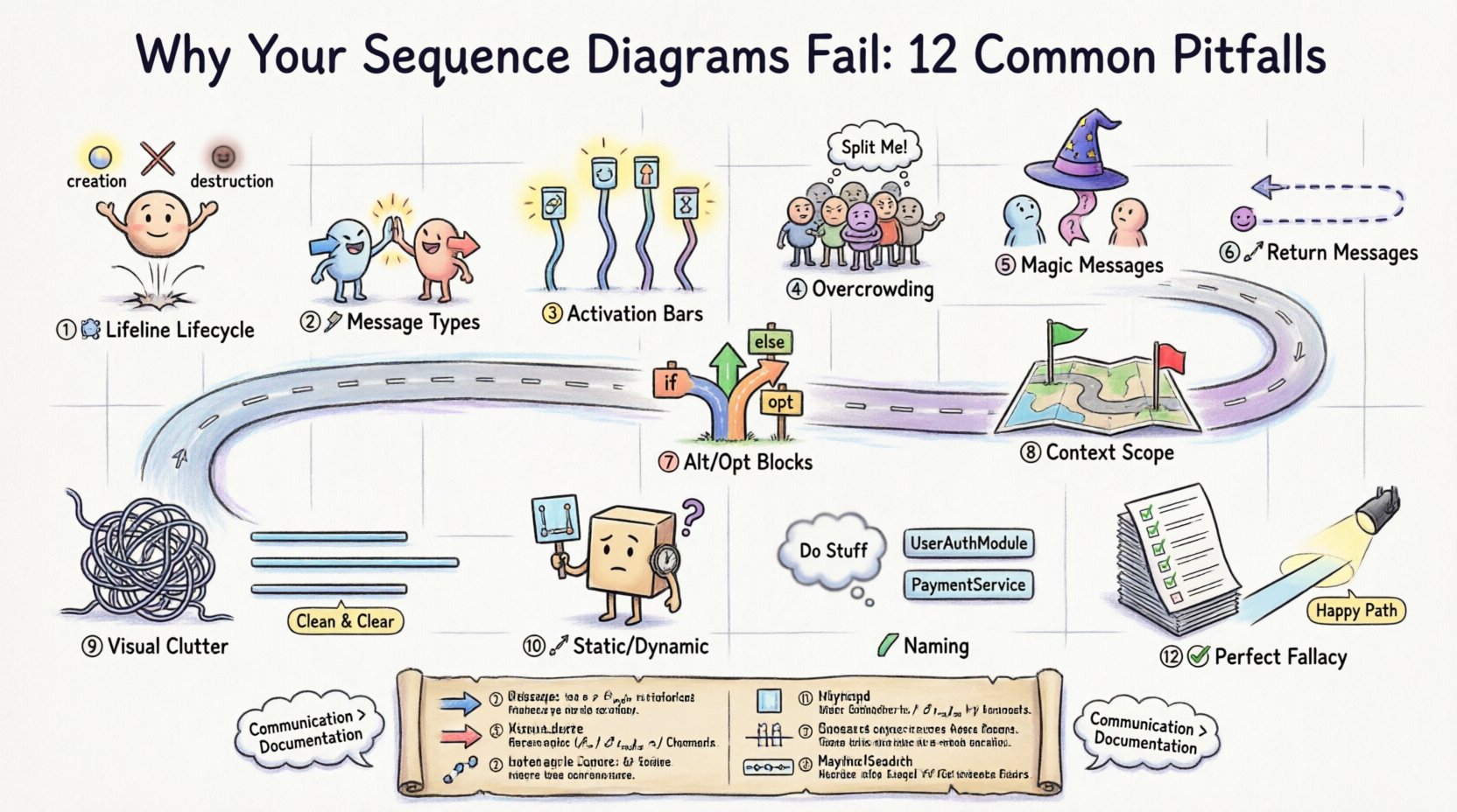
1. The Lifeline Lifecycle Misunderstanding 🕰️
One of the most fundamental errors involves the representation of lifelines. A lifeline represents a participant in the interaction, such as a user, a database, or an API service. Beginners often treat lifelines as static icons rather than active participants with a lifespan.
- The Mistake: Drawing lifelines that exist for the entire duration of the diagram without considering their actual scope.
- The Consequence: This suggests that an object is active and holding resources throughout the entire process, which is rarely true in real systems.
- The Fix: Ensure lifelines start only when the object is created and end when the object is destroyed or goes out of scope. Use destruction icons (X) where appropriate to indicate the end of an object’s existence.
Consider the context of a login system. The database connection should not exist before the login request is made. It should be established, used, and then closed. Visualizing this lifecycle correctly helps developers understand resource management requirements.
2. Message Type Confusion 📡
Understanding the difference between synchronous and asynchronous messages is crucial. Mixing these up changes the flow of control and the expectation of the system.
- Synchronous Messages: These require the sender to wait for a response. The arrow is solid and filled.
- Asynchronous Messages: The sender continues immediately without waiting. The arrow is solid but open at the head.
- Return Messages: These are typically dashed lines with an open arrowhead.
When a developer sees a solid arrow, they expect a response. If the code implements an asynchronous call, the diagram misleads them into thinking the flow blocks. This can cause concurrency bugs or timeouts in production. Always verify the intended behavior of the communication before drawing the arrow.
3. Activation Bars Without Purpose ⚡
Activation bars (the rectangles on the lifeline) show when an object is performing an action. Beginners often skip these or place them arbitrarily.
- The Mistake: Drawing activation bars that do not correspond to the incoming message or leaving gaps where execution clearly occurs.
- The Consequence: It becomes impossible to see how long an operation takes or where processing happens.
- The Fix: Align the top of the activation bar with the arrival of a message and the bottom with the departure of a return message or the end of processing.
Activation bars help identify bottlenecks. If a specific lifeline has a long activation bar, that component is doing heavy lifting. This insight is vital for performance tuning. Without these bars, the diagram is just a list of calls without temporal context.
4. Overcrowded Participants 👥
Attempting to model an entire system in a single diagram is a common trap. This leads to a visual mess that is impossible to read.
- The Mistake: Including every single service, database, and cache in one view.
- The Consequence: Lines cross everywhere, making the flow of logic indistinguishable.
- The Fix: Focus on a specific use case or transaction. Create separate diagrams for different scenarios (e.g., “User Login” vs. “Password Reset”).
Complex systems require modular diagrams. If you find yourself drawing more than ten lifelines, pause and reconsider the scope. Break the diagram into smaller, focused views. This makes the diagram easier to maintain and understand for stakeholders who review it.
5. The “Magic” Message Problem 🪄
Sometimes, the logic between two points is skipped over. A message is sent, and the next message appears as if by magic, with no intermediate processing shown.
- The Mistake: Drawing a message from Object A to Object C without showing Object B in between.
- The Consequence: It hides the complexity of the system and assumes knowledge that the reader does not have.
- The Fix: Show every hop. If Object A talks to Object B, and Object B talks to Object C, draw all three lifelines and the messages between them.
Even if the intermediate step is trivial, showing it establishes the path. If the path changes later, the diagram remains accurate. Hiding steps creates a false sense of simplicity that can lead to integration errors when the code is written.
6. Ignoring Return Messages 🔄
Beginners often focus on the forward flow and forget the return path. This is particularly problematic in synchronous interactions.
- The Mistake: Drawing the request but omitting the response arrow.
- The Consequence: It is unclear if the operation succeeded or failed, and what data is passed back.
- The Fix: Always include return messages for synchronous calls. Label them clearly if they contain specific data structures.
Return messages indicate the completion of a task. Without them, the timeline of the interaction is incomplete. This is especially important for debugging. If a process hangs, the missing return message often points to the failure point.
7. Alt/Opt Blocks Misuse 🚦
Conditional logic and loops are represented using Combined Fragments like Alt (Alternative) and Opt (Optional). Beginners often misuse these to represent time rather than logic.
- The Mistake: Using Alt frames to show things that happen one after another.
- The Consequence: It suggests that only one path will be taken, when in reality, multiple steps occur sequentially.
- The Fix: Use Alt only for mutually exclusive choices (if/else). Use Opt for optional steps that might not happen at all. Use Loop for repeated actions.
Correct usage of these frames clarifies the decision points in your system. Misusing them can confuse developers about whether a step is required or optional. Ensure the condition for the frame is clearly labeled inside the box.
8. Lack of Context and Scope 🌍
A diagram without context is just a picture. It needs to define what is happening and what the boundaries are.
- The Mistake: Starting a diagram in the middle of a process without explaining the trigger.
- The Consequence: Readers do not know what initiated the sequence or what the end goal is.
- The Fix: Start with the external actor or the event that triggers the sequence. End with the final state or return to the actor.
Always state the precondition. For example, “User is logged in” or “Database is available.” This ensures that the diagram represents a valid state of the system. Without this, the sequence might describe an impossible scenario.
9. Visual Clutter and Layout 📐
Even if the logic is correct, a messy layout destroys the value of the diagram. Lines should not cross unnecessarily.
- The Mistake: Placing participants randomly, causing message lines to intersect chaotically.
- The Consequence: The eye struggles to follow the path from sender to receiver.
- The Fix: Arrange lifelines in a logical order. Place the initiator on the left. Group related services together. Minimize line crossings.
Layout is part of the communication. A clean diagram is a respectful diagram. It shows that you care about the reader’s understanding. Take the time to align participants vertically and route messages smoothly.
10. Static vs. Dynamic Confusion 🔄
Sequence diagrams are dynamic. They show time. Beginners often use them to show static structure, which is what class diagrams are for.
- The Mistake: Trying to show inheritance or relationships that do not change over time.
- The Consequence: The diagram becomes cluttered with irrelevant structural details.
- The Fix: Focus on interaction. If it does not involve a message or a time-based event, do not include it in the sequence diagram.
Keep the focus on the flow of control. If you need to show how objects relate structurally, use a different type of diagram. Mixing static structure with dynamic behavior confuses the purpose of the visual representation.
Common Errors Summary Table 📊
| Pitfall | What Happens | How to Fix |
|---|---|---|
| Lifeline Lifecycle | Objects shown active when they are not | Start/End lifelines at creation/destruction |
| Message Types | Blocking calls drawn as non-blocking | Use solid arrow for sync, open for async |
| Activation Bars | Gaps in processing time | Align bars with message arrival/departure |
| Participants | Too many lifelines on one page | Split into multiple focused diagrams |
| Return Messages | No indication of success/failure | Always draw dashed return arrows |
| Layout | Crossing lines obscure flow | Order lifelines logically to reduce crossings |
11. Naming Conventions 🏷️
Labels on messages and lifelines are critical for understanding. Vague names like “Do This” or “Process” provide no value.
- The Mistake: Using generic verbs without context.
- The Consequence: Developers must guess the data or logic involved.
- The Fix: Use specific method names or action descriptions. Include data types if relevant.
For example, instead of “Save Data”, write “SaveUserDTO(UserDTO user)”. This specifies exactly what is being passed. It bridges the gap between the diagram and the actual code. Specificity reduces ambiguity during implementation.
12. The “Perfect” Diagram Fallacy ✅
There is a temptation to make the diagram cover every edge case. This is a trap that leads to an unmanageable document.
- The Mistake: Trying to document every possible error state and variation.
- The Consequence: The diagram becomes too large to read and is rarely updated.
- The Fix: Document the happy path and major error scenarios. Use annotations for exceptions rather than drawing every branch.
Diagrams are for communication, not exhaustive specification. If a diagram is too complex, people will stop reading it. Keep it readable and relevant. Update it only when the core logic changes, not for every minor tweak.
The Cost of Poor Diagrams 💸
Why does this matter? A bad sequence diagram has real financial and technical costs. It leads to miscommunication between teams. The backend team might build one thing while the frontend team expects another.
- Refactoring Hell: If the design is unclear, code becomes rigid. Changing it later requires rewriting large sections.
- Debugging Time: Engineers spend hours tracing logic that was not clearly defined in the design phase.
- Onboarding: New hires cannot understand the system quickly if the diagrams are confusing.
Investing time in getting the sequence diagram right saves time in the long run. It acts as a single source of truth for the interaction logic. It aligns the team before a single line of code is written.
Communication vs. Documentation 🗣️
Remember that sequence diagrams are a tool for conversation, not just a record. They should be discussed, not just created and filed away.
- Review Process: Walk through the diagram with peers during the design phase.
- Feedback Loop: Ask if the flow makes sense to someone unfamiliar with the code.
- Living Document: Treat the diagram as part of the codebase. Update it alongside the code.
If the diagram is not reviewed, it will drift from reality. The code evolves, and the diagram must evolve with it. A stale diagram is worse than no diagram because it creates false confidence.
Final Thoughts on Sequence Design 🚀
Creating effective sequence diagrams requires practice and attention to detail. Avoid the common traps outlined here to ensure your designs are clear and useful. Focus on the flow, the timing, and the participants. Keep the scope manageable. Use specific naming and clear visual cues.
By avoiding these pitfalls, you create a visual language that your team can understand. This leads to better software architecture and fewer bugs. Start with the basics, master the interactions, and build up your skills over time. The goal is clarity, not complexity.
Take the time to review your work. Check the lifelines, verify the arrows, and ensure the logic holds up. With patience and attention, your diagrams will become powerful tools for development. They will help you build systems that are robust, maintainable, and well-understood by everyone involved.