
Understanding how data moves through a distributed system is essential for architects and developers. A sequence diagram provides a visual representation of interactions between components over time. When focusing on a single API request, this diagram reveals the hidden complexities of authentication, validation, processing, and response delivery. This guide examines the lifecycle of an API call, breaking down each phase to improve system clarity and troubleshooting capabilities.
Why Visualize the Request Lifecycle? 🔍
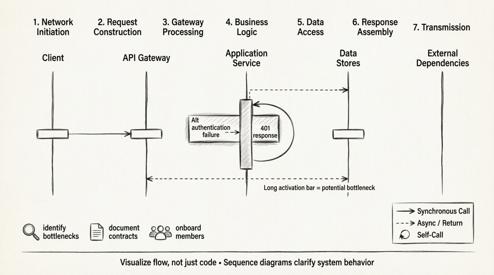
Code describes logic, but diagrams describe flow. In complex microservice architectures, a single user action can trigger dozens of backend calls. Without a clear map, debugging becomes a game of chance. Sequence diagrams allow teams to:
- Identify Bottlenecks: Spot where latency accumulates during processing.
- Clarify Responsibilities: Define which component handles specific tasks like logging or caching.
- Document Contracts: Establish expectations for message formats and error codes between services.
- Onboard New Members: Provide a quick reference for system behavior without reading raw code.
By mapping the lifecycle, teams gain a shared understanding of the system’s behavior under load. This clarity reduces friction during incident response and feature planning.
Core Components of the Diagram ⚙️
Before tracing the path of a request, we must define the actors involved. In a standard web architecture, specific lifelines represent distinct functional areas. Each lifeline is a vertical line indicating the existence of a participant over time.
1. The Client 🖥️
Whether a mobile app, a web browser, or an external partner service, the client initiates the interaction. It constructs the initial message and waits for a response. In the diagram, this is often the topmost lifeline.
2. The Entry Point / Gateway 🚪
This component manages incoming traffic. It handles SSL termination, rate limiting, and routing. It does not process business logic but ensures the request reaches the correct destination.
3. The Application Service ⚙️
The core logic resides here. This layer validates input, enforces business rules, and coordinates with other services. It acts as the brain of the operation.
4. Data Stores 💾
Services persist information. This could be a relational database, a NoSQL store, or a cache layer. The diagram distinguishes between reading data and writing changes.
5. External Dependencies 🌐
Modern systems rarely exist in isolation. Third-party payment gateways, email providers, or legacy systems may be involved. These are often represented with dashed lines to indicate external boundaries.
Step-by-Step: The Request Journey 📡
Tracing a request requires looking at the sequence from the moment the user hits “send” to the moment the UI updates. This journey involves multiple protocol layers and logical steps.
Phase 1: Network Initiation
- DNS Resolution: The client resolves the domain name to an IP address.
- TCP Handshake: A three-way handshake establishes a reliable connection.
- TLS Negotiation: If HTTPS is used, keys are exchanged to encrypt the channel.
Phase 2: Request Construction
The client sends the HTTP request. This includes:
- Method: GET, POST, PUT, DELETE, etc.
- Path: The specific endpoint URL.
- Headers: Metadata like authentication tokens, content type, and language preferences.
- Body: The payload containing the data to be processed.
Phase 3: Gateway Processing
The entry point receives the traffic. It performs:
- Authentication: Verifying the token is valid and not expired.
- Rate Limiting: Ensuring the client has not exceeded their quota.
- Routing: Directing the request to the correct internal service.
Phase 4: Business Logic Execution
Inside the application service, the request is parsed. Middleware functions run in a chain, such as logging, input sanitization, and validation. If validation fails, an error response is generated immediately. If successful, the service interacts with the data layer.
Phase 5: Data Access
The service queries the database. This step may involve:
- Index Lookups: Finding records efficiently.
- Joins: Combining data from multiple tables.
- Caching: Checking if the data exists in a faster storage layer first.
Phase 6: Response Assembly
Once data is retrieved, the service formats it into JSON or XML. Status codes are assigned based on the outcome (e.g., 200 OK, 201 Created, 400 Bad Request). Headers are added to indicate content length and type.
Phase 7: Transmission
The response travels back through the same path in reverse. The gateway may log the transaction. The client receives the data and updates the user interface.
Message Types and Flow Control 🔄
Not all messages are the same. Sequence diagrams distinguish between different types of interactions to clarify timing and behavior.
| Message Type | Visual Representation | Behavior |
|---|---|---|
| Synchronous Call | Solid Arrow | Caller waits for the receiver to finish before continuing. |
| Asynchronous Message | Dashed Arrow | Caller sends and continues without waiting for a reply. |
| Return Message | Dashed Arrow (Open) | Response sent back to the original caller. |
| Self-Call | Looping Arrow | A component calling itself for internal processing. |
Understanding these distinctions helps in analyzing system performance. Synchronous calls can create blocking behavior, while asynchronous messages allow for better throughput in high-load scenarios.
Timing and Latency Analysis ⏱️
Visualizing time is critical for performance tuning. While standard sequence diagrams show order, timing diagrams show duration. However, even in standard diagrams, we can infer timing issues.
- Long Activation Bars: A long vertical bar on a lifeline indicates that component is busy for a long time. This suggests a heavy computation or a slow database query.
- Deep Nesting: If a request triggers five other services, the total latency is the sum of all individual latencies plus network overhead.
- Parallel Processing: If the diagram shows multiple arrows sent simultaneously to different services, the total time is determined by the slowest service.
Optimizing the lifecycle often involves identifying these long bars. Caching frequently accessed data or moving computation to the edge can reduce the duration of these bars.
Handling Errors and Exceptions ⚠️
A robust system must handle failure gracefully. Sequence diagrams should include failure paths, not just the happy path.
Common Failure Scenarios
- Network Timeouts: The request took too long, and the client gave up.
- Service Unavailable: A downstream dependency is down.
- Invalid Input: The client sent malformed data.
- Authentication Failure: The token was rejected.
Diagramming Errors
To document these scenarios:
- Use Alt (Alternative) fragments to show different outcomes based on conditions.
- Use Opt (Optional) fragments for non-mandatory steps.
- Show error messages flowing back up the chain to the client.
- Indicate retry mechanisms where applicable.
For example, if a database query fails, the service might return a 500 error. If a third-party API fails, the service might return a 503 with a message indicating temporary unavailability. The diagram makes it clear which component is responsible for which error type.
Best Practices for Documentation 📝
Creating a diagram is an art. To ensure it remains useful, follow these standards.
1. Keep it Focused
Do not try to show the entire system in one image. Create separate diagrams for different use cases, such as “User Login” or “Order Processing”. This keeps the complexity manageable.
2. Use Clear Naming
Lifelines should use domain names, not technical class names. Instead of “UserServiceImpl”, use “User Service”. Messages should describe the intent, not the function name. Use “Fetch User Profile” instead of “getProfile()”.
3. Limit Depth
Hide complexity by abstracting. If a service calls ten internal modules, represent that as a single self-call or a summary box. Only drill down when debugging a specific issue.
4. Maintain Consistency
Use the same notation style across all documentation. Decide on arrow styles, line thickness, and color coding, and stick to them.
5. Version Control
Treat diagrams like code. Store them in the repository and update them when the logic changes. An outdated diagram is worse than no diagram at all.
Advanced Patterns in Complex Systems 🧩
As systems grow, simple request-response flows become insufficient. Several patterns emerge in high-scale environments.
Event-Driven Architecture
In this pattern, the API request triggers an event. The response is sent immediately, and processing happens in the background. The diagram shows the initial request returning a 202 Accepted status, followed by a separate sequence for the background task.
Circuit Breakers
To prevent cascading failures, services use circuit breakers. The diagram should show a check before sending a request. If the circuit is open, the request is rejected immediately without contacting the downstream service.
Retries and Backoff
Network issues are common. Diagrams should show retry loops. A successful retry might show a second arrow after a delay. Exponential backoff can be noted to indicate increasing wait times between attempts.
Batching
To reduce overhead, multiple operations might be grouped into one request. The diagram shows a single incoming message triggering multiple internal writes.
Common Pitfalls to Avoid 🛑
Even experienced architects make mistakes when mapping lifecycles.
- Ignoring Asynchrony: Treating async callbacks as synchronous blocks can mislead performance expectations.
- Missing Context: Failing to show authentication steps makes it unclear how security is enforced.
- Overloading the Diagram: Including database schema details or code snippets clutters the visual flow.
- Static Views: Treating the diagram as a one-time document rather than a living representation of the system.
Final Considerations 🎯
Mapping the lifecycle of a single API request is more than a documentation exercise. It is a discipline that forces clarity on system interactions. By visualizing the flow, teams can identify inefficiencies before they become production issues. The sequence diagram serves as a contract between developers, ensuring everyone understands how data moves through the infrastructure.
When creating these diagrams, focus on the flow of information and the responsibility of each component. Avoid unnecessary detail that obscures the main path. Regularly review diagrams during sprint planning and architecture reviews to keep them aligned with reality. This practice ensures that the documentation remains a valuable asset throughout the project lifecycle.
Ultimately, the goal is communication. A well-crafted diagram speaks faster than a thousand lines of code. It bridges the gap between technical implementation and business requirements. By mastering the visual language of sequence diagrams, teams build systems that are easier to understand, maintain, and scale.